a journey
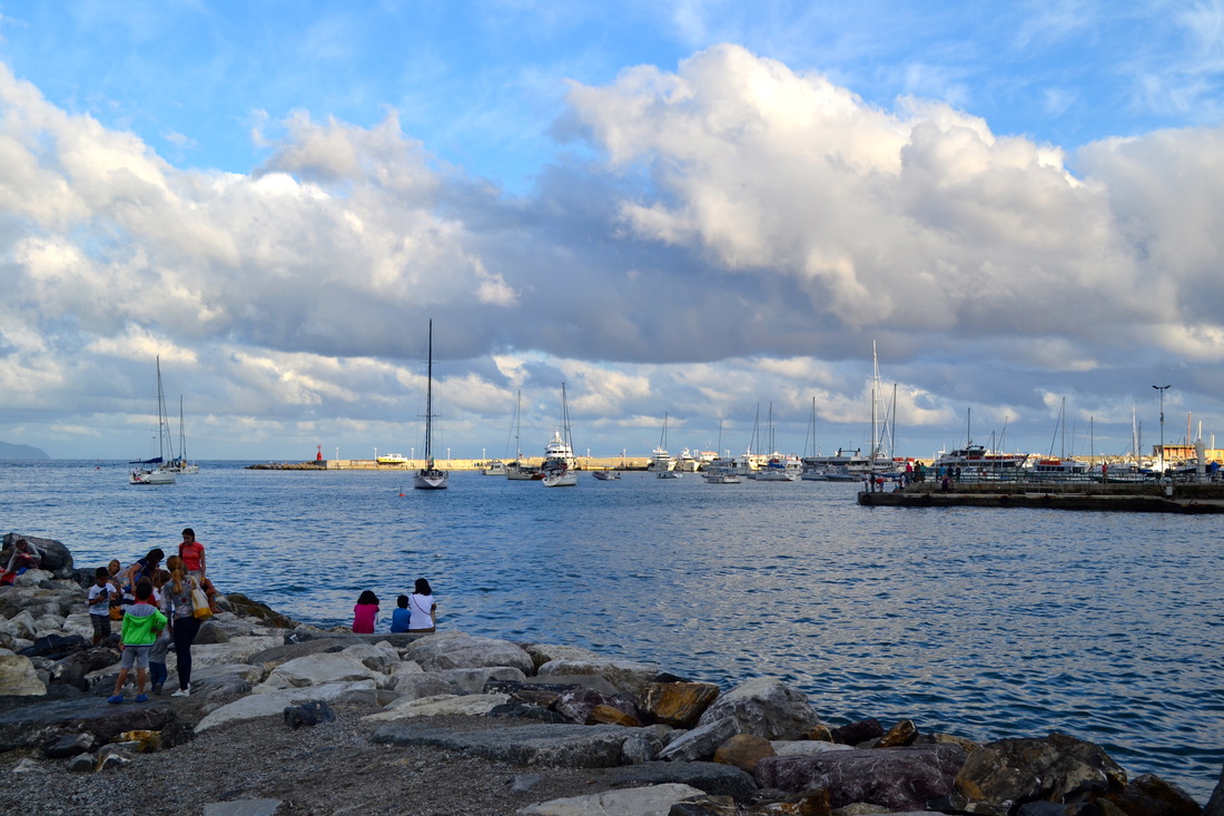
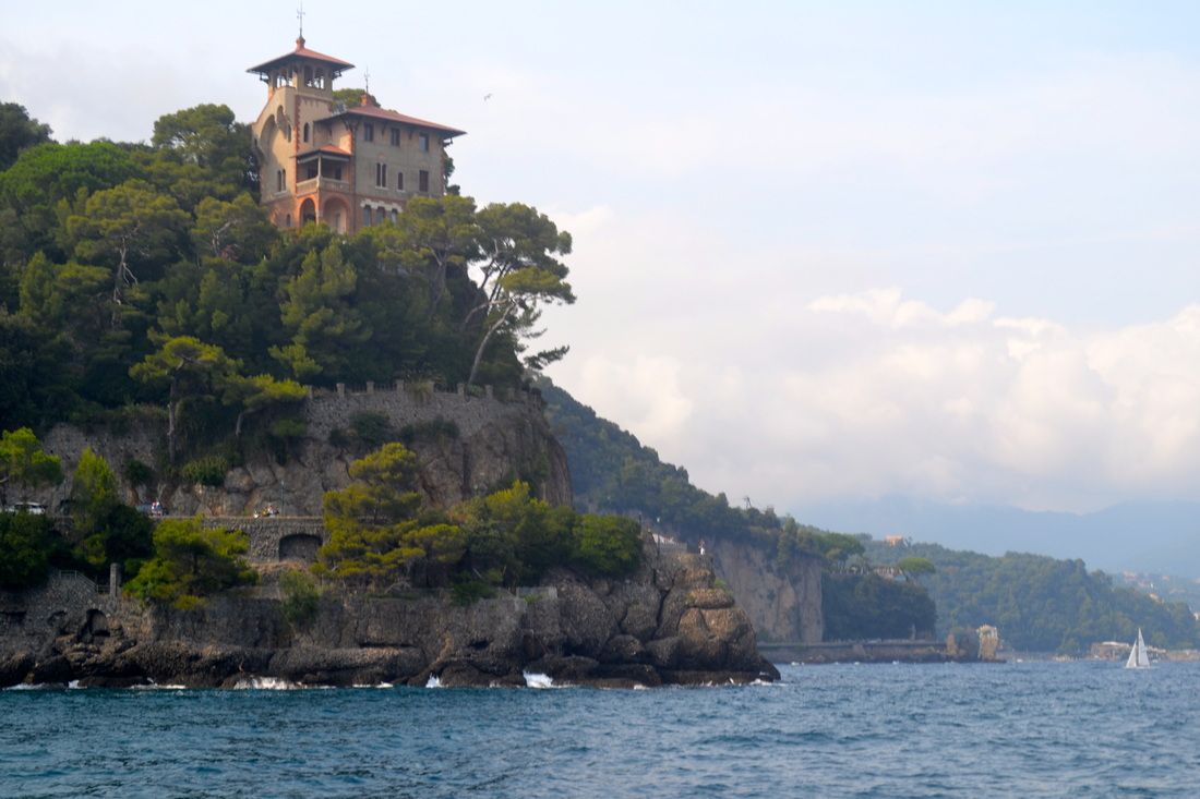
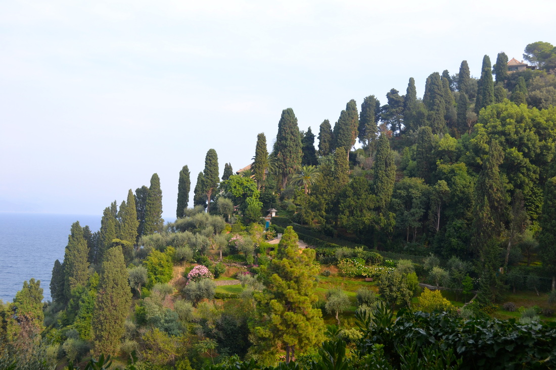
Beyond the photograph
During this project, I will experiment with various untraditional methods and takes on traditional photography. I will do this through the use of different types of mediums, through the dark room and through photo's of photo's.
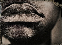
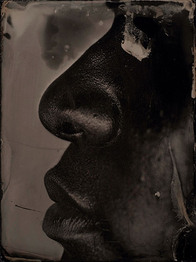
myra greene
|
|
|
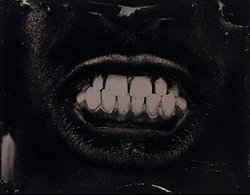
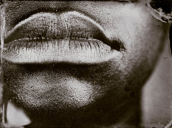
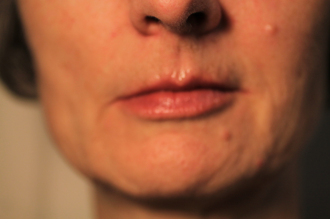
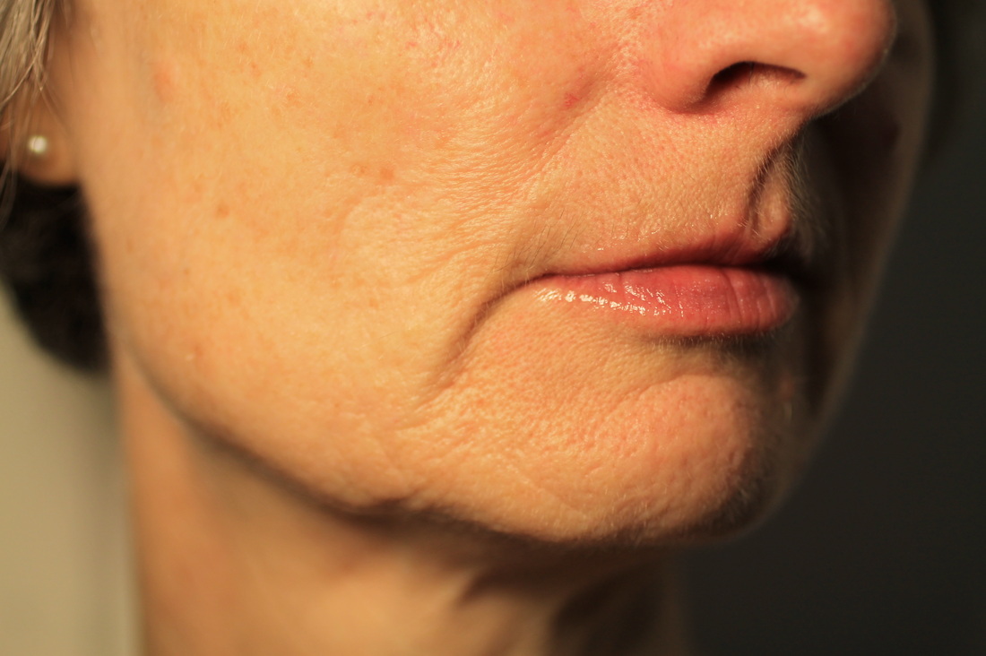
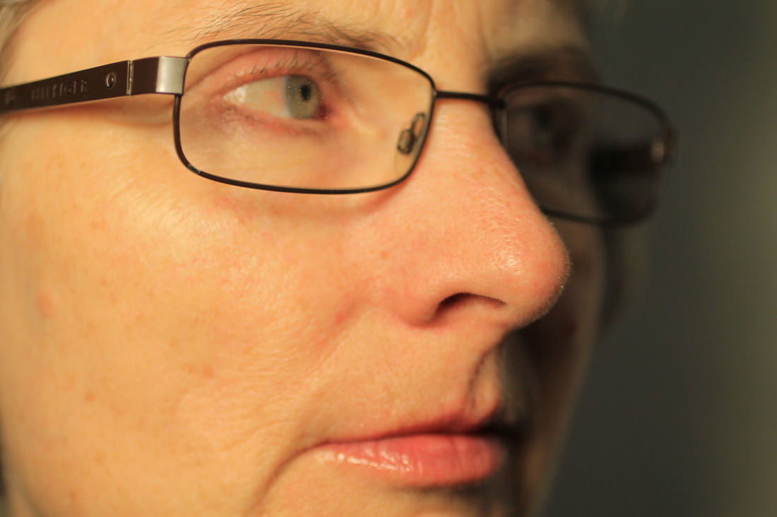
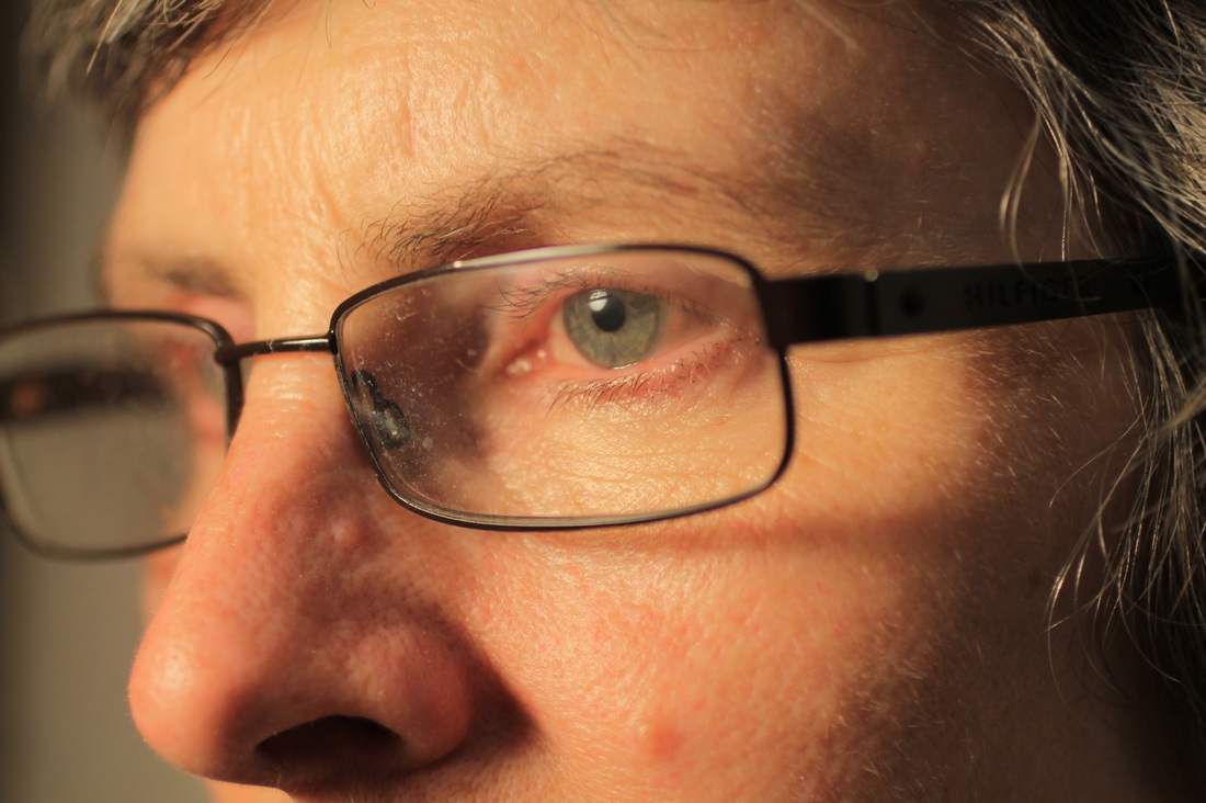
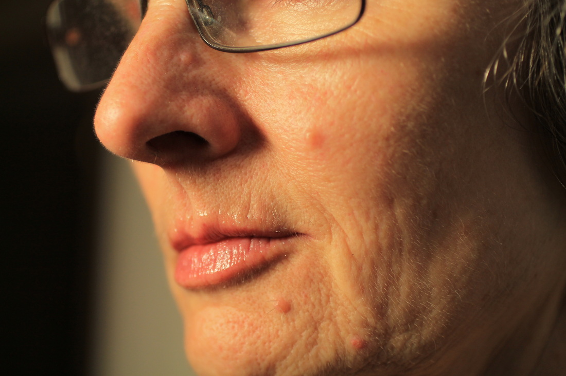
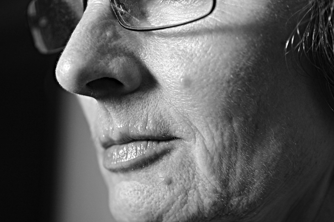
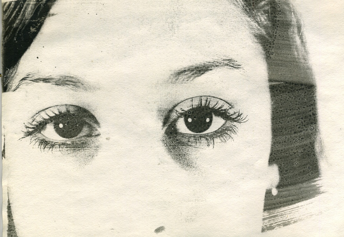
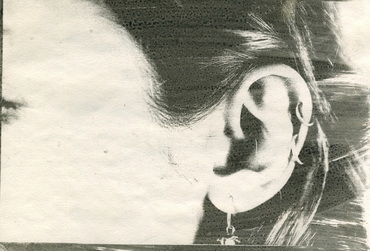
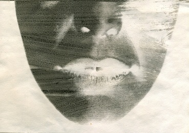
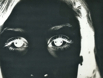
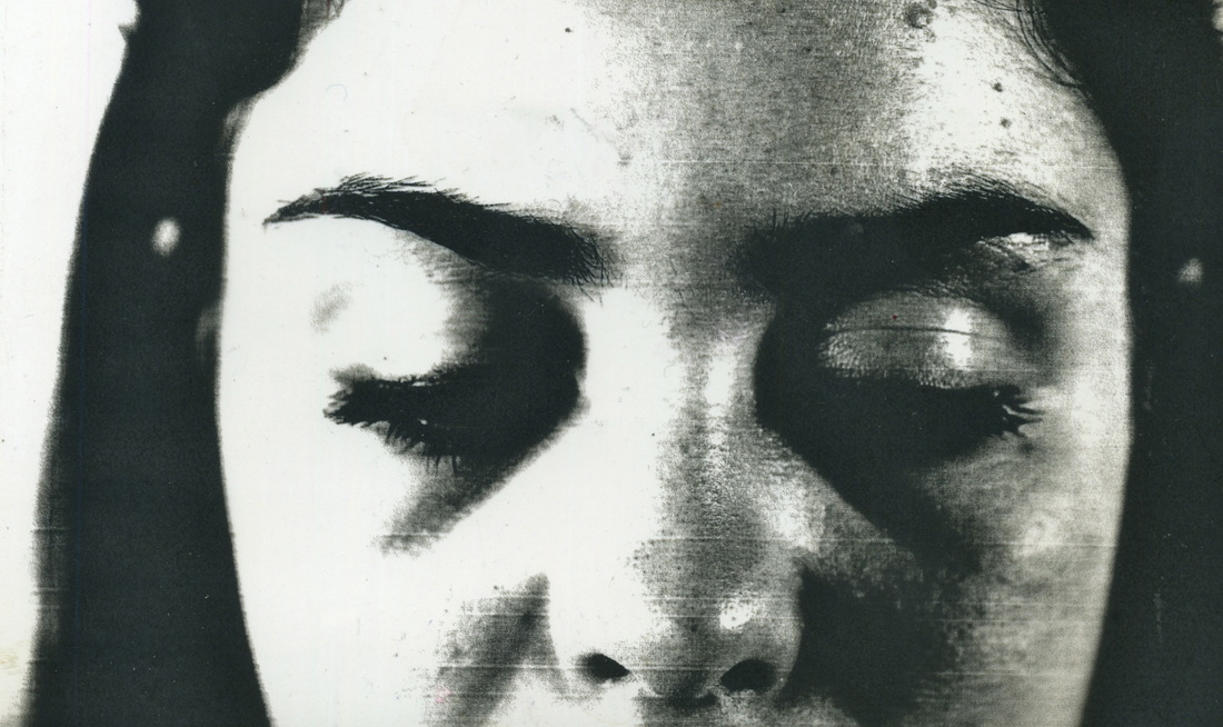
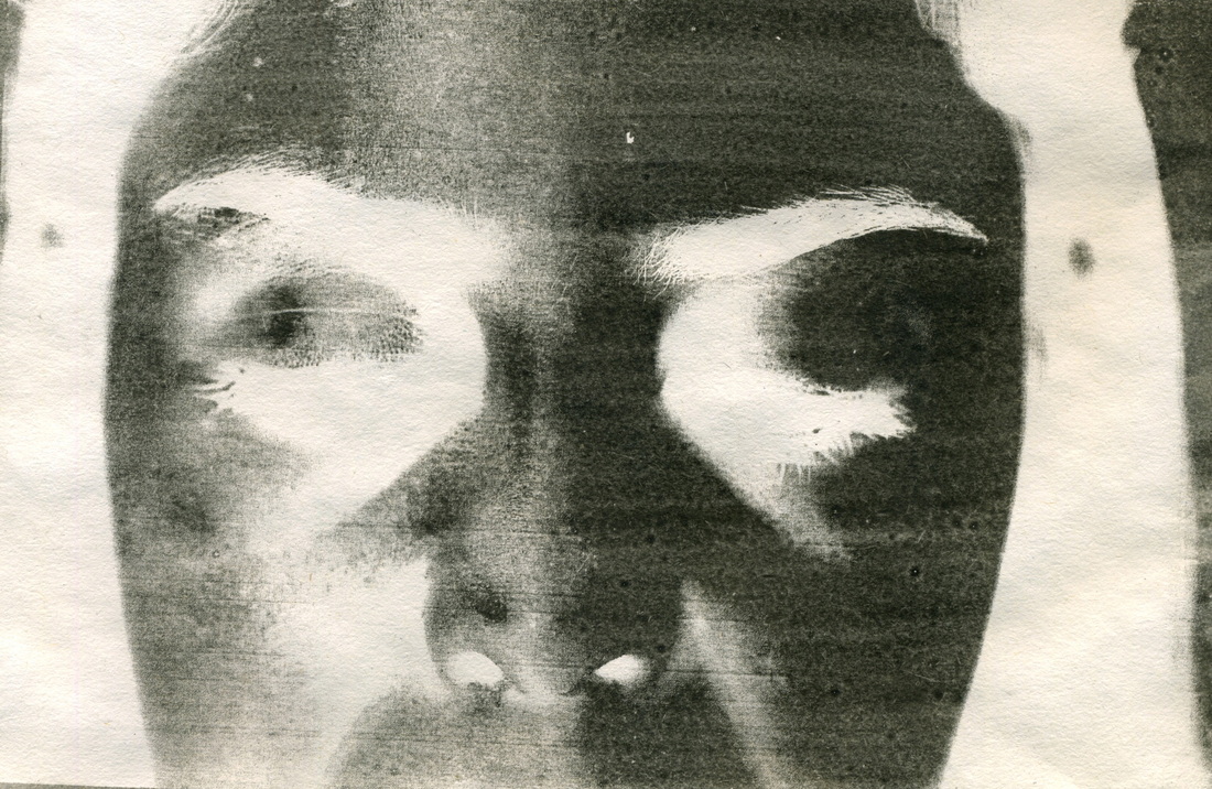
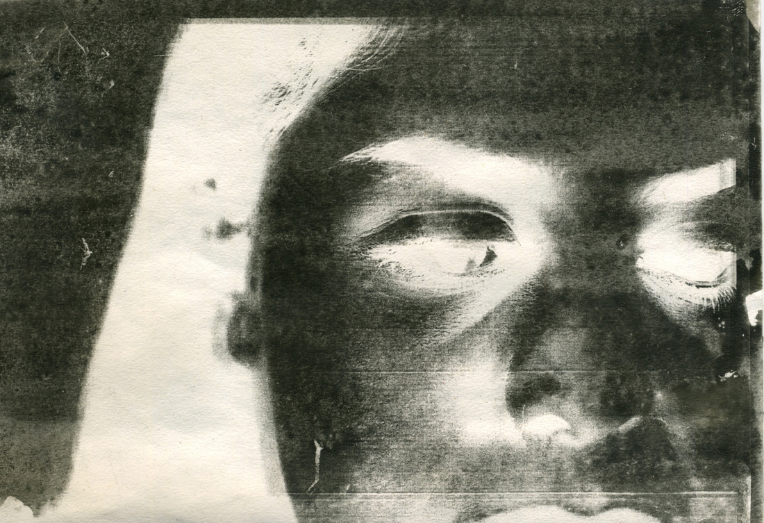
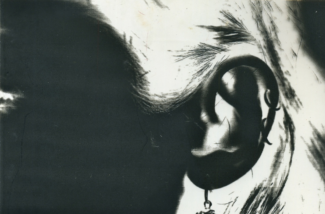
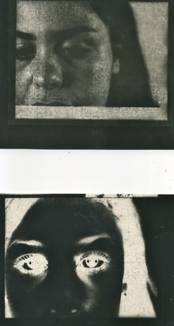
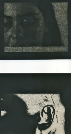
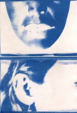
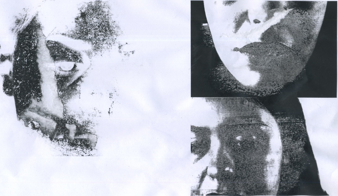
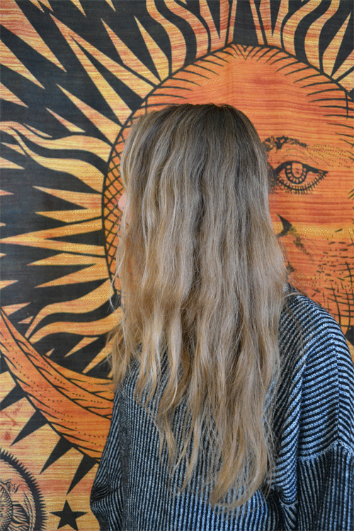
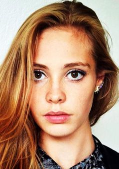
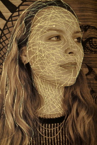
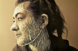
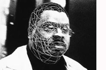
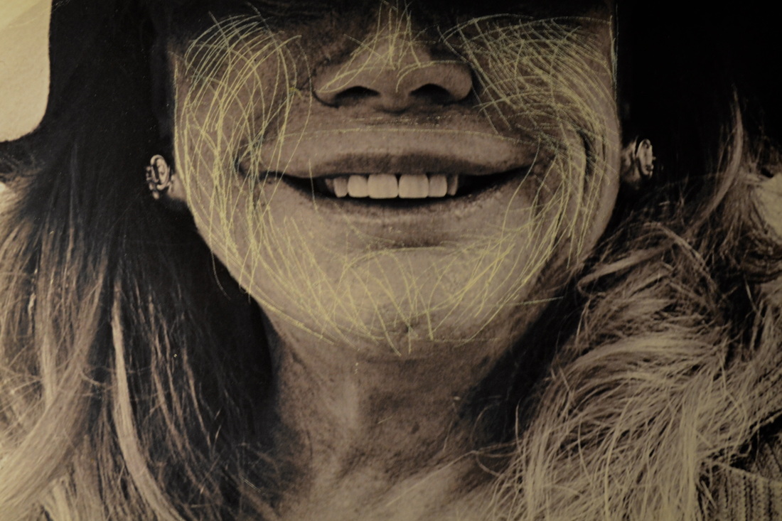
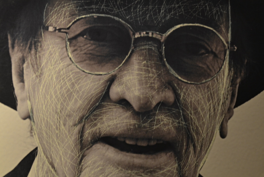
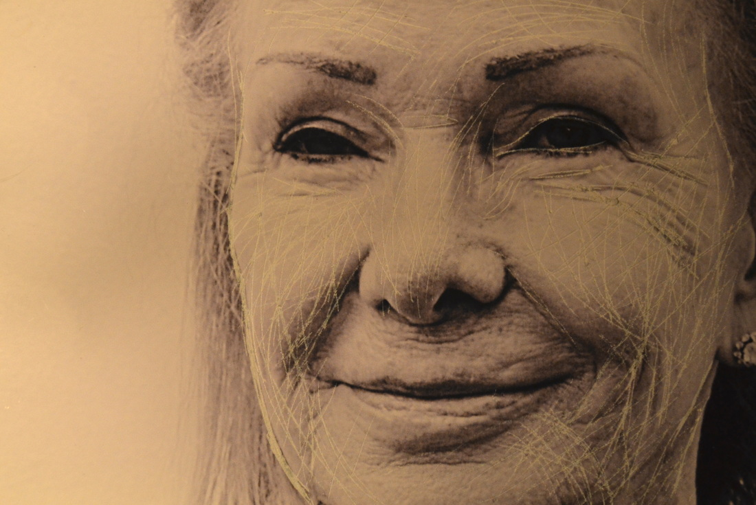
I moved on to Myra Greene with the theme of using untraditonal methods and materials to take portraits. The images above come from Myra Green's project 'Character Recognition', in which all images are close ups of individual features, exceeding the standard portrait. She quotes "Confronted with an up swell of bigotry both personal and public, I was forced to ask myself, what do people see when they look at me. Am I nothing but black? Is that skin tone enough to describe my nature and expectation in life? Do my strong teeth make me a strong worker? Does my character resonate louder than my skin tone? Using a photographic process linked to the times of ethnographic classification, I repeatedly explore my ethnic features in character recognition. The lessons learned are haunting and frightening in these modern times." The work of myra greene inspired me to emulate the framing that she used by taking close ups in the same style. I choose to do this on people that I already know, in a way to get to know them better.
|
|
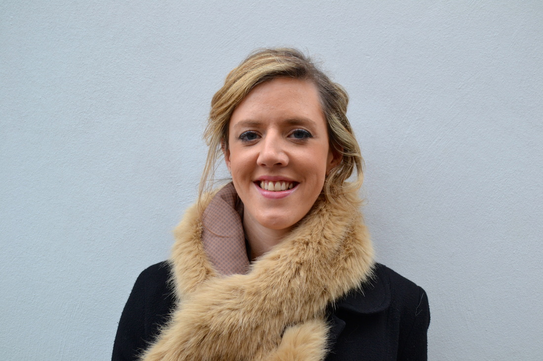
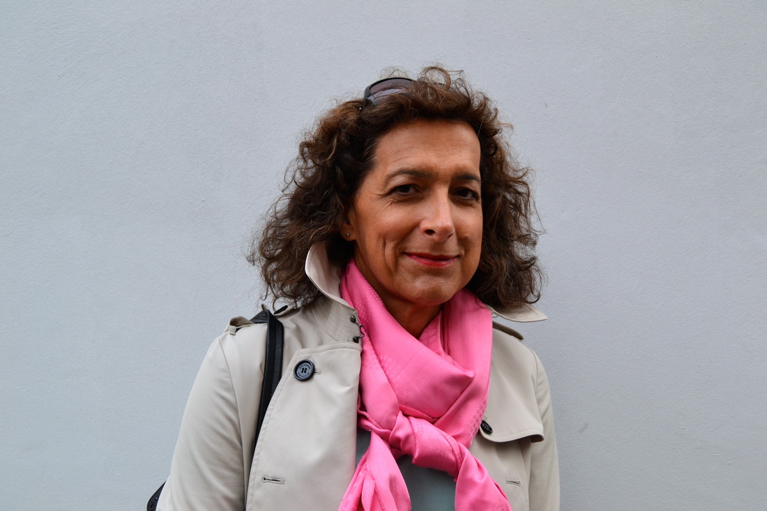
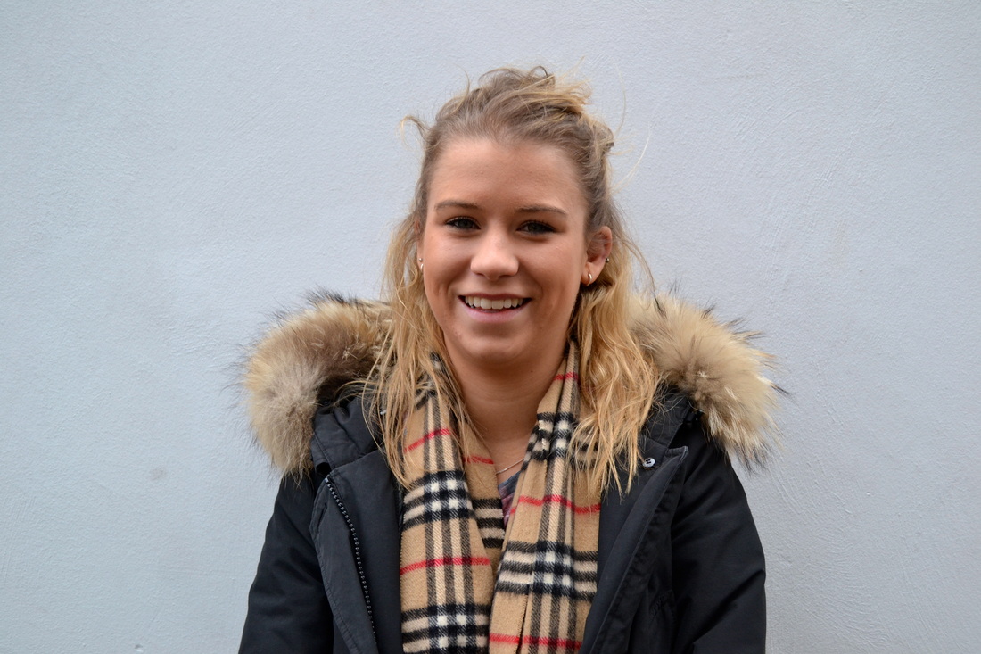
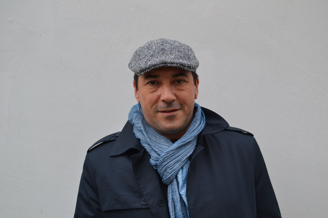
artist and me
|
|
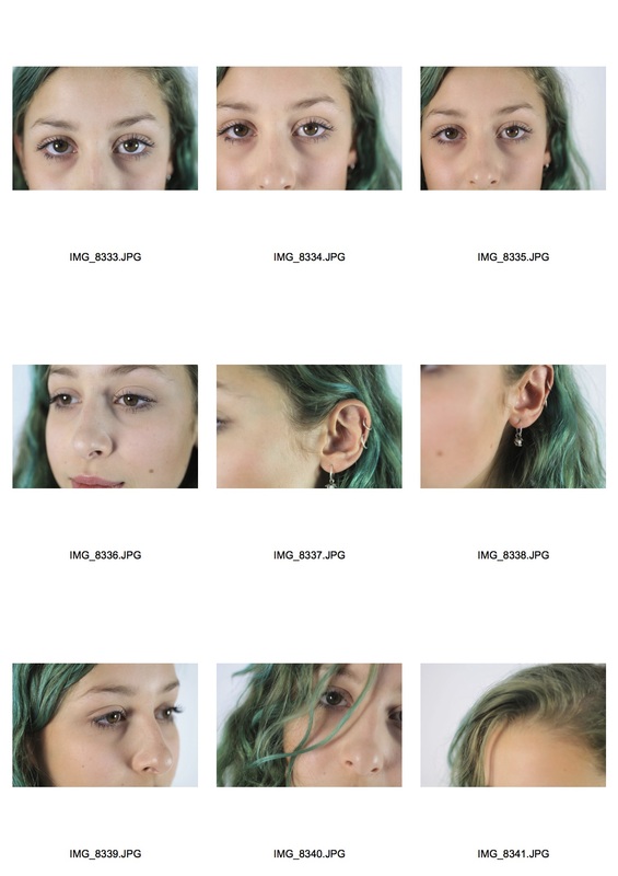
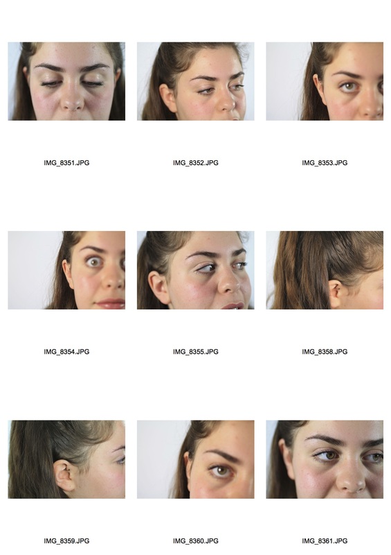
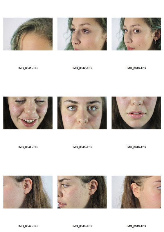
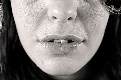
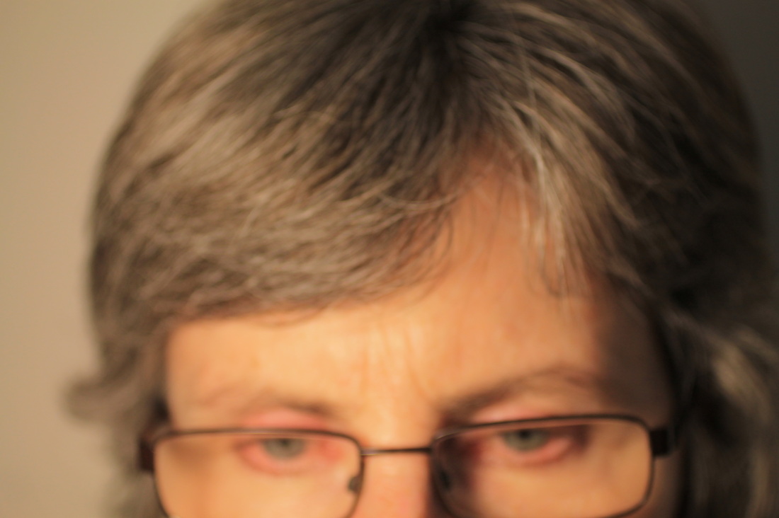
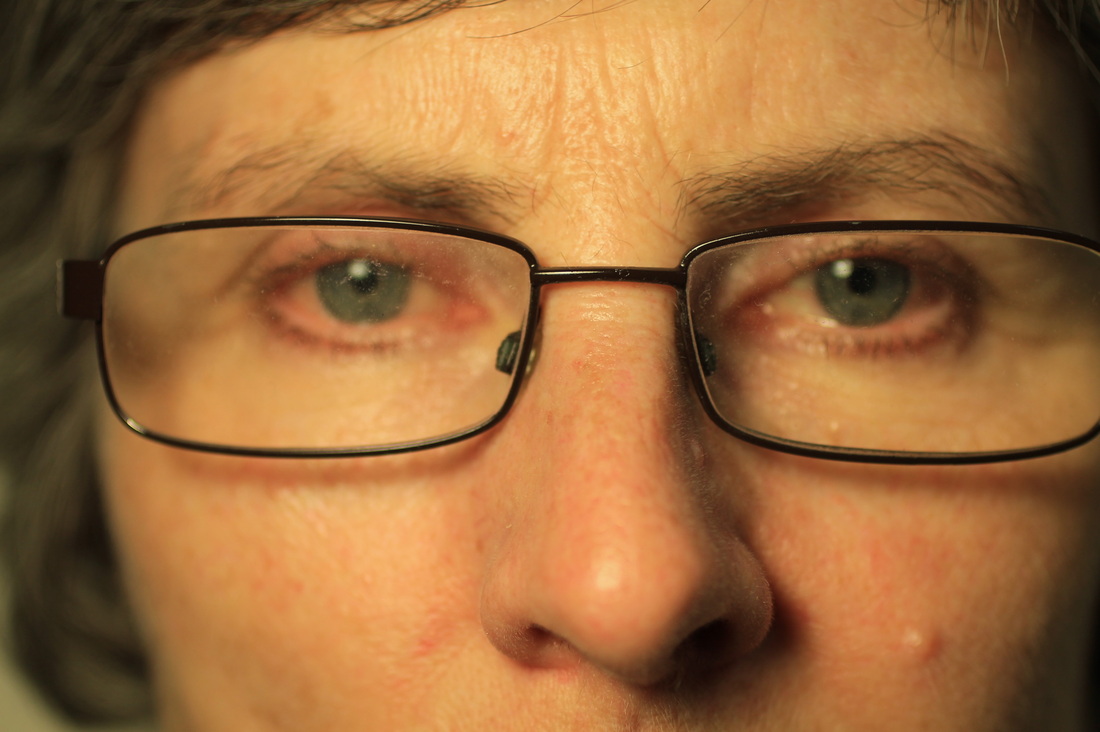
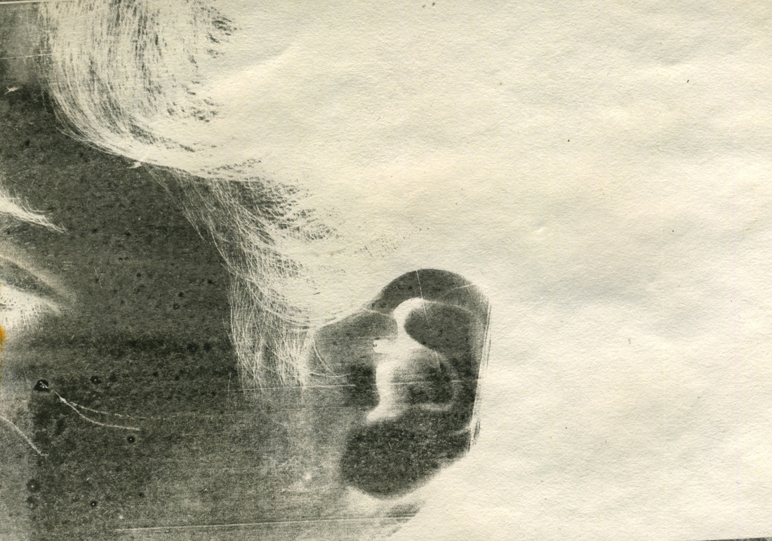
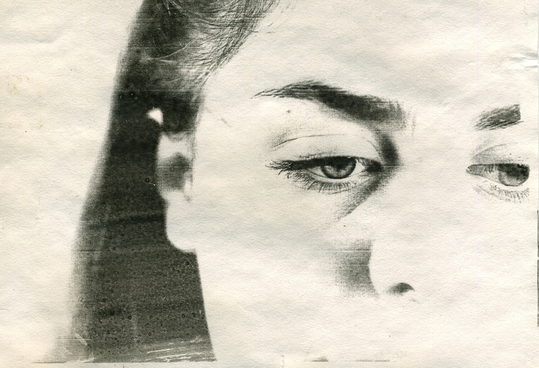
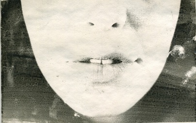
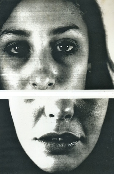
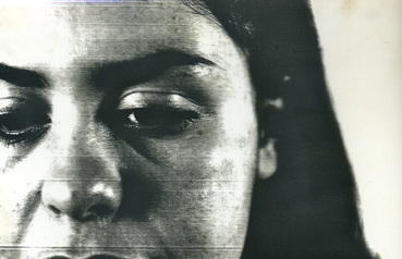
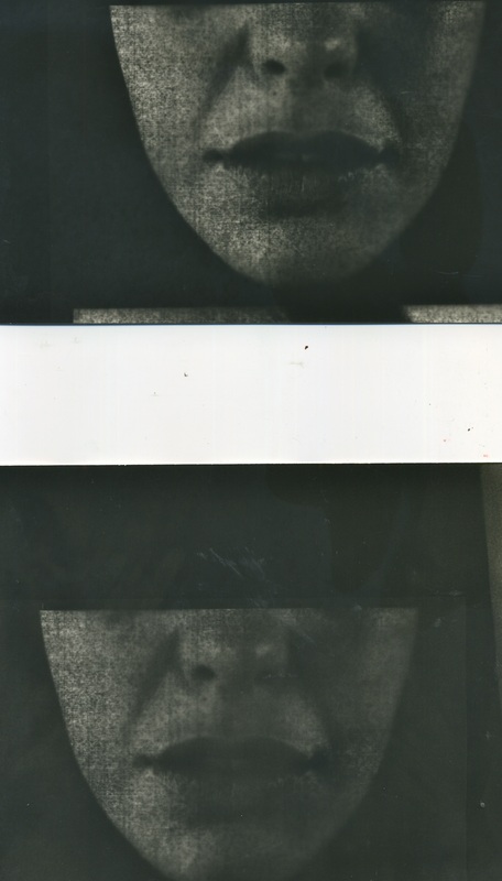
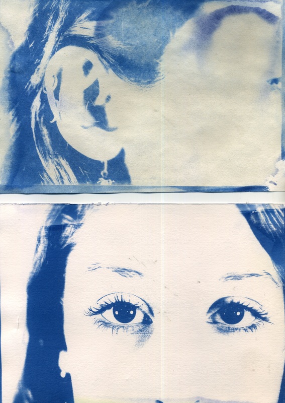
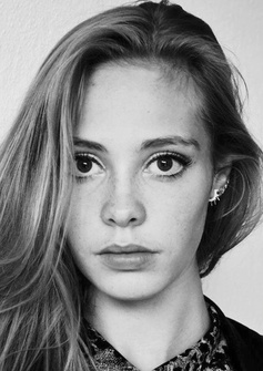
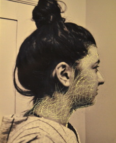
Similarly to Myra Greene, I took close up images of sections of my friends faces. The image above is a response to Myra Green's close up of the model's lips. I took the image from a similar angle, with the lips being the focal point of the final photo, however my photo wasn't as zoomed in allowing other features in the photo. In contrast to my photo, Myra Greene emphasises the lips by blurring out the rest of her face, whereas my image remains in focus all over. I edit my photo on photoshop into black and white, and changed the the texture and gradient of the image in order to appear similar to the texture of Green's image, however her image has more of granular appearance.
|
|
|
|
|
|
|
|
|
|
noemie goudal
|
|
|
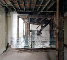
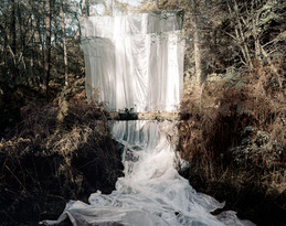
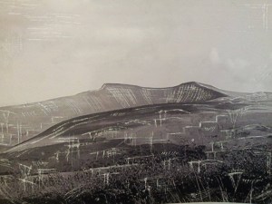
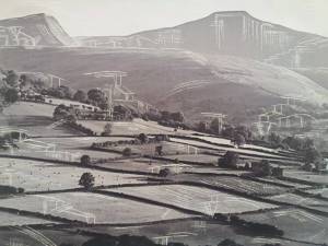
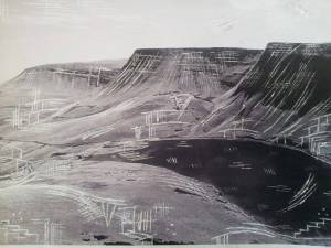
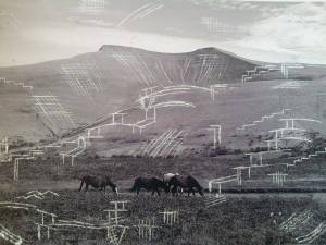
Noemie Goudal was born in Paris 1984, and currently lives and works in London. Goudal experiments with various materials through mixed media. He goes beyond the photograph by combining photography with textures and materials coming out of the photo, giving the final piece a 3 dimensional finish. Goudal frequently works with largescale paper backdrops, juxtaposed closely with the existing landscape and blurring the bounds of the real and the fictional, questioning reality. His work has a dreamlike appeal to it, as if Goudal's inviting the viewer into his dream world, who is then disappointed by transition of the reality from 2D to 3D, for example in the middle image, the hope of a waterfall that is merely sheets. This picture in a picture gives the effect of inception. The artist reflects: ‘I wish to offer through my photographs escapes into alternative landscapes where the reconstruction of new lands is made possible. the journey inside the image will invite the viewer to enter the space as well as entering the narrative of a ‘make-believe’, bringing him into the game between fiction and reality in which one can identify the fragility of one’s own desires.‘
starn brothers
|
|
|
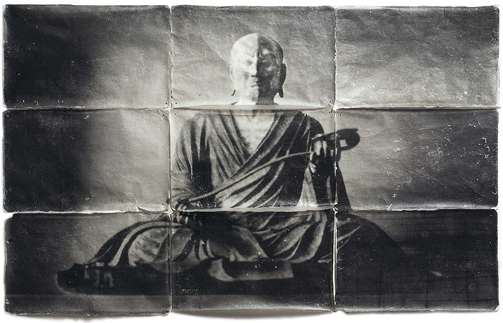
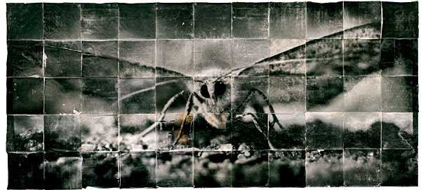
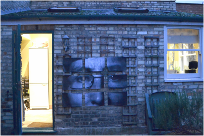
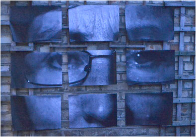
Doug and Mike Starn are identical twins, known as the Starn brothers, who are American artists. They were born in New Jersey in 1961, and took up residence in New York in the earlys 1980s working in Brooklyn. Over the past two and a half decades they have been primarily working through the medium of photography. They're most renowned for their penetrating conceptualization of light, using this as a metaphor of the power of creativity, intelligence and the way everyone goes about their day to day lives. They combine different traditional methods to create something new and untraditional. Such methods vary from photography, sculpture and architecture. Their images above are all examples of the various toning and bleaching methods they use on silver gelatin papers. The image on the left is one their earliest exploration into the art of combing photographic and the art of mosaics, by splitting the image into a grid creating tension between the collaged elements. Over the years, the Starn brother progress to experiment on a larger scale using a range of materials and methods, creating more dramatics and vast effects.The Starns were represented by Leo Castelli from 1989 until his death in 1999. Their art has been the subject of numerous solo and group exhibitions in museums and galleries worldwide. The Starns have received many honors including two National Endowment for the Arts Grants in 1987 and 1995; The International Center for Photography’s Infinity Award for Fine Art Photography in 1992; and, artists in residency at NASA in the mid-nineties. They have received critical acclaim in The New York Times, Dagens Nyheter, Corriere della Sera, Le Figaro, The Times (London), Art in America, and Artforum amongst many other notable media. Major artworks by the Starns are represented in public and private collections including: The Museum of Modern Art (NYC); San Francisco Museum of Modern Art (SF); Solomon R. Guggenheim Museum, (NYC); The Jewish Museum, (NYC); The Metropolitan Museum of Art (NYC); Moderna Museet (Stockholm); The National Gallery of Victoria (Melbourne); Whitney Museum of American Art (NYC); Yokohama Museum of Art (Japan); La Bibliotèque Nationale (Paris); La Maison Européenne de la Photographie (Paris); Los Angeles County Museum of Art, amongst many others.
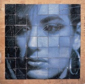
Inspired by the work's of Myra Greene and the Starn brothers, I produced the piece below. I used a close up image of my mother I took in the style of Myra Greene, then similary to the Starn brothers I edited it into black and white and separated in into a three by three grid. Then I blew it up by printing out each nine sections of the original image and stuck it outside on the wall of my house.
|
|
experimenting using the dark room
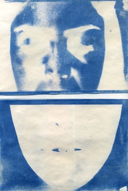
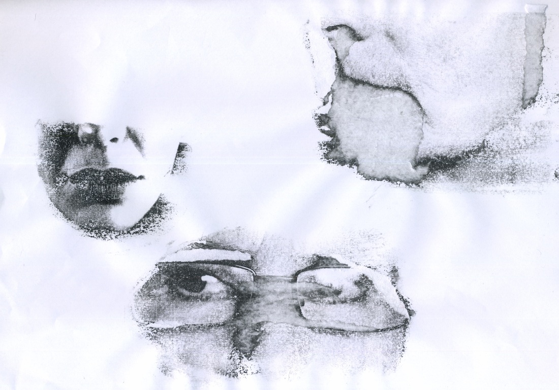
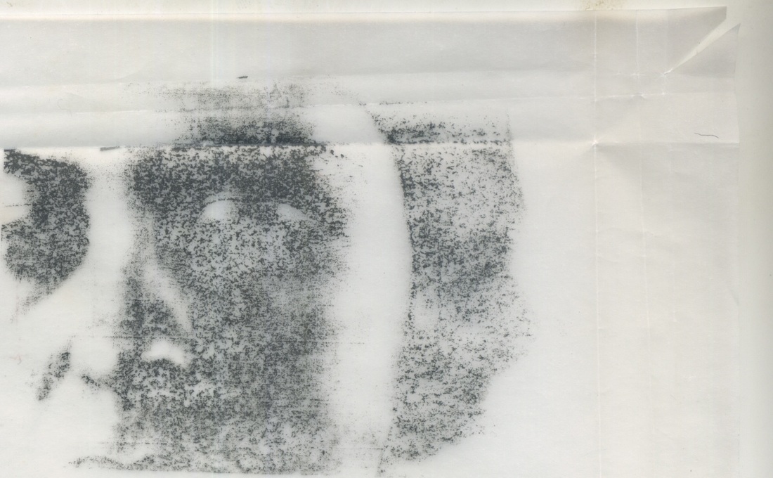
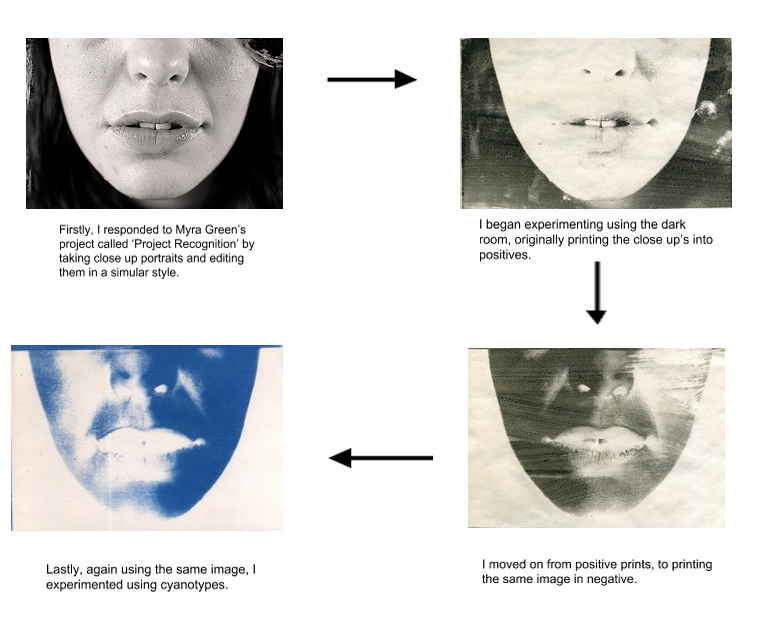
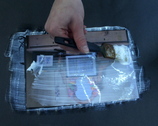
I took my photo's in the style of Myra Greene a step further by printing them using various techniques using the dark room. I edited my previous photos using photoshop by inversing them into negatives, and them printed them out on to assetate. In the dark room I then put the assetate on top of the liquid light paper (paper that has been soaked in the chemical liquid light in order to make it photographic), and exposed it for between 30-50 seconds. I then put the paper into the developer solution for three minutes, the stop for one minute, the fix for five mixtures, and then let all the chemicals wash off in the water. After this, I let my photo dry to see how effective the procedures were.
|
|
|
|
|
cyanotypes
PROCESS OF CYANOTYPES:
Firstly, the cyanotype is made up of two simple solutions; Potassium ferricyanide and Ferric ammonium citrate are mixed with water separately. The two solutions are then blended together in equal parts. This solution then gets painted onto the material; paper, card, textiles or any other natural material (I used card), and left to dry in the dark. I printed some of my photo's onto photographic paper and laid these on top of the cyanotype and left it outside in the sun for between 5/10 minutes (depending on the strength of the sun).
Firstly, the cyanotype is made up of two simple solutions; Potassium ferricyanide and Ferric ammonium citrate are mixed with water separately. The two solutions are then blended together in equal parts. This solution then gets painted onto the material; paper, card, textiles or any other natural material (I used card), and left to dry in the dark. I printed some of my photo's onto photographic paper and laid these on top of the cyanotype and left it outside in the sun for between 5/10 minutes (depending on the strength of the sun).
|
|
|
cellulose transfer
Cellulose transfer is when a black and white image is printed on to paper which is then put face down on a piece of plane paper. Next, you apply nail varnish to a piece of cotton wool which is rubbed on top of the face down image. The image should then be printed on to the place piece of paper causing the image to appear faded and distant. Below are my attempts using this technique for some of my responses to Myra Greene. Some of them worked more effectively than others. In the left image, the eyes and lips printed well however the other image didn't as some of the paper got too wet by the nail varnish remover so came away.
|
|
|
lucas simoes
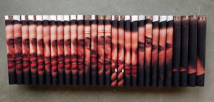
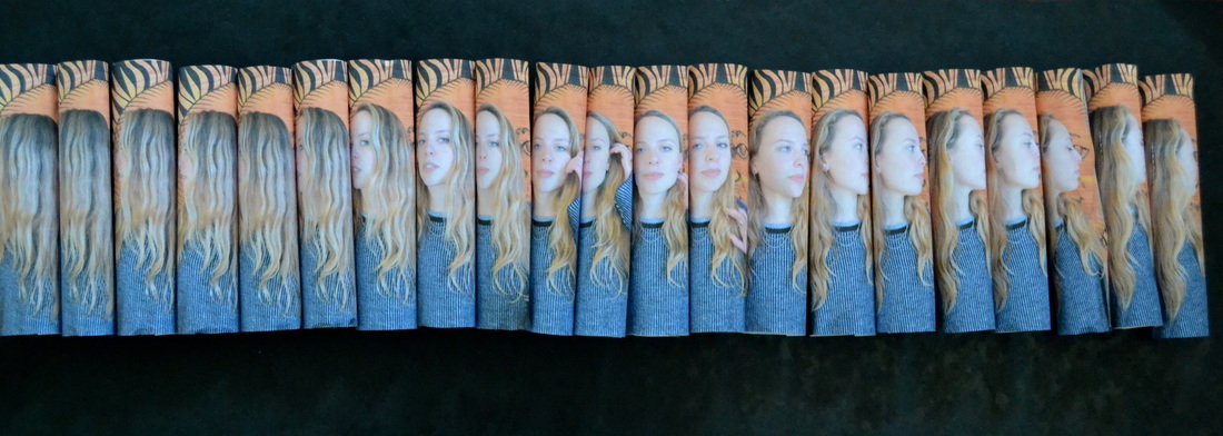
Lucas Simoes is an independent artist based in Sao Paulo, with a background in architecture and design. In architecture, he says, ’a drawing is more than a drawing: it is the intent that something concrete will materialize through the construction process’. This view is portrayed through the way he draws and produces collages and sculptures. Simoes experiments through various materials such as maps, books and photographs, which he then folds, cuts and deconstructs to create something completely new. ‘In my work’, he explains, ’the materiality of the supporting medium is important. The process of making the support a part of the work is achieved through the experiences it is subjected to, such as burning, cutting, distorting or diluting, which, at its most extreme, can destroy the subject.’ In all of his constructive and distorted works, its clear he's conveying the transition of meaning and representation that images show when they've been maniupulate, questioning the traditional methods of art and beauty. ’There is a kind of perversion in it, to take the meaning out of place,’ he says. ‘Strangeness is something that fascinates me, and to make it beautiful is even better.’ In one of his well known projects, 'Almost Cinema', Simoes takes various pictures of a person or situation, prints them out and rolls them into cylinders, and sticks them on to card, showing a still film of movement. This project is what I choose to repsond to.
my response - artist and me
I chose to respond to Simoes project 'Almost Cinema', by creating my own still section of movement. Using the same technique as Lucas Simoes, I set my camera to continuous shooting mode and took photo's of my friend moving her head from one side to the other. I then printed these images out, rolled them into cylinders and stuck them down to black with cellotape. The end result appears similar to Simoes as clearly the same individual technique as used, however there are several differences with the two pieces. Firstly each of my individual rolls are on a larger scale than Simoes in order to get more of the separate images in. Simoes photo's are taken closer up, and the end result focuses on the transition of facial expressions whereas mine focuses on the movement of her head.
|
|
Continuing from my AS work in Unit 2, I decided to again create a gift. I loaded all the photo;s that I used in my response to Simon's and made a gif. A step by step process of how to make a gif is under my Unit 2 section. The end result is abit jerky as I should of taken more photo's in order to make it come together more smoothly.
Seung Hoon Park
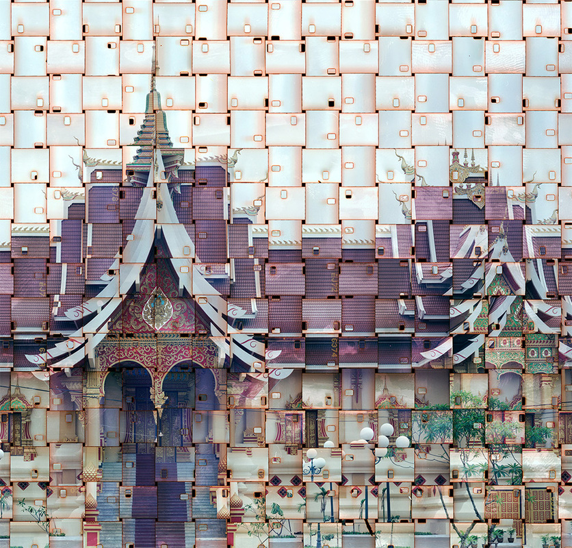
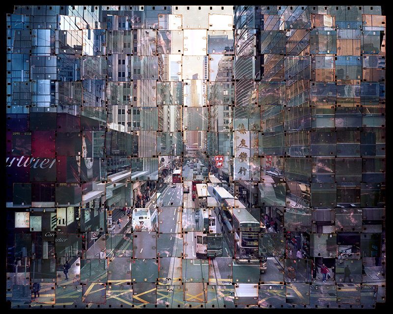
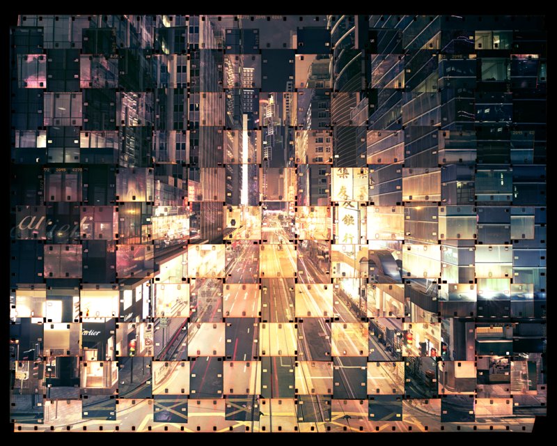
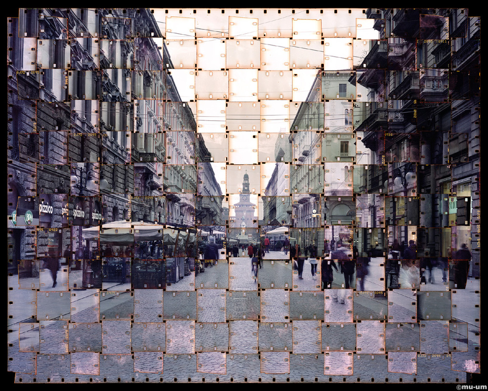
Sueng Hoon Park is an artist from South Korea, who combines photography, collage and tapestry together. Seung Hoon Park uses both 8mm and 16mm films to create his work which he lays down in rows to create a larger surface that effectively acts as a single piece of film. Park then exposes two images in a large format 8×10″ camera using sets of vertical and horizontal strips which are woven together to create a a look of woven textiles. The majority of his photo's are taken from urban views in Italian cities such as Rome, Milan and Venice. The image's above are all taken from his series 'Textus'. Sueng Hoon Park quotes “Writing, as weave, is a no-end experience. Tirelessly, the thread and the text can stretch themselves infinitely… My project “Textus” tries to show the tentacular aspect and the complexity of the nowadays cities.” The third image above appears to be two photo's that were taken from different times due to the different lighting, whereas the first image appears to be the same photo but positioned differently causing the individual strips to not match up exactly giving it a distorted look.
my response
|
|
my response - artist and me
|
|
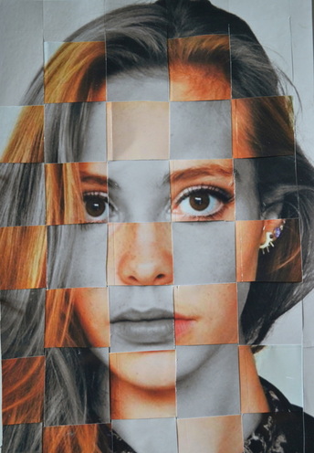
I responded to Seung Hoon Park's work by 'weaving' two images together. I duplicated an image of my friend, and kept one in colour and edited the other one into black and white. I then cut the images into equal strips (horizontal for the coloured image and vertical for the black and white image. Similarly to Park, I weaved the strips together to give a grid-like appearance for the finishing product. Park uses two of the same images but in different tones, which I incorporated into my work, however instead of tones I decided use one image in colour and the other in black and white which produces an effective contrast. To make my image more effective and more similar to Park, I should of cut the strips on a smaller scale and weaved the lines straighter together.
dryden goodwin - cast
Initially I responded to Dryden Goodwin's (whom I researched and analysed in my curatorship task) work by taking portraits of my friends looking into the distance, and editing them into a sepia tone. I then printed these photographs out onto photographic paper, and used a compass to carve lines onto the portraits, tracing the lines of their faces.
|
|
|
artist and me
|

|
Similarly to Dryden Goodwin, I took a portrait image of someone looking away into the distance. Unlike Goodwin I then edited this image into sepia as opposed to black and white, which I then printed out onto photographic paper. I used the same technique as him by using a compass to scratch lines into the photographic paper, tracing lines over the models face. I think the compass technique produced an effective end result of a 'mask' over my friend's face, however I traced too many lines on the neck which are places too closely together, and the few lines on the hair look out of place. Unlike Goodwin, I photographed someone I knew whereas he used strangers and scratched lines onto their faces as method of getting to know them, which is why I moved on to photographing strangers in order to make my work more like Goodwin's.
portraits of strangers in sloane square
After looking at the work of Dryden Goodwin and experimenting ontop of photos in his style, I did further research and realised that he worked on top of images taken of strangers. This led me to go out to Sloane Square targeting strangers to take portraits of to use in style. I found a white wall in Sloane Square in which I asked the strangers to go infront of allowing me to take a picture focusing on them.

I then choose my three favourite portrait photos, edited them into black and white and printed them out onto photographic paper. I then used a compass to trace on the lines of their faces. When I printed them out, I cropped the image to producer a zoomed in section of the original image focusing on the features of the stranger's faces. Even though these photo's are more in the style of Goodwin as I'm photograping strangers, the end result isn't as effective as my previous attempt. The scratched lines are too close together, and especially my image on the right, the contrast is too light causing the lines to be too faint.
|
|
|
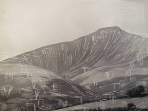
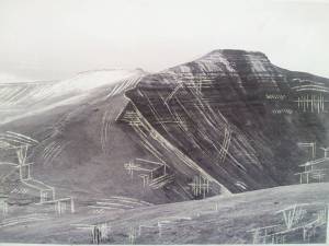
gemma schiebe
Whilst researching work similar to Dyrden Goodwin's, I came across Gemma Schiebe. She also carves on top of photographs using a compass creating interesting patterns and textures. However, instead of scratching lines on portraits, she uses landscapes. The images below are photographs of the countryside and hills, with Schiebe adding extra lines and marks on to them, creating an abstract end result.
|
|
|
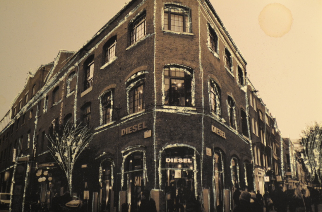
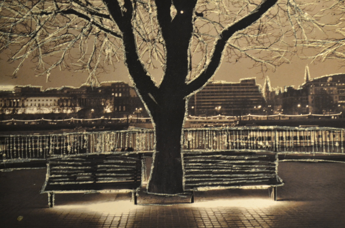
EXPERIMENTATION'S using dryden goowin's compass technique
I responded to Gemma Schiebe's work by scratching on top of photographs that I've previously taken of various landscapes. As opposed to creating new lines, I worked on top of the lines adding emphasis to the buildings/nature, causing a 3 dimensional appearance.
|
|
|
artist and me

|
Similarly to Gemma Schiebe, I printed out a landscape image on to photographic paper, however I edited mine using more of a sepia tone as opposed to black and white. Schiebe uses rural images of the countryside, whereas I focused on urban landscapes. Gemma Schiebe scratches lines which aren't previously there, whereas I scratched on top of the lines created by the buildings.
|
|
unknown places
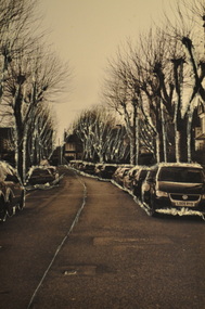
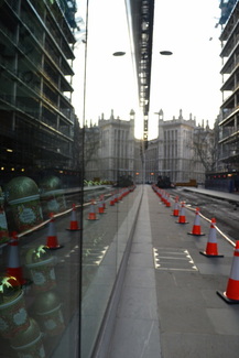
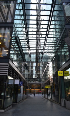
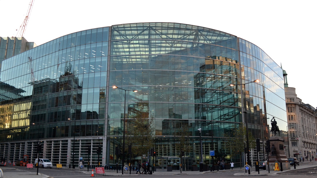
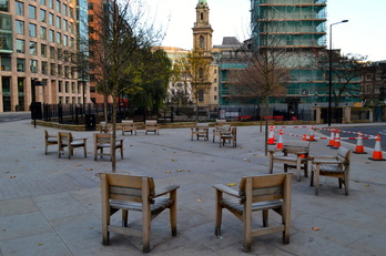
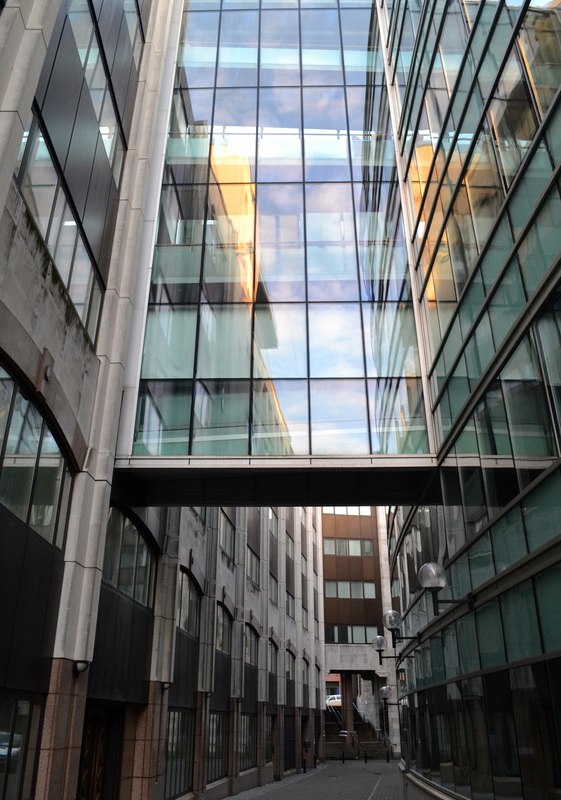
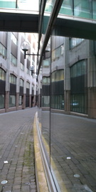
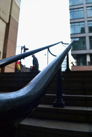
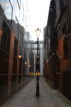
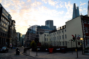
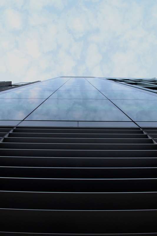
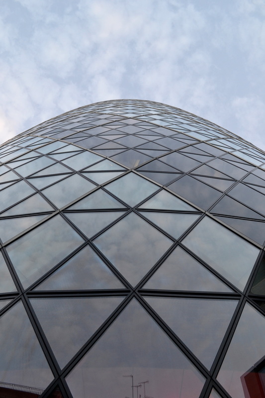
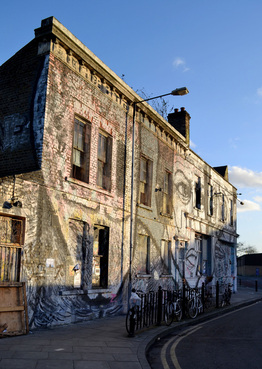
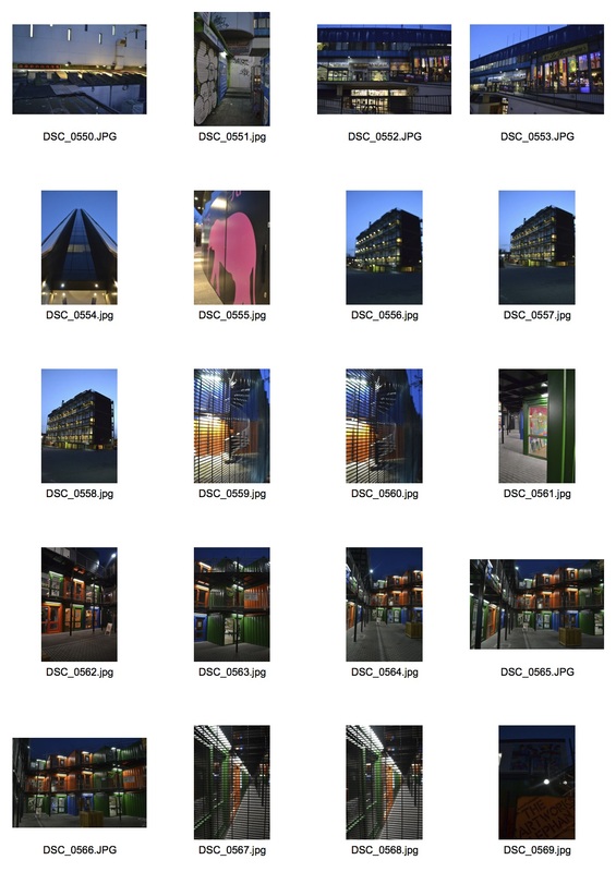
Linking the work of Dryden Goodwin and Gemma Schiebe, I decided to move on from portraiture to landscapes, and begin photographing unknown places. I randomly picked tube station's that I've never been to on the different lines, starting with the circle line. My chosen tube stops ended up being Farringdon, Aldgate, Blackfriars, Elephant and Castle, and Hackney Wick. Farringdon and Aldgate were unknown to me, howeve began focusing on architecture and symmetry.
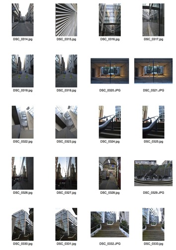
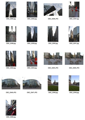
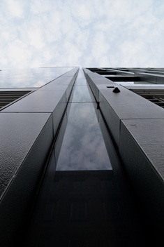
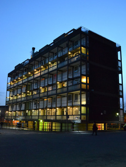
Initially I had never been to Farringdon before and had no preconception of what it would be like. It turned out to be a business area of London filled with interesting architecture and glass buildings. During my time at this stop, I focused on the different symmetry and patterns made by these modern offices
|
|
edits
|
|
|
|
|
|
|
|
|
|
|
|
|
|
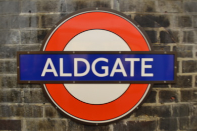
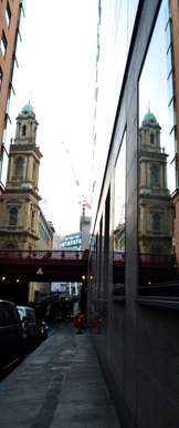
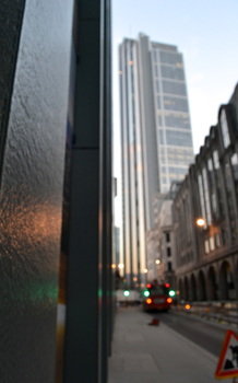
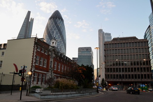
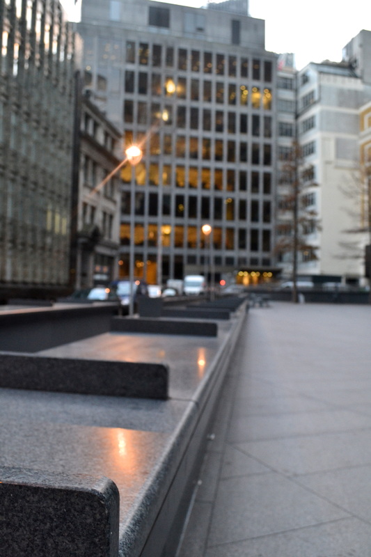
Similarly to Farringdon, Aldgate was also situated in the business area of central London. I realised there were some parts of Aldgate I'd previously visited, but I focused on the background and buildings that I haven;t seen before. Again, I focused on capturing symmetry and patterns created by the buildings.
|
|
edits
|
|
|
|
|
|
|
|
|
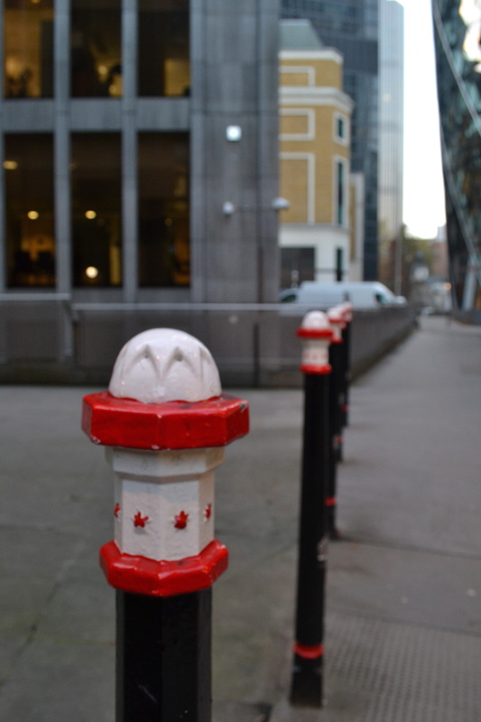
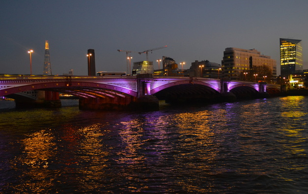
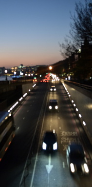
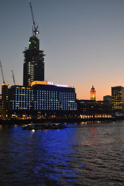
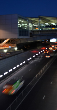
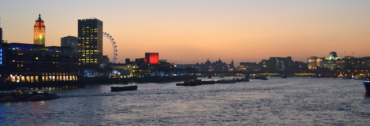
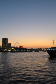
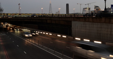
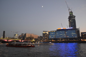
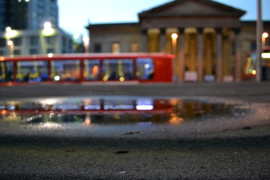
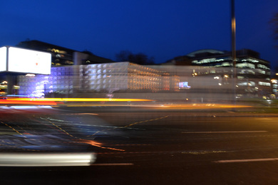
I went to the station Blackfriars believing I hadn't been there before, however when I left the tube station, I realised it was Southbank an area which I have visited multiple times. Nonetheless, I decided to shoot this area. It was dusk at this time, hence the orange sunset reflected elegantly on to the Thames river. Whilst I was passing the bridge, I shot passing cars underneath using a slow shutter speed in in order to effectively capture the movement.
|
|

|
edits
|
|
|
|
|
|
|
|
|
|
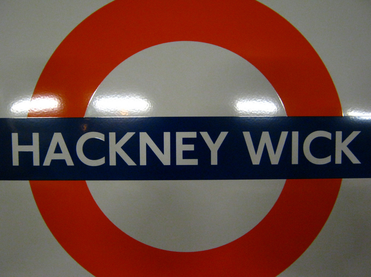
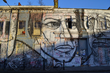
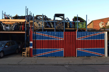
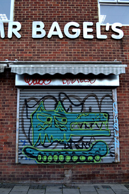
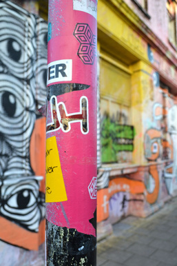
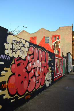
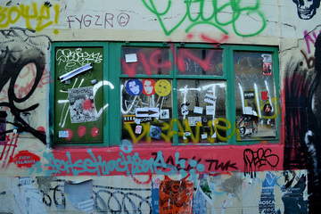
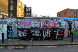
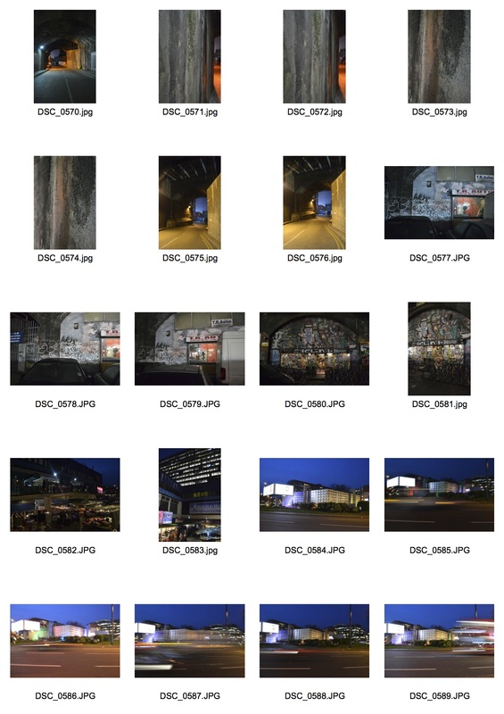
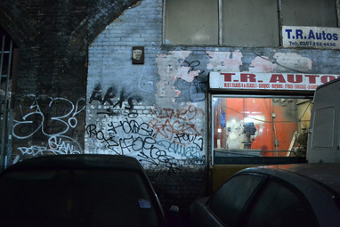
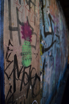
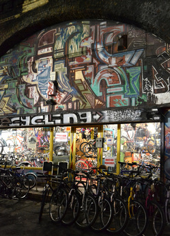
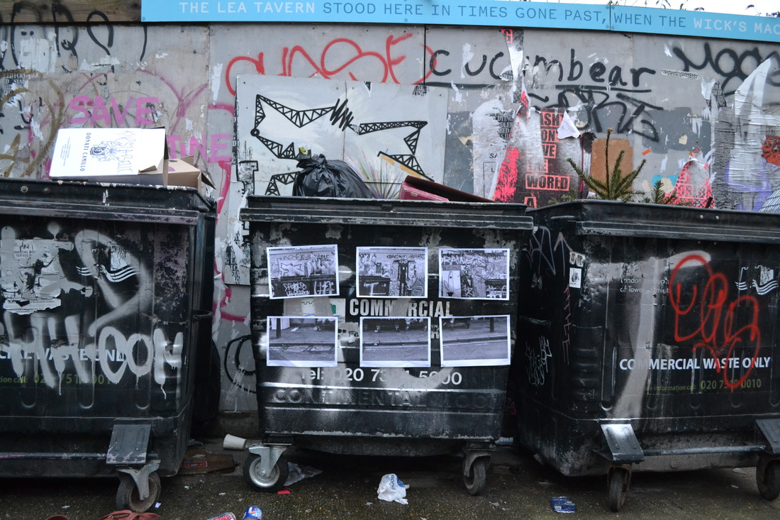
Before visiting Hackney Wick, I didn't know much about the area apart form that it would be desolate and filled with graffiti. As soon as I got there, I realised straight away that it fit both my two criteria's. It was extremely isolated with few passers by and filled with graffiti. I found it very interesting due to the decay and the interesting art in the form of graffiti everywhere, from decorating walls and garage doors, to lamposts.
|
|
edits
|
|
|
|
|
|
|
|
|
|
|
|
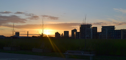
I visited Elephant and Castle at dusk causing the lighting in my photos to vary to darker tones. Combining my focuses in Hakcney Wick and Farringdon, I focused on the juxtaposition the graffiti had on the buildings.
|
|
|
edits
|
|
|
|
|
|
|
|
|
|
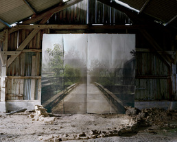
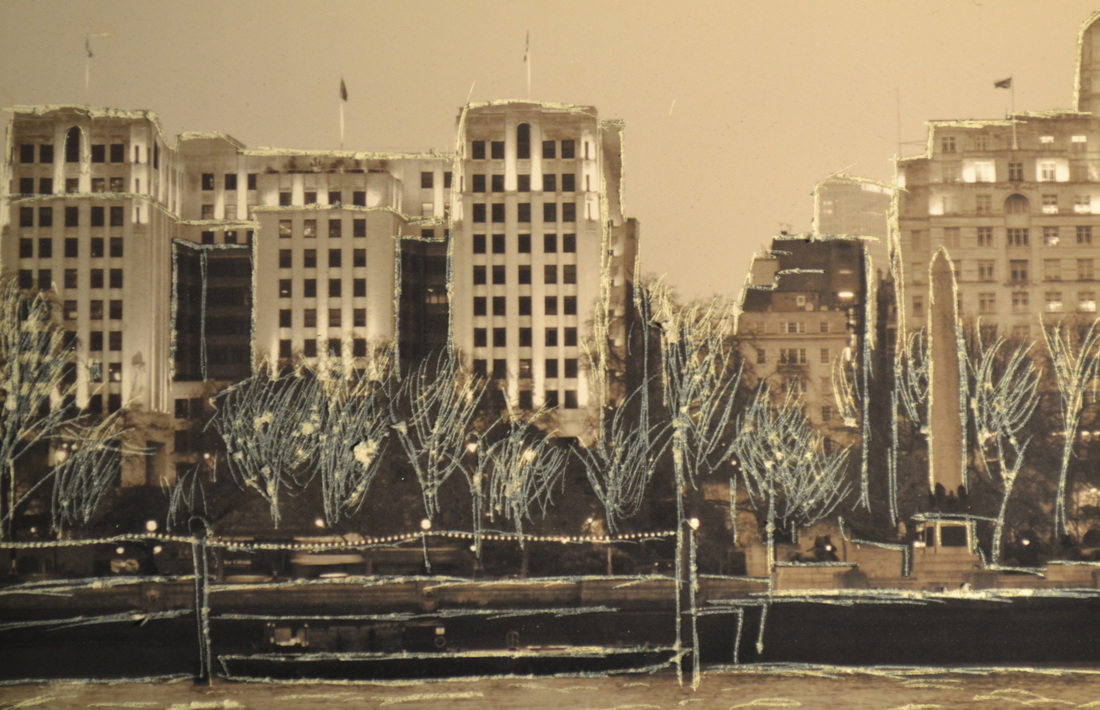
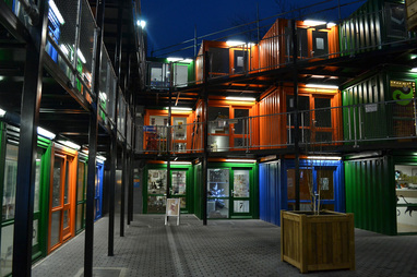
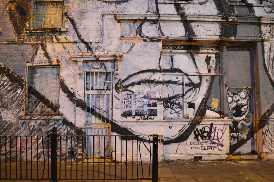
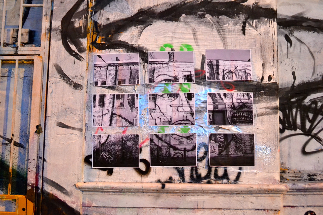
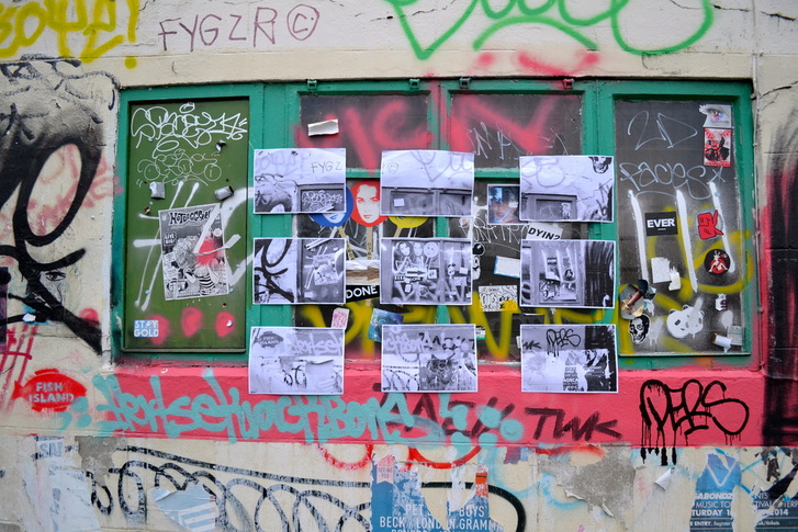
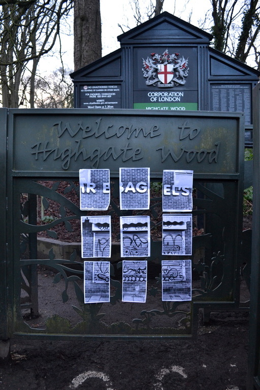
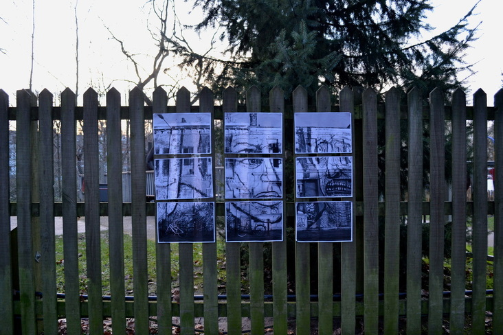
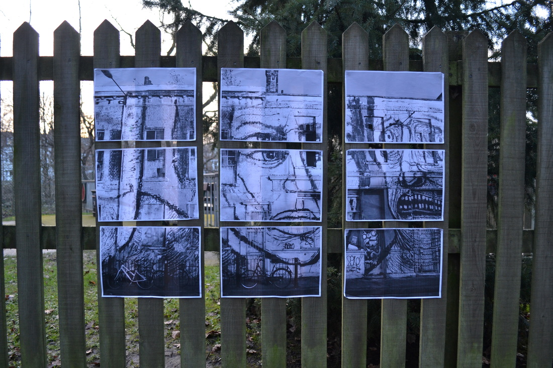
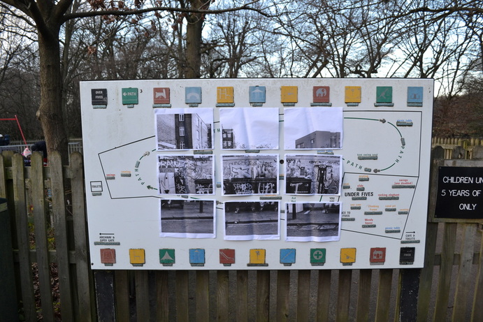
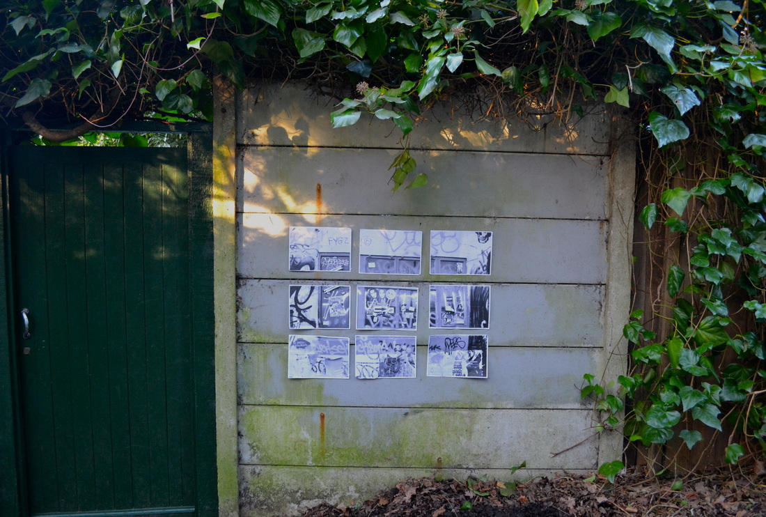
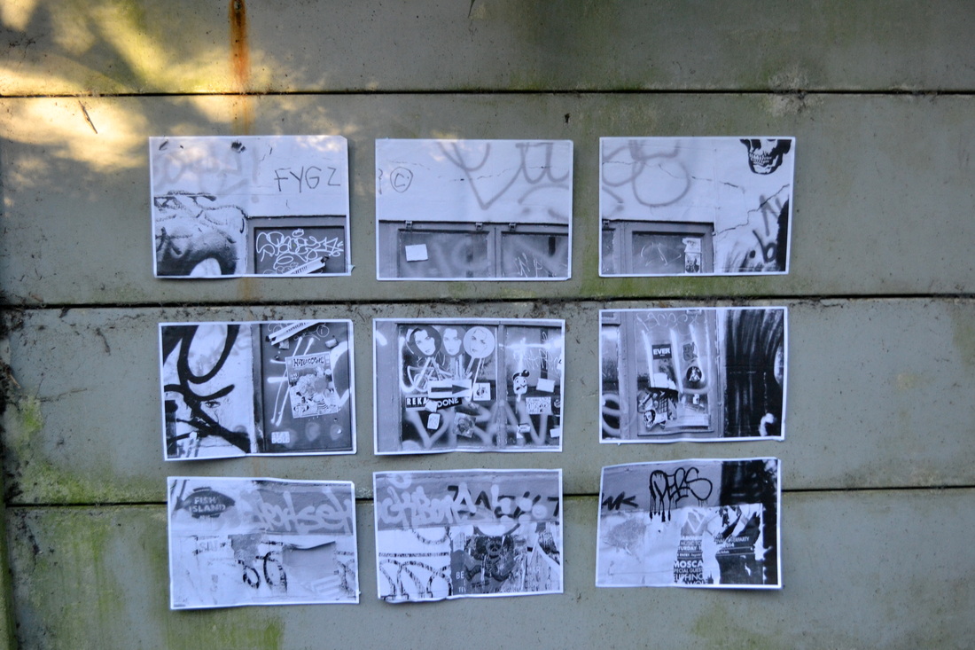
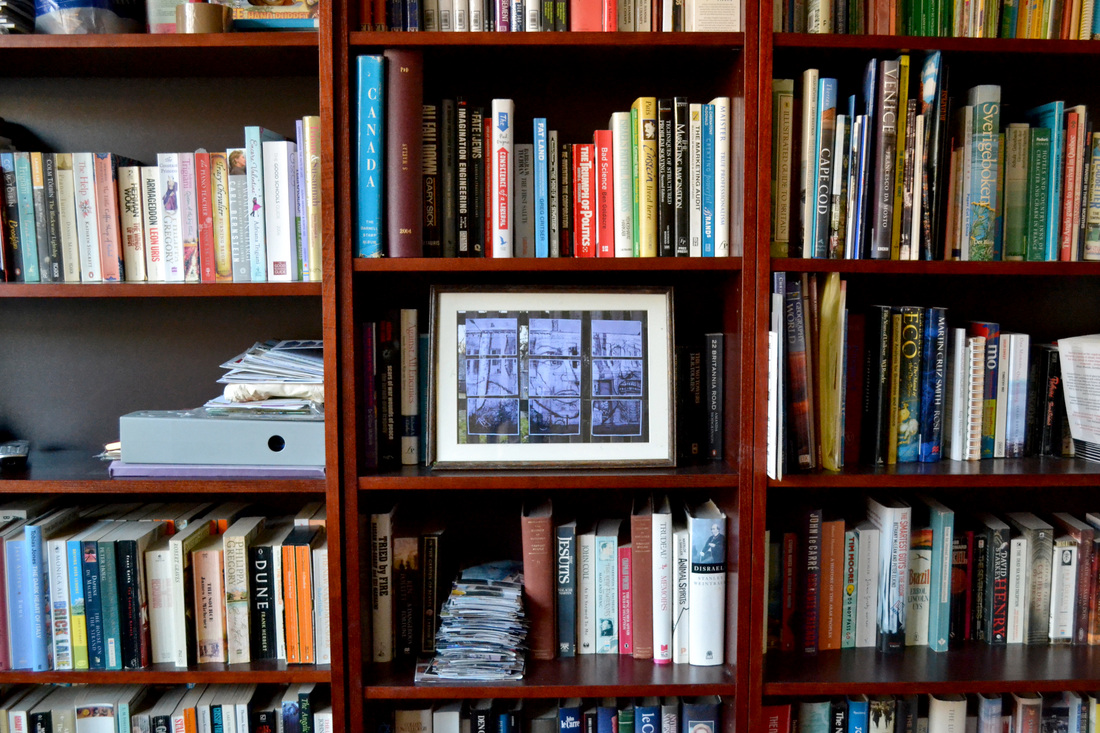
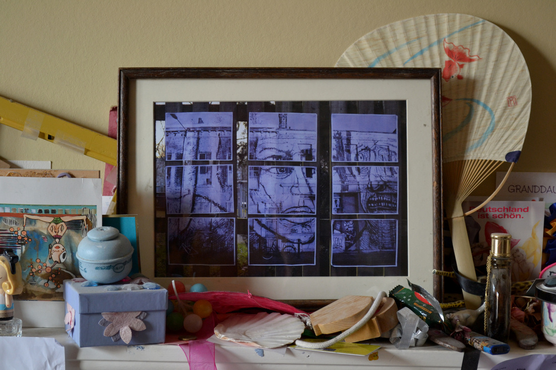
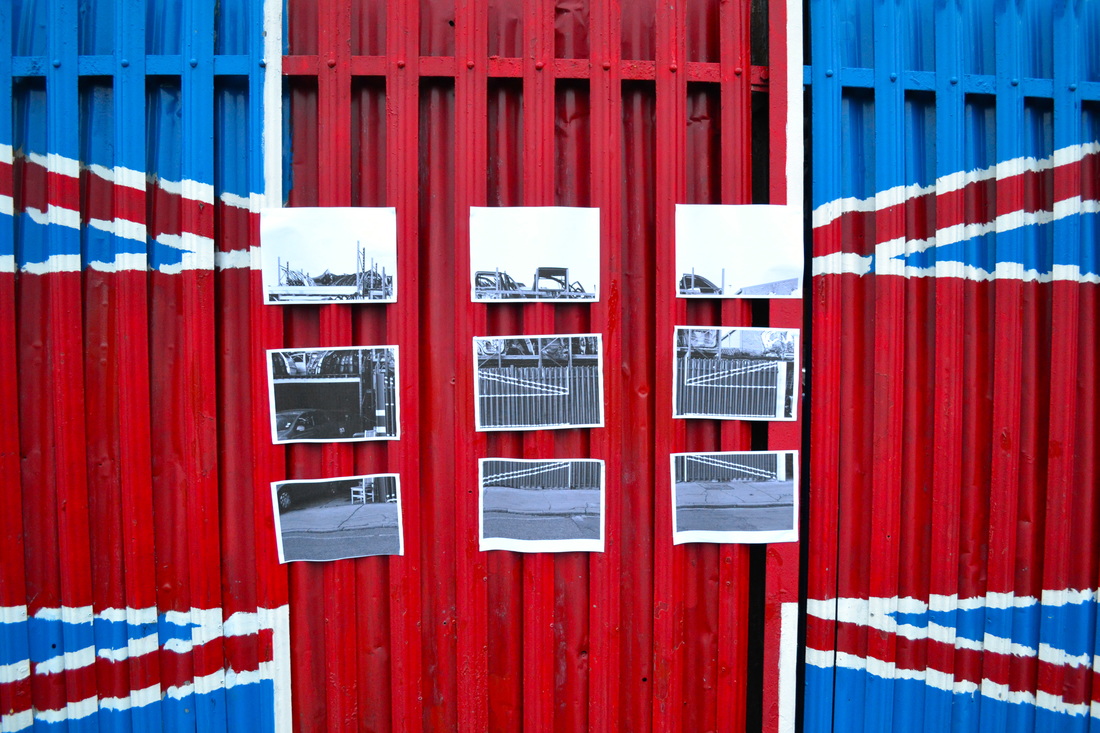
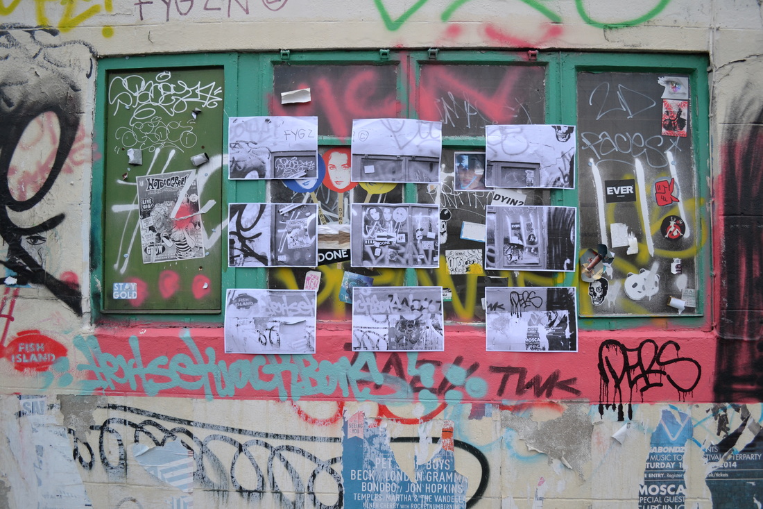
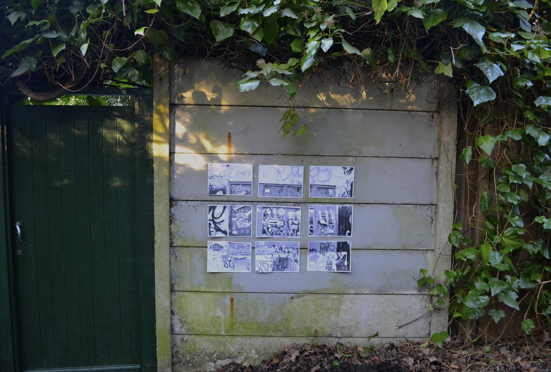
After taking photo's of locations that I didn't know, I then went back to my previous work which linked the Starn brothers and Myra Greene together, in which I split the image of my mother into a grid, and printed it out into nine A3 images which was then stuck on to a wall. I decided to use this method with five of my favourite images of Hackney Wick. I only edited and went back to Hackney Wick there was a lot of interesting graffiti which produced the most effective images. I linked this work with Dyrden Goodwin's, as he scratched into the portraits to gain familiarity and to get to know the person, whereas I blew up images and edited into them closer in order to get to know the place. To do this, I loaded the images into photoshop, edited them into black and white, then put them into a three by three grid of which each section was printed out onto A4 paper. Then I returned to the location with image, and put the section of the photo's on top of the place of which the photo was taken. In this way I went back to a place in which was previously unknown to me, which I then got to know. The end result causes almost inception on the viewer and asks the question which is reality.
|
|
|
|
|

|
|
|
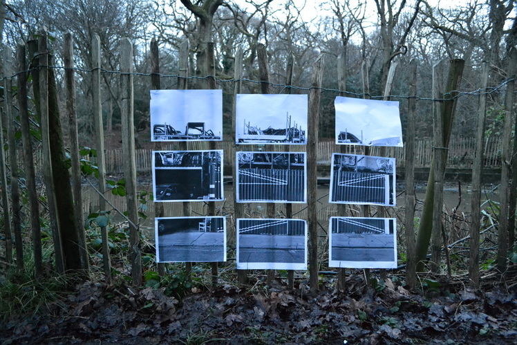
I moved on by bringing the unknown to the known. I brought the same printed out photo's of Hackney Wick to places that are well known to me, hence bringing the unknown to the known. This time, I chose a natural area as opposed to a rural, juxtaposing man v. nature. I chose to photograph Highgate and Queens Woods as I've spent a large amount of time there.
|
|
|
|
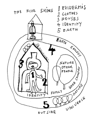
Hundertwasser - skins
|
'For Hundertwasser, man has three skins: his natural epidermis his clothes, his house When in 1967 and 1968 the artist delivered his “Naked” address to proclaim man’s right to his third skin (the free alteration of his house), he accomplished the ritual full cycle of his spiral. He re-found his first skin, that of his original truth, his nakedness as a man and painter, by stripping off his second skin (his clothes) to proclaim the right to his third skin (his home).
Later, after 1972, when the major ideological turning-point had been passed, the spiral of Hundertwasser’s chief concerns began to unfold. His consciousness of being was enriched by new questions, which called for fresh responses and elicited new commitments. So appeared the new skins that were to be added to the concentric envelopment of the three previous ones. Man’s fourth skin is the social environment (of family and nation, via the elective affinities of friendship). The fifth skin is the planetary skin, directly concerned with the fate of the biosphere, the quality of the air we breathe, and the state of the earth’s crust that shelters and feeds us.' I was inspired by Hundertwasser's ideology of the five skins, and of how he's brought ideologies closer to him through |
|
duane michals
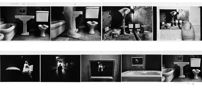
Duane Michaels produced the piece above called 'Things are queer' in 1973. It's a photo sequence of illusions produced in the cinema's frame-by-frame format. Initially it begins with a photo of a normally sized bathroom, however in the next image a large leg that it out of proportion with the rest of the image is added. In the third photo, we see a body connected to the leg, whom of his a lot bigger than the rest of the bathroom, causing him to appear like a giant compared to the room. This image then appears to be in a book that a man is reading, whom is standing outside in a corridor. However, this image is then framed on bathroom wall, which we then discover is in the original bathroom, being the same photo as the first. This illusionary image causes the viewer to question their perception.
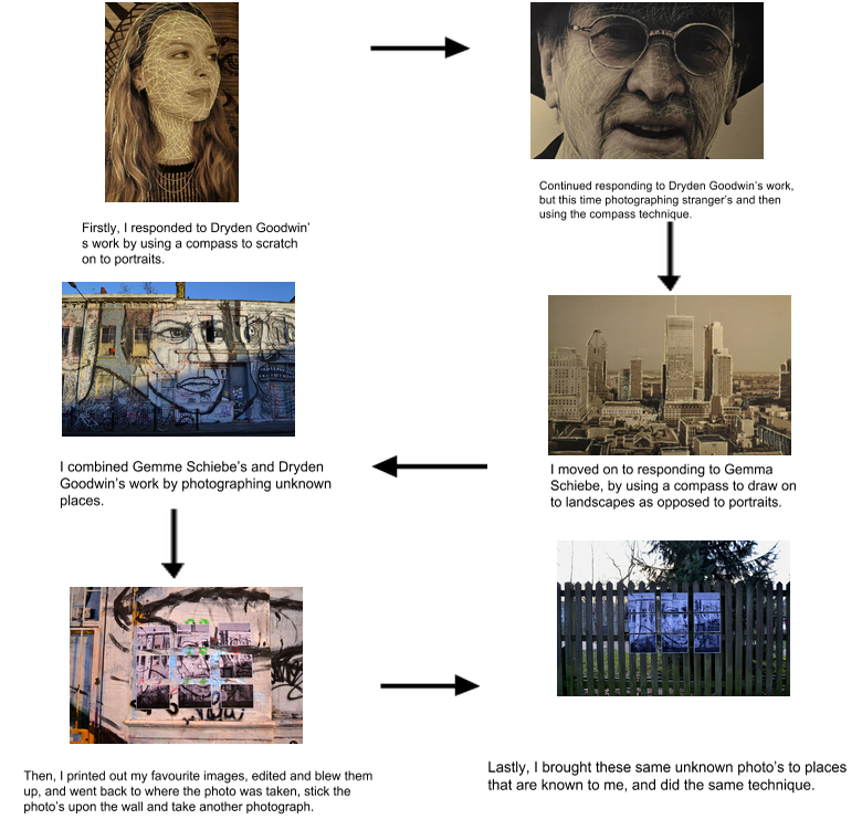
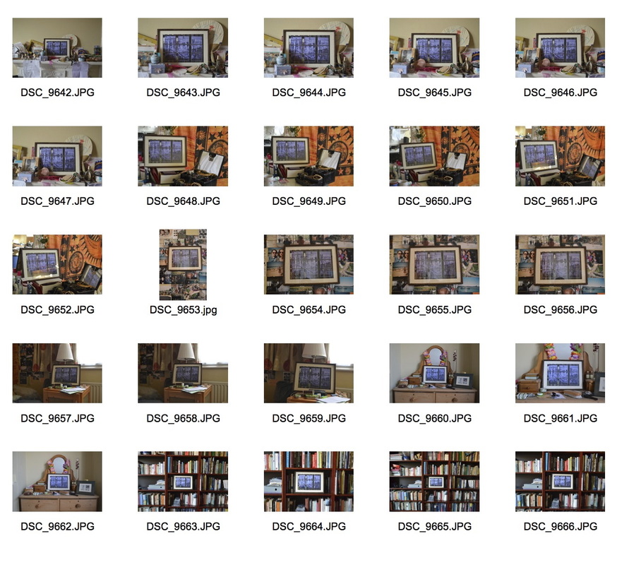
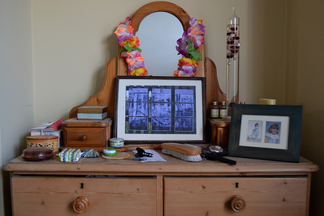
Inspired by Hundertwasser's work of the 'five skins', and Duane Michaels use of illusionary pictures within pictures, I then decided to bring this 'inception' image closer to me, by the previous image of Hackney Wick in Highgate woods, to my house. I printed out my favourite image into A3 and placed it into a picture frame. Doing this is brining the unknown place one step closer to me by placing it in my room surrounded by all my belongings. I then placed the frame around various places in my bedroom to see which is the most effective. Below is contact sheet of all my attempts, and underneath that are my three favourite images that I edited using photoshop.
three most successful images
|
|
|
image transfer
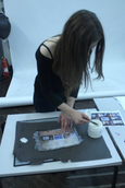
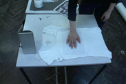
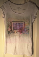
After this, I decided to use these photo's to print on to one of my tops, bringing this process another step closer to me. To do this I used a technique called image transfer. To do this, firstly I had to print out my chosen image in colour onto plain paper. I then painted image maker onto the colour side of the image, and pressed it face down onto the white tee-shirt. Four hours later, I dampened a sponge with water, and using the wet sponge, peeled the paper away from the top.
|
|
|
|
|
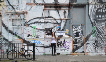
After creating this top, I went back to where the original image in Hackney Wick was taken from and took a photo of me wearing this top in front of it. I wanted to take the same photo that I took before, with me wearing the t-shirt juxtaposed in front of it, however this image turned out to be unsuccessful due to scales of the images not adding up, hence the image on the on the top not being able to to seen. This was my final strand of bringing images one step 'closer' to me.
final images
For my final piece, I discontinued my idea of bringing my images one step closer to me, and went back to my photos within a photo of Hackney Wick, alongside two photo's of Hackney Wick juxtaposed in front of places close to me. Below are my six, final most successful images that portrayed my ongoing theme. Overall, I found this project very interesting and different from other my other units. I enjoyed the concept of taking a photo of a photo, altering the viewers perception of the photo, adding a new depth and untraditional technique to photography. My project has changed from portraiture, to photographing unknown people/places, to taking bringing these photo 'closer' to me.

|
|
|
|
|
|
