beyond the photograph
In this exhibition, the internationally renowned artists use various methods such as stitching, cutting, piercing and punching to explore between the ambiguous space between two and three dimensions. These artists go beyond the traditional methods by testing the materiality of their medium. Through a variety of distinct propositions, this exhibition follows an diversified journey exploring a rich dialogue between various materials and photography. This exhibition includes work from artists such as Dryden Goodwin, Gordan Magnin, David Hockney, Hannah Hoch, Barbara Kruger and Peter Kennard. Each artist has their own unique way of presenting their interpretation of photocollages. Dryden Goodwin goes beyond the traditional techniques and mediums of photography by using a compass as a gateway of exploration by carving into portraits as a method of getting to know the individual better. Similarly, Gordon Magnin works into and ontop of portraiture, by representing various abstractions through the mediums of collage and photography. 'Found images, originally intended to direct and control public perception, consumer activity, and self image, are modified to create a sense of ambiguity to heighten mystery and defy closure.' Another artist who recreates images in an abstract form is Hannah Hoch whom uses images found from various places and mediums which she arranges together, creating interesting mixed media pieces. David Hockney's interpretation of mixed media is by layering photos together of the same subject taken from different angles, which he presents as a cubist puzzle-like piece. Another way of presenting mixed media is through the use of combining words and images, shown by Barbara Kruger who portrays her views on consumerism and her feminist ideology through this template. Peter Kennard similarly voices his beliefs through photomontages by arranging photos together effectively voicing his political messages.
room 1
This exhibition opens with the work of Dryden Goodwin and Gordan Magnin who both go beyond the photograph by using untraditional methods to edit and manipulate portraiture, creating depth and texture to their works. Dryden Goodwin's choice of medium is to use a compass as a metaphorical paintbrush, working into the image in order to get to know the individual better. The end result appears three dimensional, causing the viewer to feel more involved and drawn into to his work. Gordan Magnin uses found images of models which he then deconstructs using variety of methods from folding/cutting photocollage techniques to photoshop. This deconstruction from 2D to 3D creates completely different images with a new meaning.
dryden goodwin
Education
1992-96 the Slade School of Fine Art, BA Hons in Fine Art
1995 Erasmus exchange, Stadelschule and Institut der Neuen Medien, Frankfurt, Germany
Projects
2011 Open - Project for Battle Library, Reading. A permanent commission made for Battle Library, including 26 pencil portraits, 26 films, a website and multiples of 26 postcard bookmarks.
2008 Cabot Circus retail centre, Bristol. 12 Portraits (2008) - 12 etched plates installed in the central atrium of the development. Part of Bs1 which was a two year programme of creative interventions in response to the evolution of Cabot Circus from building site to retail centre. Six artists, were invited to participate in the BS1 programme. The Bs1 project was conceived and organized by Neville Gabie who was the artist in residence during the build from 2006 to 2008, working closely with Sam Wilkinson of InSite Arts, the arts consultants for the development.
2007 The Calvert Centre Project - 20 pencil portrait drawings, photographically enlarged and installed in the centre. A permanent commission made for a new building that combines health and local authority services in Hull.
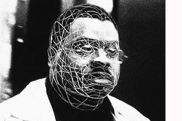
The image above is taken from the series of images named Cradle (2002). These photographs are the first in the on-going series all following the method of tracing the face and head with a compass. The Cradle series presents these individuals in life-size proportions. The large scale image emphasises Goodwin's work and allows the viewer to closely examine the detail of the thin scratched lines. In all his photos from this series the figure is never caught making direct eye contact with the camera, they always seem to be caught off guard hence unposed. The lines on the subjects face appears like a net as if Dyrden Goodwin has 'caught' this stranger through his camera. Furthermore, the scratches upon the figures appear as the artist mapping their face, getting to know each detail of each of the stranger's face, emphasising their individual features.
|
|
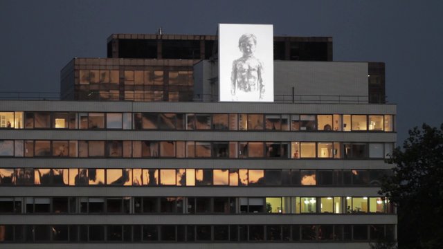
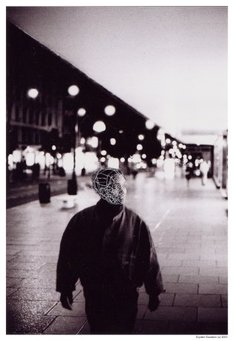
This photograph has been taken from one of Dryden Goodwin's piece of work called 'Breathe', and is part of a bigger project called 'Invisible Dust.' Dryden Goodwin has worked with Scientist Professor Frank Kelly of King's College London. Goodwin has created an animation, shown on an 8-metre screen from dusk on the roof of St Thomas's Hospital, next to Westminster Bridge and looking over to the Houses of Parliament. Every night until the 8th of October, passers by were shown this animation showing more than 1,300 tiny pencil drawings of his 5-year old son. His son being so young emphasises the severity and extent that air pollution can have without us knowing, and evokes sympathy from the viewers. The large scale further juxtaposes the young child's fragility and youthfulness. The conspicuous and populated setting in such a polluted area stresses the amount of people being affected.
|
gordOn magnin
Born
1978 Reno, Nevada
Solo Exhibitions
2010 “The Dregs” Face to the Sky Gallery; Los Angeles
2009 “10:10” Gallery 825, Los Angeles
Duo Exhibitions
2012 "Modern Ciphers" Holland Project Gallery; Reno, Nevada
2009 “ReunioN ColLAges” exhibition following a 15 day artist residency, L’Ecart Gallery, Rouyn Noranda Quebec
Awards/Residencies
15 day residency/show sponsored by L’Ecart Gallery/Canada Arts Council, Rouyn Noranda Quebec
Collaborations/Projects
2011 Nothing Major/Pitchfork Media T-shirt/Tote bag
2010 Das Monk T-shirt design
Education
2008 Mountain School of the Arts (MSA^); Post Graduate Studies
2006 The Southern California Institute of Architecture (SCI_arc); M_Arch I
2001 University of Nevada, Reno; BSCE structural engineering
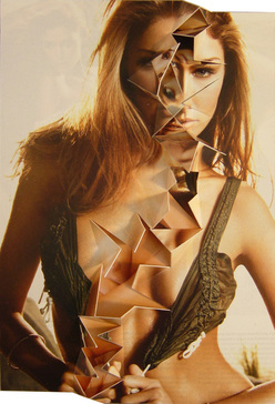
Gordon Magnin works with images, turning images models featured in high fashion magazines into unusual laid out collages, creating a completely new image. He alters fashion/celebrity photography by contoring and manipulating the images to make fun of the celebrity culture that magazines portray. In the image above he has destroyed an image of a model, by cutting out triangular shapes, mixing them up, and sticking them back down, causing her to appear deformed by having an unnatural amount of features (for example five eyes, or having two cleavages.) This method desexualises the image, making a critique on magazines on how they over sexualise woman.
|
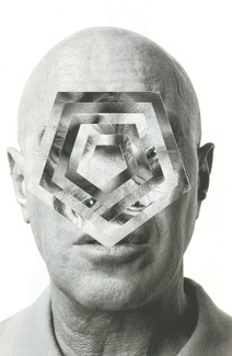
Gordon Magnin has manipulated this photo by rotating each layer into pentagon's, causing the viewer to feel as if they are looking into a kaleidoscope. This optical illusion draws attention to his mind, by magnifying into his mind. The fact that it focuses into the centre makes you feel separated, as if you can't get in touch with him. The rotated pentagon's cause the man's features to be split up all around his face, producing his face to appear distorted, abstract and fragmented. Through it being a close up shot in black and white, it takes away all the thrills of classic fashion photography by focusing more on the pure image making it more personal.
|
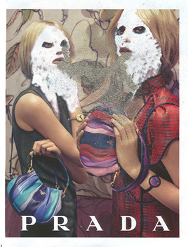
Simularly to the first image, Gordon Magnin has manipulated a Prada advert from a magazine. The two most poignant subjects in the photo are the brightly coloured bags, and the model's face's. The models present the bags as if they are pushing it towards the viewer. This portrays capitalism through Magnin criticising consumer activity. This is juxtaposed with the slightly disturbing display on the model's faces. Their faces are washed out by a white texture, causing them to have a ghostlike haunting appearance. Magnin did this to satirise the celebrity culture that is continually portrayed throughout the media. He does this by manipulating original images that are originally intended to influence and control consumer activity, public perception, and how people view themselves, and changing them into ambiguous abstract images.
|
room 2
This exhbition moves on to room two, featuring works from the renowned artists David Hockney and Hannah Hoch. These artists both experiment with mixed medias through the use of photomontage. Both artists recreate individually traditional images by breaking up images and laying them out in a contemporary way. The artists use of distortion causes the viewer to question their perception of the images. David Hockney's interpretation of mixed media is through the use of taking multiple images taken from different angles of the same subject matter, which he then layers together creating a cubist puzzle-like piece. Hannah Hoch on the other hand uses images found from different places and mediums which she presents together in an abstract formation.
david hockney
1937 Born July 9 in Bradford, England.
1953-57 Studies at Bradford School of Art.
1959-62 Studies at Royal College of Art, London.
1964 Moves to Los Angeles. Makes first swimming pool paintings. Begins making instant (Polaroid) photographs. Begins working with acrylic paints.
1968 Creates first large double portraits. Moves to London.
1970 Traveling retrospective at the Whitechapel Art Gallery, London. Creates first photographic “joiners.”
1976 Returns to Los Angeles. Begins working extensively with photography; makes large scale lithographs.
1982-84 Makes first composite Polaroids and photographic collages.
1985 Designs cover and 40 pages for the December 1985 issue of French Vogue magazine.
1988 Creates 24 original pages for his book, David Hockney: A Retrospective.
1988-89 Returns to painting, concentrating on seascapes, potted flowers, and portraits of his family and friends.
1990 Works at Tyler Graphics Ltd. on six new prints.
1992 In January, opens Turandot and a painting exhibition in Chicago.
1996 Paints portraits of family and friends in January.
1999 Opens three exhibitions in Paris.
2003 Begins watercolors in Los Angeles.
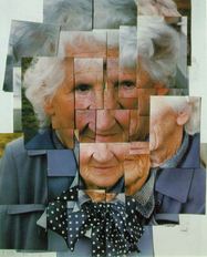
David Hockney produced photocollages, which he names 'joiners'. At first, he made these by using polaroid prints, moving on to 35mm commercially processed colour prints. He creates photomontages by taking many polaroid pictures of a single subject, printing the photos and arranging them in a puzzle-like formation of overlaying images. The photocollage above consists of various photo's of his mother taken from different angles and at different times, resulting in a cubism like outcome. Demonstrating Hockney's aim to experiment with human vision, and cause people to look beyond two dimensional photography. Hockney even stopped painting for a while to exclusively purse this technique and convey this message. The individual images overlay each others, causing an almost distorted like appearance, due to her some of her features being duplicated, and moved around. This technique adds complexity to an originally relatively simple photo. Links to cubism and the depiction of space Date your images |
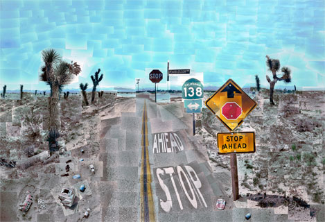
Initially the set of photos above meant to illustrate a story for vanity fair about driving around the south west, emphasising the monotony of the roads. Hockney drove around the south west looking for a suitable location until he eventually came across the side road photographed above. The particular side road was ideal as it was deserted with little life. Initially it was meant to illustrate a story for vanity fair about driving around the south west, conveying the tediousness and repetitiveness of these roads. Hockney searched for a while until he came across this particular desolate side road featuring four interesting signs. This piece took him 10 days to shoot about 800 photos. Even though it may appear as if there's focul point, all the individual images are taken from various perspectives as opposed to being taken from the centre. David Hockney aims to allow the viewer to connect with the image by his use of his individual close up images causing the viewer to interpret all the details. He says that his use of 200 separate pictures making up the sky, all in different tones is a metaphor a painting as he's painting the sky. He quotes that when he originally started making collages, he called it drawing with a camera, as similarly to drawing, the artist makes choices, as we don't all see the same things.
|
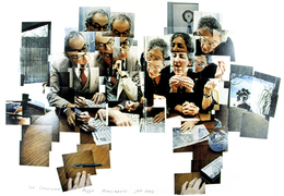
This photocollage features two friends; Martin Freedman and his wife. They were all staying at the walker art centre, and one morning, David Hockney was having a cup of tea whilst watching them doing a crossword puzzle. He quotes that the way they went about this crossword puzzle was as if they were participating in an intellectual contest of some kind. This caused Hockney to want to capture this moment by taking photos. After taking several photos, he arranged them into a collage back in London. The way he arranges his photo's tells a story in itself. Each image conveys different emotions and stages. The photo of the woman in the top right corner looks as if she's just started the crossword, about to write her first word, then as the photos progress, she looks more excited as if she's just realised she's correct. In this photocollage, Hockney experiments with the passing of time by telling a story using his camera as a gateway.
|
hannah hoch
1889 - Born 1 Nov, as Johanne Hoch in Gotha. Her mother an amateur painter, her father a manager for an insurance company.
1912 - Enrolled in Kunstgewerbeschule, Berlin Charlottenbourg studied glass design.
1914 -Outbreak of World War 1 - traveled to Cologne to see the Werkbund Exhibition.
1915 - Moved to Berlin to study graphics with Emil Orlik at the Staatlichen Lehnranstalt des Kunsgewerbemuseum. Met and became lovers with Raul Hausmann.
1920 - First exhibited in the Novembergruppe annual exhibitions, subsequently participating for the next 10 years.
1922 - Separation from Hausmann and exhibited in Berlin.
1924 - First Parisian visit Hoch met Mondrian and exhibited in the Soviet Union.
1925 - Exhibited in Deutschen Kunstgemeinschaft Berlin. Second trip to Paris.
1928 - Exhibited in the Netherlands and other cities in Germany.
1929 - First one person exhibition: Kunsthuis de Bron in the Hagues, Rotterdam.
1930/1931 - Moved back to Berlin with Brugman and exhibited in the Grosse Berliner Kunstausstellung and the Berlin Fotomontage exhibition.
1932/1932 - Exhibited in America and Brussels.
1934 - One person exhibition at Kunstzaal d'Audretsch in the Hague. One person exhibition in Czechoslovakia.
1935/37 - Separation from Brugman.
1938 - Married Kurt Matthies.
1942 - Separated from Kurt Matthies.
1945 - Exhibited in Berlin and at the Museum of Modern Art, New York.
1978 - Died in Berlin
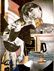
This piece by Hannah Hoch is named Da-Dandy and was done in 1919. It includes images of woman, presumably models advertising fashion, overlapped over images of various patterns and textures. The photo's of the woman appear them arranged in a line, gradually increasing in size, as if they're coming closer towards the viewer. The images of woman are mainly in black and white contrasting with the unstructured arrangement of patterns of the beige, red and blue tones, causing the woman to be further emphasised. The woman appear to be presented similarly through their choice of style and tones, representing the typical 1970's version of a female dandy. The definition of a dandy is a man who places particular importance upon physical appearance, hence the woman in the photomontage above are the female version of these shown through their choice of accessories and clothing. Critics such as Taylor K noted that one of the woman in the photomontage has one bigger eye representing a monocle, tying in Dadaism as Hoch stated that the monocle was the sign for this art movement. Hoch seems to weave in the theme of Dadasism in several of her photomontages, particularly embedding photo's of woman.
|
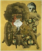
This photomontage is called 'Das schöne Mädchen' or 'The Beautiful Girl' in english, was done in 1919. Similarly, to the previous image, Hoch uses images of woman however this time she mixes it with various photos of technology. The centre point of this photomontage focuses on a woman sitting on a beam in a bathing suit, holding an ambiguous object appearing to represent her head, appearing to be a cross between a lightbulb and an umbrella. Directly behind this woman is a section of a vintage looking advertisement, with a large image of a woman's hair on top. Together, this creates an un-proportional part woman, part object figure. In the upper right corner there is the upper half of a woman's head appearing from behind the large image of woman's head and an image of a hand holding a stopwatch. Another similarly between this piece and the previous one, is that Hoch also stuck a photo of an eye ontop of the woman's face, continuing the use of monocle's and the theme of Dadaism. Underneath, there are many BMW symbols adding colour to the overall beige theme. Finally, in the bottom left corner, there is large image of tyre with a man inside it appearing to be lifting an umbrella. 'Das schöne Mädchen' was made in the early 90's, when a new wave of feminism was being introduced, suggesting feminist ideology presented through the collage of women's bodies and faces mixed with technology and wheels, usually associated with men and seen as unfeminine. The depiction of women's body parts suggests the objectification of women in the early 90's, further implied through merging woman and mechanical objects in the collage to represent the patriarchal societies' degrading of women's subjectivity.
|
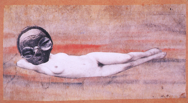
This piece is named Fremde Schönheit (Strange Beauty) and was done in 1929. This piece portrays a female body with the face covered with an imaged layered on top of a disfigured face by the magnified section of eyes from their glasses, taken from tribal images with a warm background. The covered face suggests the objectification of women by dehumanising the woman from removing the female's subjectivity to only a body. The woman's figure is very light in black and white, contrasting to the dark face layered on top. The contrast created draws attention to the darker face, creating ambiguity to intrigue the viewer of personal interpretations. The woman is white to represent the white German Aryan race to contrast to the face overlapping the nude figure's face. This piece was used in the time of World War 2 when the Nazi party focused on propaganda of aryan figures. |
room 3
Room 3 presents artists whom voice their personal views through mixed media. Barbara Kruger opens this room with her pieces that portray her feminist ideology and her views on cosumerism through her statement template of her bold words written on top of an image, continually using the same colour scheme. By combining a statement with a photo, she goes beyond the photograph by adding more depth and meaning to the photograph. The second artist featured in this room is Peter Kennard who likewise conveys his beliefs through art. Minus the words, Kennard also effectively voices his political message through the use of photomontage.
Barbara kruger
1945 born on January 26 in Newark, New Jersey.
1964 spent a year at Syracuse University
1966 she took a job with Condé Nast, working in the design department ofMademoiselle and for the next decade, Kruger supported herself doing graphic design for magazines, book jacket designs, and freelance picture editing.
1966-69 Kruger creates large woven wall hangings of yarn, beads, sequins, feathers, and ribbons, that exemplify the feminist recuperation of craft during this period.
1976 Kruger abandoned art making and moved to Berkeley, California, where she taught at the University of California for four years and steeped herself in the writings of Walter Benjamin and Roland Barthes.
1977 She took up photography producing a series of black-and-white details of architectural exteriors paired with her own textual ruminations on the lives of those living inside.
1979 Kruger stopped taking photographs and began to employ found images in her art with words collaged directly over them.
1980 Kruger perfected a signature agitprop style, using cropped, large-scale, black-and-white photographic images juxtaposed with raucous, pithy, and often ironic aphorisms, printed in Futura Bold typeface against black, white, or deep red text bars.
1990 Kruger has incorporated sculpture into her ongoing critique of modern American culture
Kruger lives and works in New York and Los Angeles.
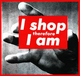
'I shop therefore I am', 1987.
This image of a hand reaching out towards the camera with 'I shop therefore I am' written on the hand. Barbara Kruger presents her views about consumerism and the Western culture through this image. She's conveying her views of how shopping has gone beyond just buying what we need, it's become a method of gaining an identity and asserting our status in society. What we wear and how we present ourselves has become a way how to identify and conform with groups, using other people as role models. The hand appears to be quite small implying it belongs to a younger person, suggesting how these issues have more of an impact on younger people. The hand is reaching out to the camera, acting as a metaphor for our unconscious attraction to consumerism. |
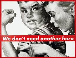
This piece of Kruger similarly deals with feminist issues. Using her template, she uses an image of a young body flexing his arm's whilst another girl points to his arm muscle whilst looking surprise, with 'We don't need another hero' written on top. This image presents the stereotype of masculine strength though a woman admiring a man's biceps, showing how society demine's female power by showing woman's dependence on men. The phrase 'We don't need another hero' implies how society expects men to be the stereotypical heroic figure by having characteristics such as strength, hence the boy in the image flexing his biceps. It can also be viewed that through the body language of the girl of her leaning over admiring the boy's muscles, she's respecting his power and strength, whilst still holding power over men through her mind, showing how woman also have power, and can be the hero.
|
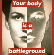
Barbara Kruger designed this piece for the March for Woman's Live's protest in 1989 in Washington D.C. She uses her standard template of a black and white image, with a red border and red and white writing. The image is a close up portrait of a woman's face, with half of it being a positive image, and the other half a negative, with 'Your body is a battleground' written on top. The message conveys Kruger's feminist opinions of her support for woman's right whilst voicing her political views. This poster was designed in order to present her support support for legal abortion and birth control, as Kruger is saying that a woman's body no longer belongs to herself due to the Conservative's belief on contraception and abortion. The statement causes you to question the boundaries between the public and private, as Kruger believes that birth control is clearly a personal choice that shouldn't be depicted by the government. The woman is staring straight ahead through the text right at the viewer, causing them to feel addressed. The use of half her face being negative, and the other half being positive presents a simplified version of the two opposing sides 'good and bad' sides in this conflict.
|
PETER KENNARD
Personal Details:
Date of Birth: 17 February 1949
Place of Birth: London
Studied:
1976-79 Royal College of Art - MA in Fine Art
1967-70 Slade School of Fine Art, University College London - Slade Diploma
1965-67 Byam Shaw School of Art
Work History:
1994-present Royal College of Art - Senior Lecturer in MA Photography
1979-present Byam Shaw School of Art - Part-time lecturer
1989-94 West Surrey College of Art and Design - Lecturer in Fine Art and Photography
1980-82 North East London Polytechnic - Part-time lecturer
Film and video:
1982 Photomontages for Labour Party political broadcast against nuclear weapons
1983 Photomontages Today : Peter Kennard, Chris Rodriguez and Rod Stoneman (dirs), 35 minutes, Arts Councli of England, London
1984 Animated sequences for Unstable Elements Newsreel for Channel 4
1986 State of Emergency-South Africa Bandung File, Channel 4
1987 Animated sequence for The People's Flag Platform Films for Channel 4
1991 Heartfield the Father of Photomontage Granada TV
1992 Welcome to Britain The Late Show, BBC2
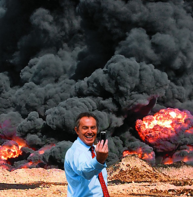
This photo by Peter Kennard shows Tony Blair smiling, holding a camera taking a photo of himself, whilst behind him is a fire with clouds of thick black smoke, implying Blair's relation to the war in Iraq. Judging by Blair's happy, carefree facial expressions, suggests his oblivious and unrepenting towards his participation involved in the war, showing no apparent regrets. The orignial image of Blair came from a photo of him taking a selfie with a group of cadets as part of a campaign for the general election in 2005. The fact that this photomontage presents Blair as taking a selfie infront of a war, goes beyond his carelessness to his impact, as he appears to be proud of himself. This photo shows the reality of the goverment's contribution to the Iraq war. This became one of the most iconic propaganda image's from the Iraq war.
|
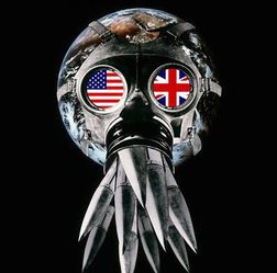
This photomontage is called Union Mark and was done in 1981. This image is of a gas mask surrounding the earth, with missiles coming out of the mouth, and the England and United States flag over the eye parts. The fact that the gas mask is attached to the earth can be perceived in two ways. Firstly, it can be seen as the mask is trapping the world, emphasising how war's do not just affect the country in question, it impacts everyone. Secondly, it can be perceived as the gas mask protecting the world from the war. The goggles with the England and American flag represent how they're at deciding point, they're strapped to the world which portrays how they have influence over everything. The missiles that appear to be coming out of the world show how they're needlessly destroying the world. The fact that the missiles are attached to the mouth piece could represent the earth breathing in all the pollution and damage caused by the war.
|
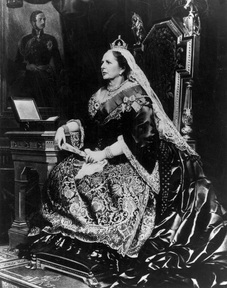
This image is one of Kennard's most well known pieces of Margaret Thatcher, named 'Maggie Regina'. It was orginially designed for front cover of the New Statesman in May 1983, but now it's owned by the Tate and is regularly exhibited. In this photomontage, Kennard simply transforms Thatcher's head onto a Victorian body, acting as a visual representation of Thatcher's statement that 'we should all return to Victorian Values'. Critics such as Ann Jones noted that Kennard used a portrait of Thatcher which has very subtly been taken from a slightly different angle to the original portrait image of the Victorian in the painting. Furthermore, this different angle defies the 'convention' at the time of just the profile being photographed, as a small section of the other side of her face is revealed. This angle gives her a witchlike appearance due to the sharpness of her features causing her to look sincere.
|
conclusion
In conclusion, this project has developed shown me the various unconventional mediums and techniques that can be used to create and manipulate photography. I feel I have gained a more indepth understanding of how meaning can be created through the use of using different materials from a compass to magazines. Some photomontage's focus on voicing the artist's beliefs on social subjects ranging from feminism by Hannah Hoch and Barbara Kruger, to Peter Kennard's political ideology. Whereas other artists I researched focused on recreating and manipulating images using various unconventional mediums and techniques, from Dryden Goodwin using a compass, to David Hockney's manipulation of angles causing distortion of perception. Dryden Goodwin was my main inspiration for my practical response. Initially by practising his compass technique onto portraits of unknown people, to unknown places. This concept of photographing the unknown, led me to go to tube stations that are unknown. Inspired by how Goodwin photographed unknown, then worked into it as a method of getting to know the person, I brought back my photo's of these unknown places, edited and enlarged them, bringing them back to the original destination as a way of getting to know these places. Hannah Hoch and David Hockney inspired me to give a different outlook of the traditional presentation of photography, leading me print out blown up sections of my photo's, and photographing them stuck against the place the original photo was taken.
