david bailey
David Bailey was born on January the 2nd, 1938, in London, England. He taught himself photography, before serving with the Royal Air Force in Malaysia in 1957. In 1959 he became a photographic assistant at the John French studio before being contracted as a fashion photographer for Vogue magazine. He also did a large amount of freelance work. In 1960, David Bailey began photographing for British Vogue, and his fashion work and celebrity portraiture, known for stark backgrounds and dramatic lighting effects, transformed British fashion and celebrity photography. His work reflects the 1960s British cultural trend of breaking down antiquated and rigid class barriers by injecting a 'punk' look into both clothing and artistic products. Along with Terence Donovan, he captured, and in many ways helped create the Swinging London of the 1960s: a culture of high fashion and celebrity chic. Both photographers socialised with actors, musicians and royalty, and found themselves elevated to celebrity status. Together, they were the first real celebrity photographers. As well as fashion photography, Bailey has been responsible for record album sleeve art, for performers including The Rolling Stones and Marianne Faithfull. He has also directed several television commercials and documentaries. Bailey has married four times: in 1960 to Rosemary Bramble, in 1967 to the actress Catherine Deneuve (divorced 1972), in 1975 to the model Marie Helvin and in 1986 to the actress Catherine Dyer to whom he is married as of 2004. He was awarded the CBE in 2001.
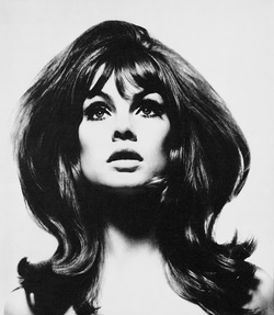
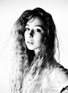
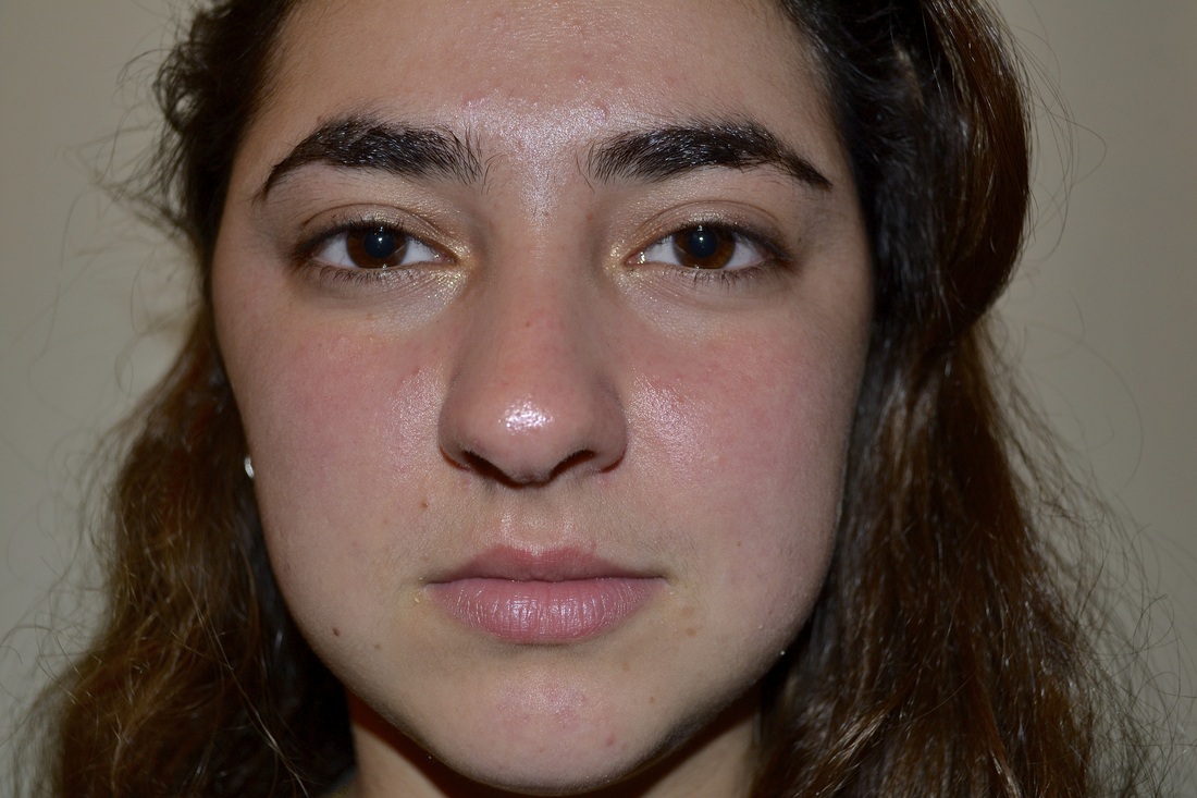
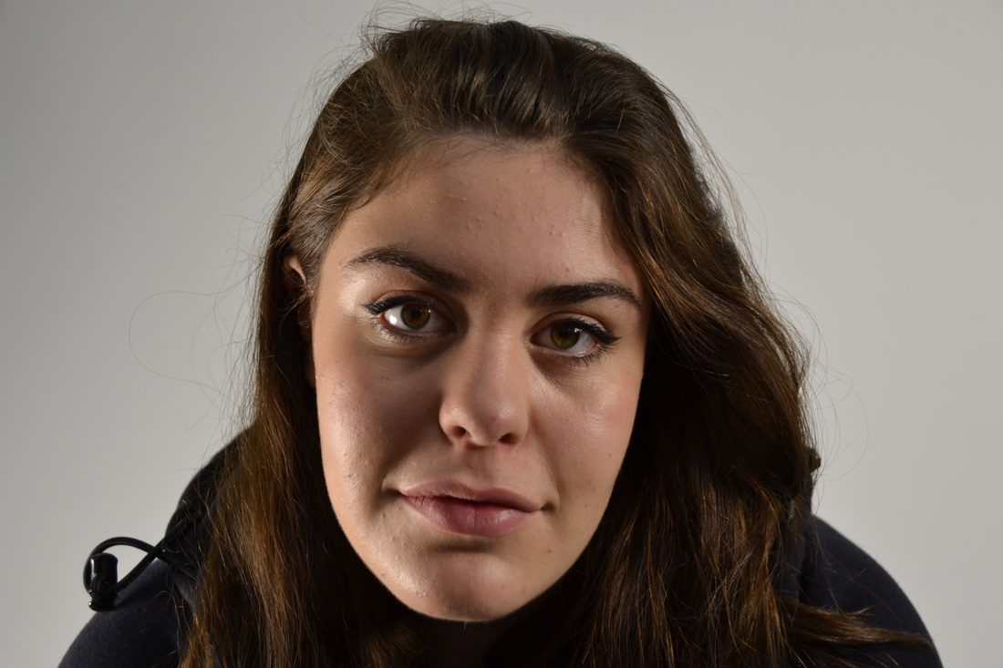
The photo is in black and white and he's over exposed her skin to eliminate any blemishes or lines which is almost idealising beauty. The hair is sculpted as opposed to being natural and her eyes are dough eyed. The background is pure white with the colour of her skin almost blending in to the background, with her hair separating her face from the background. The image is made up of black and white lacking any shades inbetween which creates a dramatic effect. The use of black and white, and the absence of tonal values causes the image to 2D.In the sixties, the norm was realism and this image was a fresh new perceptive.
artist and me
|
|
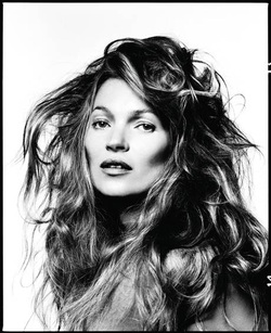
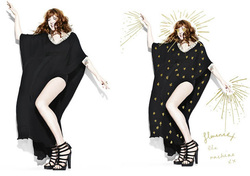
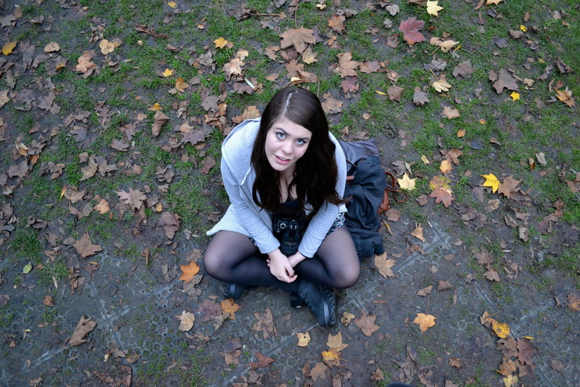
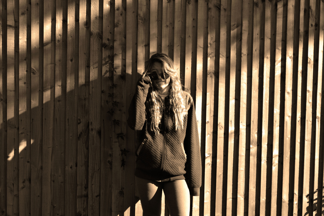
Kate Moss starred in the series of photos taken by David Bailey for the August 2013 edition of Vogue Paris magazine, styled by Geraldine Saglio. Hair by Luigi Murenu, makeup looks are courtesy of Miranda Joyce. This shot is similar to the previous photo I used, which could be David Bailey recreating the look and feel for Jean Shrimpton. Similarly, its a white background, apart from the shadow in her check bone. Her face has no definition or tonal values which makes her more perfect and blemish free, but less real. Her hair is huge and also separates her face from the background. The light is studio, direct light which obscures details and draws our eyes to the contrasting features such as her cheekbones and her hair. The image to the left is my studio portrait in the style of David Bailey. I feel that the lighting and toning is successfully simular to Kate Moss', however the hair is quite different.
rankin
John Rankin Waddell, also known under his working name Rankin, is an English portrait and fashion photographer. Rankin has created landmark editorial and advertising campaigns. His work has featured some of the biggest brands and charities such as; Nike, Swatch, Dove, Pantene, Diageo, Women's Aid and Breakthrough Breast Cancer. He has shot covers for Elle, German Vogue, Harpers Bazaar, Esquire, GQ, Rolling Stone and Wonderland. His work aims to question the social norms and ideas of beauty. Rankin's destroy project was a concept which involved teaming up with a children's music charity; Youth Music. He asked 70 musicians and visual artists to 'destroy' their own portraits. This would eventually lead to an iconic, original piece of work produced by the artist themselves. The destroy project allows them to release their inner creativity and portray their true personality.
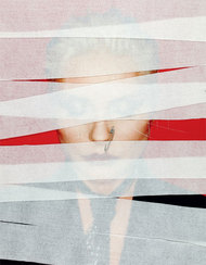
This image is a co-creation of Florence Welsh. She used to restyle photos in magazines, and drew over her portrait that Rankin took. She's consistently used a gold pen to decorate both her dress, and extend herself throwing dynamic lines of 'energy' through her hands and her head. Florence says that 'music is a way of empowering yourself, and gives you strength'. Her stature is bold almost heroic and the rays from her hands would not be out of place in a comic book hero drawing. The whole picture is upbeat and lively, expressing her view that music empowers young people.
This image is a co-creation of Debbie Harry. She burnt, painted and stitched-up her picture, ultimately creating a series of six ‘destroyed’ portraits. The tape could represent how she's been censored by the media, and the stitching up portrays how the media caused her to break. Paper clips are commonly associated with punk rock, which shows her music taste. Her eyes are closed, and the majority of her face is covered with tape which suggests that she's hiding away from something.
My interpretation of rankin's work:
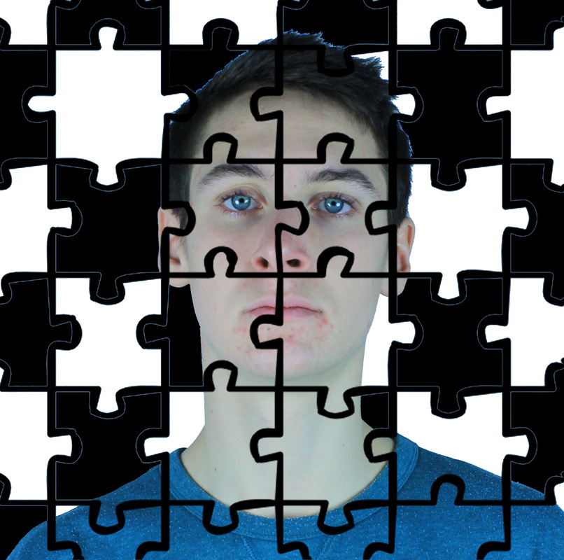
I chose an image of Miley Cyrus as she is currently appearing in the media alot at the moment, creating strong views. I tore her face into various pieces to represent how she is tearing herself away from her child friendly, disney self. The various pieces of her face are scattered around the page, showing how her new image of fame is fragmented. I outlined the torn fragments of her face to intensify how she's 'breaking' herself away, and how she's creating her new bold, rebellious image. I made a 'wrecking ball' in the centre her as her music video for her song 'wrecking ball' created alot of controversy in the media. I used newspaper to make the wrecking ball as the media are effectively 'breaking her'.
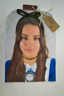
This is my personal destroy image. I printed off a head shot of me and edited it to make myself look like Alice in wonderland. I painted on a blue dress with a white apron onto my chest, a black ribbon on my head and a stopwatch around my neck. I cut the square piece of paper into the shape of a bottle, and attached a 'drink me' label, as in Alice in Wonderland, Alice drinks from various bottles in this style. The first obvious similarity between Alice in Wonderland and I is that we share the same name. We also have some of the characteristics as we're both curious, impulsive and naive.
playing with perspective
symmetrical portrait
extreme angle portrait
close up portrait
camouflaged portrait
balanced portrait
solarised print
sepia print
masking pattern
BIRDS EYE PHOTO
mid-shot
close up
Deirdre o'callaghan
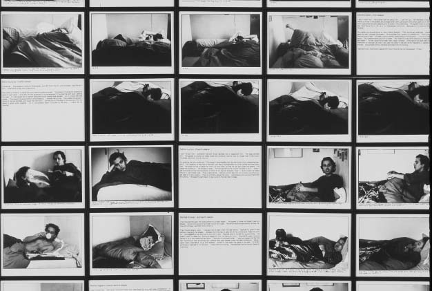
Deirdre O'Callaghan took a series of photos called 'hide that can' over the course of four years. She photographed men who lived in a hostel in Camden, called Arlington house. Most of the residents moved from Ireland to London to work in the 50's and 60's. The Aisling Project made it possible for them to take a trip to Ireland, for many it was first time they'd been home in 40 years.
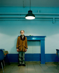
This is a photo of a man posing for a picture, but not looking directly at the camera. He's wearing a dishevelled coat, baggy trousers that are clearly oversized. His hair is unkempt and he has a scraggly beard. He looks poor, forlorn and tired. There's no signs of any joy or life in the image. The mood is rather sad and depressing. The room is made to look industrial being painted dark and light blue on a brick wall, with pipes and a single light over the man's head which is harsh and unflattering. Theres a fire place surrounding but no fire which demonstrates how cold and uninviting the atmosphere is. There are cheap chairs to the side, almost like the salvation army. The man is alone in an unappealing room with no pictures or furniture which could represent is empty, lonesome life. The bleak colouring of the photo reflects his dull life.
This is a photo of a man posing for a picture, but not looking directly at the camera. He's wearing a dishevelled coat, baggy trousers that are clearly oversized. His hair is unkempt and he has a scraggly beard. He looks poor, forlorn and tired. There's no signs of any joy or life in the image. The mood is rather sad and depressing. The room is made to look industrial being painted dark and light blue on a brick wall, with pipes and a single light over the man's head which is harsh and unflattering. Theres a fire place surrounding but no fire which demonstrates how cold and uninviting the atmosphere is. There are cheap chairs to the side, almost like the salvation army. The man is alone in an unappealing room with no pictures or furniture which could represent is empty, lonesome life. The bleak colouring of the photo reflects his dull life.
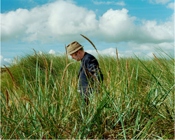
Similarly to the previous photo, this image focuses on a man. He's walking alone in the nature in his native country Ireland in a contemplative pose. His arms are behind his back and he's looking down at the ground, either still or moving slowly. He's not smiling but reflecting on his past time and experiences in Ireland. Unlike the pictures taken in the charity home, this image features bright sunshine, bluish skies and vibrant green vegetation. The bright vibrant colours give a sense of health and well being. It's natural lighting, there are some distinct shadows, its not a posed photo which portrays the naturalness of the photo. This image continues the theme of loneliness, however the photos taken in Ireland give a more positive vibe.
martin parr - the last resort
The Last Resort were taken between 1983 and 1985, a period of economic decline in northwest England. They depict a seaside resort past its prime with attractions designed to appeal to an economically depressed working class: overcrowded beaches, video arcades, beauty competitions, tea rooms and chip shops. Traditionally, documentary photography in Britain sought to glorify the working class; here Parr shows a warts-and-all picture of a down-at-heel resort populated by day trippers seeking cheap thrills. The series contains many images of people dressed in the day-glo lycra fashions of the time, eating junk food in the crumbling remains of a seaside town. In the 1980s The Last Resort was seen as an indictment of the market-led economic policies of the Conservative government led by Margaret Thatcher. Some critics understood Parr’s depiction of an area of economic deprivation and his focus on his subjects’ personal indulgences as a political statement decrying the excesses of Thatcherism.
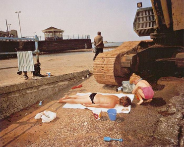
In this image, a woman lies face down on the ground sunbathing, with a child at her head bending over her. They seem out of place as they look as if they should be lying upon a beach, whereas they're 'sunbathing' on a concrete pathway underneath a construction vehicle. The child appears to be playing with a red bucket, and there are other blue bucket and spades lying in the foreground, however there is no sand to be seen. The colours of the buckets could represent the two main political parties; conservatives and labour. The child seems uninterested in the blue bucket and spade (portraying conservative), however paying her attention to the red bucket (portraying labour and socialist views). The woman lying down has her face turned away from the camera which could represent how Thatcher has turned her back on the recession and the suffering of the unemployed. The old rusty vehicle conveys how industry is suffering. All of three subjects' faces are turned away from the camera, which represents how the public are turning their backs on Thatcher.
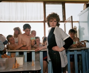
In this photo, the main focus is the woman standing in front of the barrier with her hand on her hip, facing the camera. Behind the barrier are several children squashed together queuing for ice cream. The woman standing in front of the blue barrier could represent the divide between Thatcher and the public. The people behind the barrier are all children, which could highlight the negative views of the younger generation towards the conservative party. The disorderly crowd of children rushing to get ice cream from the woman could represent the public rioting to get attention from Thatcher; however, the woman is looking away representing Thatcher's oblivion to the riots.
sophie calle
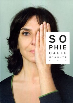
Sophie Calle is a french photographer. After completing her schooling she travelled for seven years. When she returned to Paris in 1979 she began a series of projects to acquaint herself again both with the city and people of Paris and with herself. These sought to construct identities by offering documentary ‘proof' in the form of photographs. Her work was seen to have roots in the tradition of conceptual art because the emphasis was on the artistic idea rather than the finished object.
In Suite Venitienne, Calle started of by following a man she met at a party in Paris to Venice, where she disguised herself and followed him around the city, photographing him in black and white. Next year, Calle organised a project named 'The Sleepers', a project in which she invited 24 people to occupy her bed continuously over eight days. Of these people, some were friends, friends of friends, and some were strangers to her. She served them food and photographed them every hour. Calle made another project named The Shadow, which consisted of Calle being followed for a day by a private detective (who'd been hired by her mother.) Sophie Calle described it as an attempt 'to provide photographic evidence of my own existence'. She led the detective around places in Paris that were meaningful to her, and kept a diary of her journeys throughout. Her projects question the role of the spectator, with views often feeling uneasy by violating others privacy. Furthermore, her documentary gives a sense of being artificial, questioning the nature of truths. In her project 'The Hotel', she was hired as a maid at a hotel in Venice where was free to gain an insight into the hotel guests. She qutoes "I spent one year to find the hotel, I spent three months going through the text and writing it, I spent three months going through the photographs, and I spent one day deciding it would be this size and this frame...it's the last thought in the process."
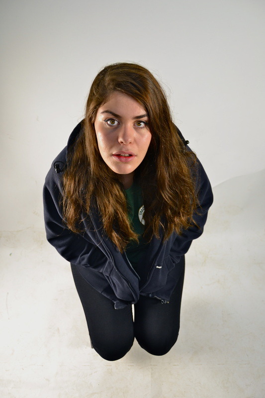
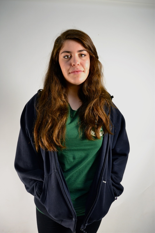
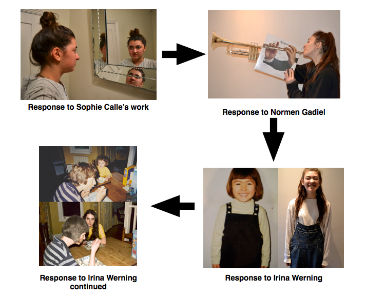
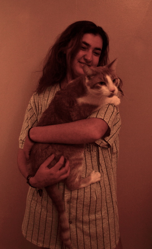
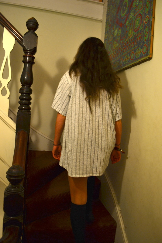
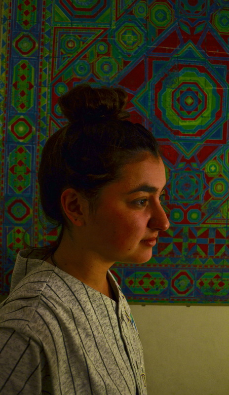
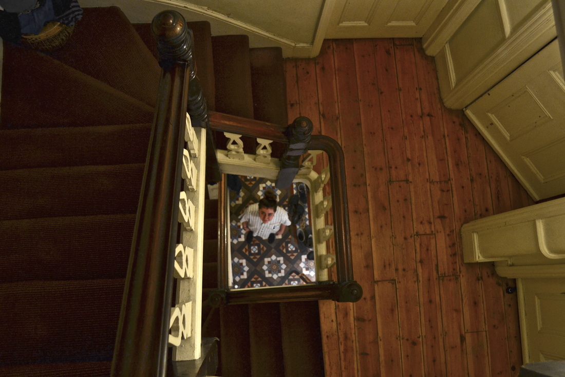
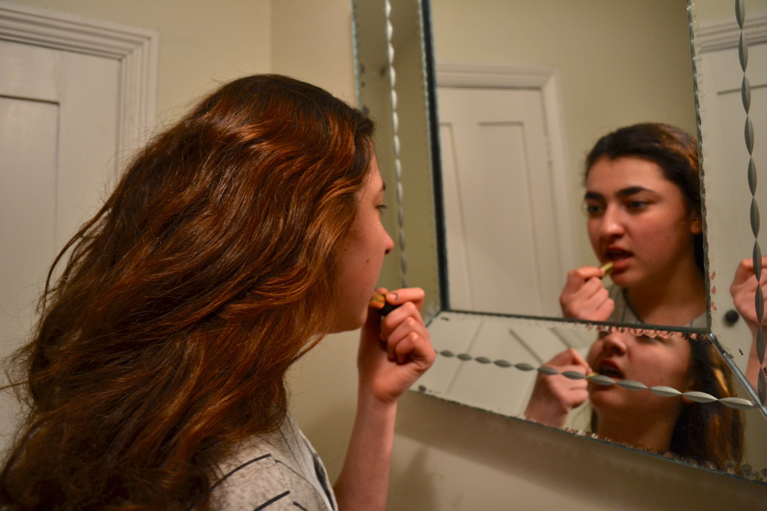
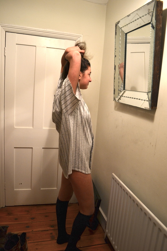
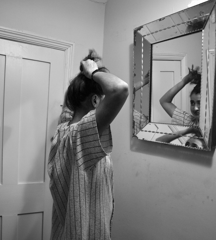
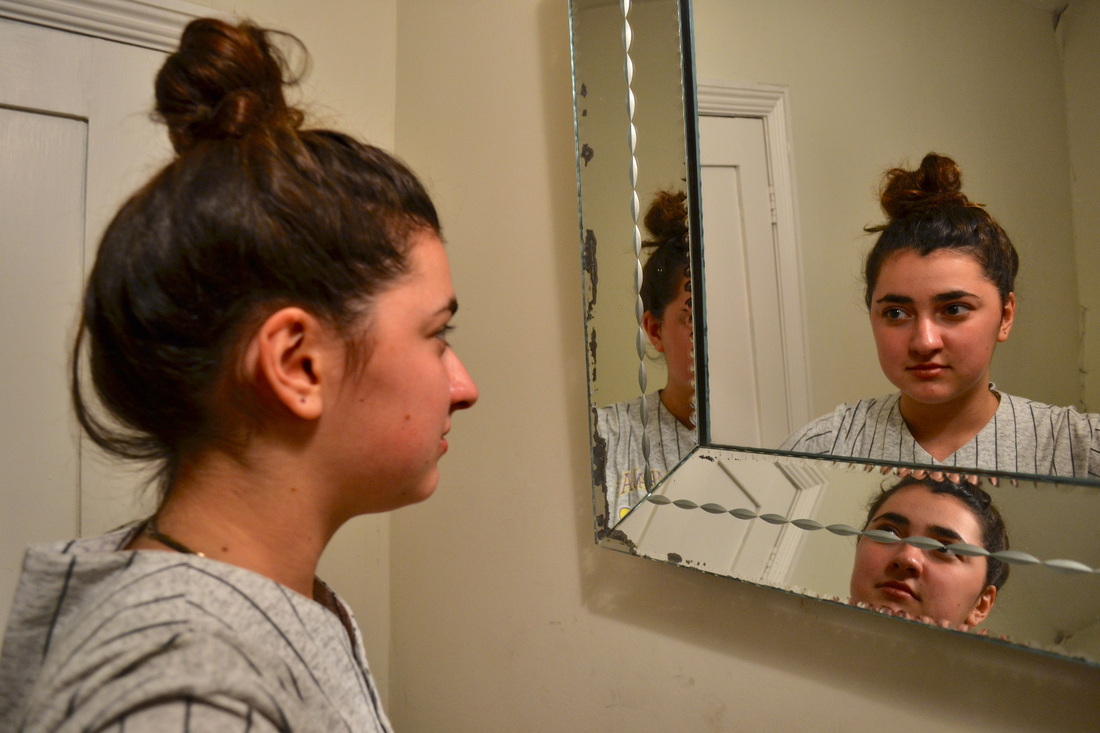
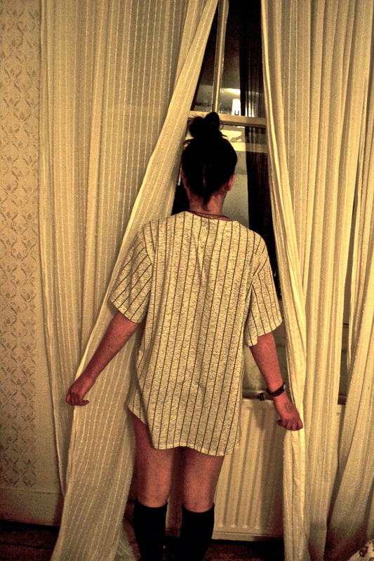
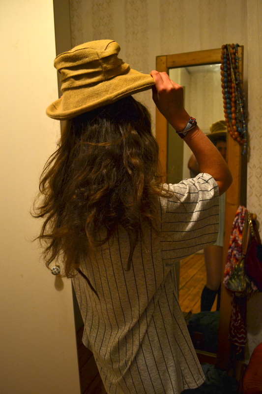
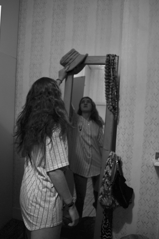
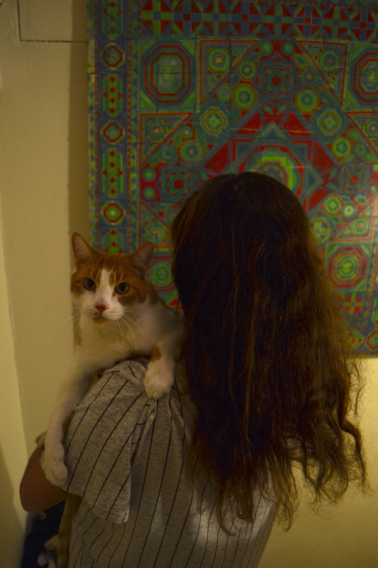
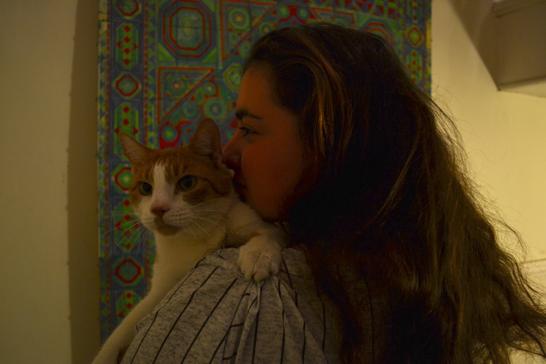
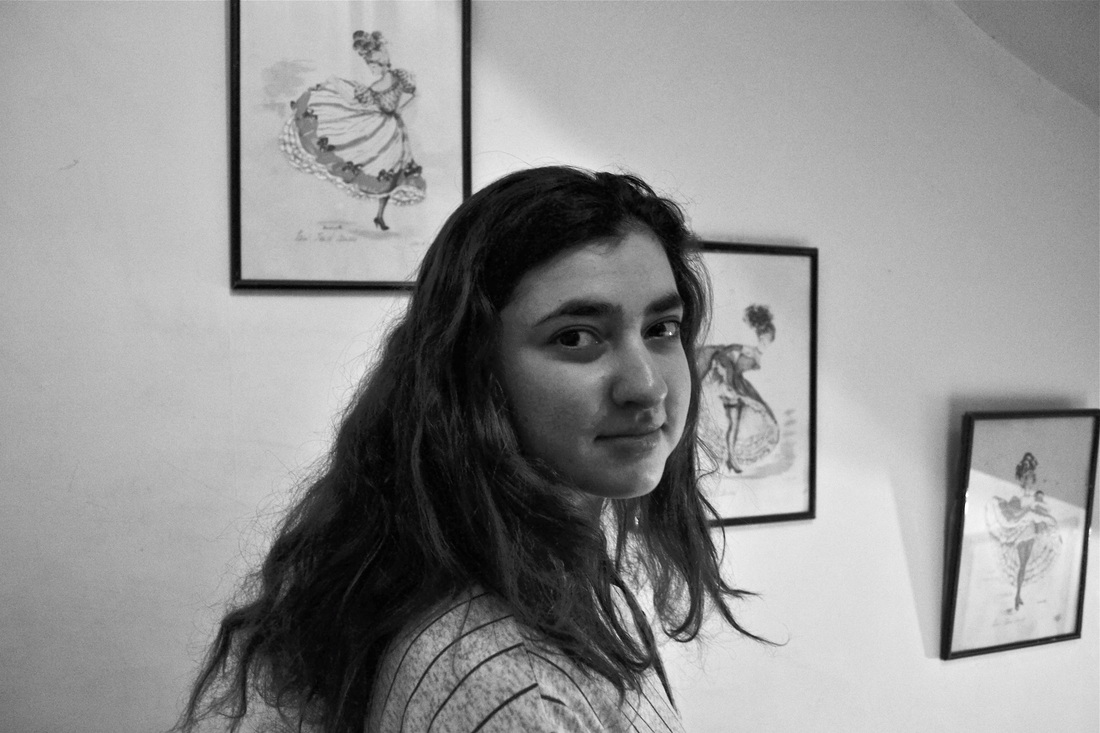
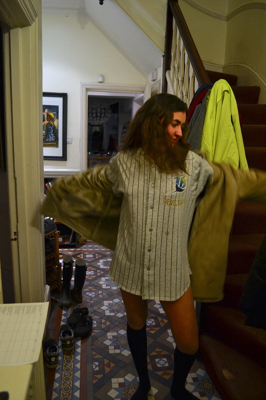
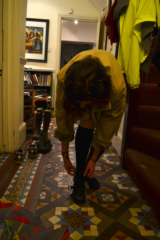
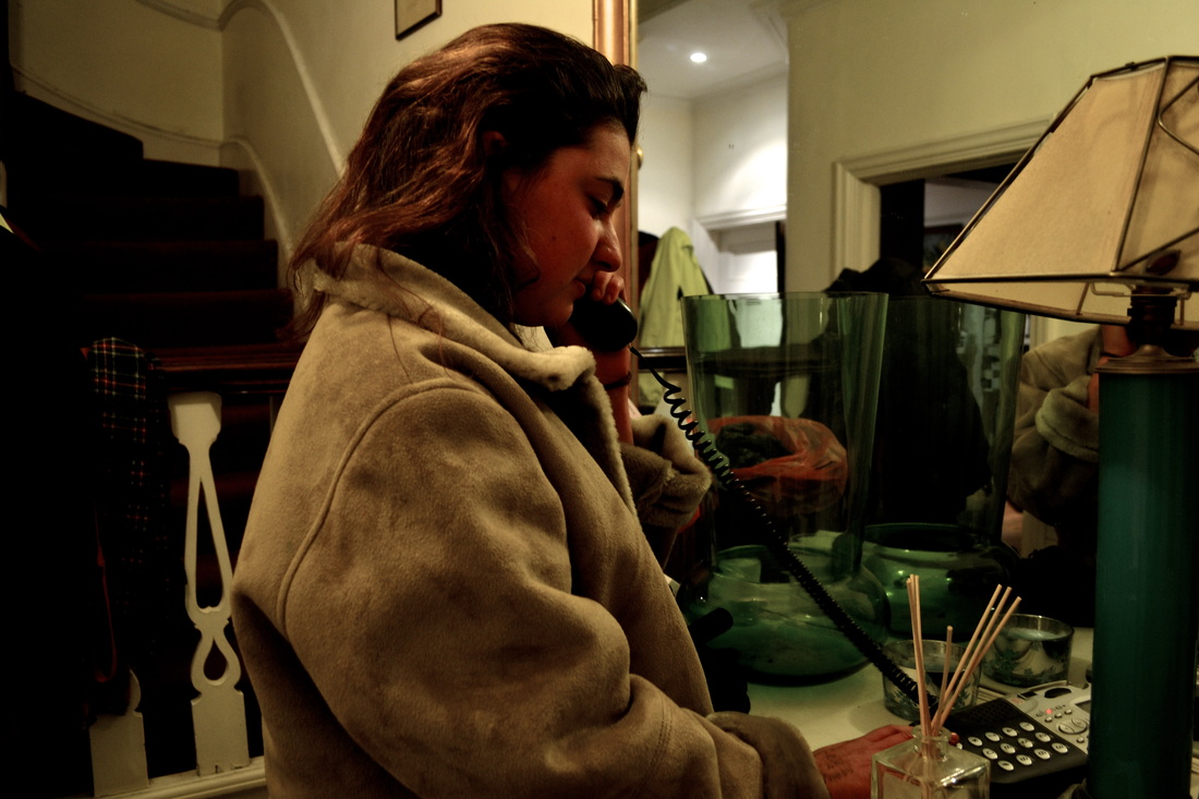
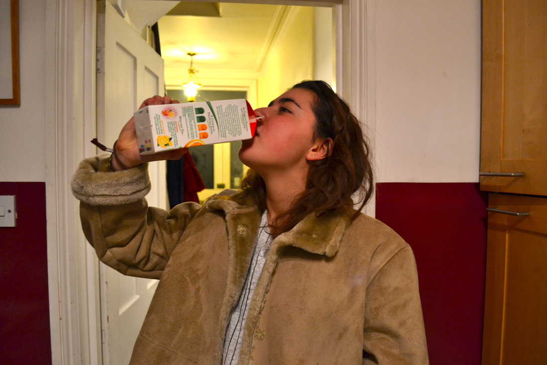
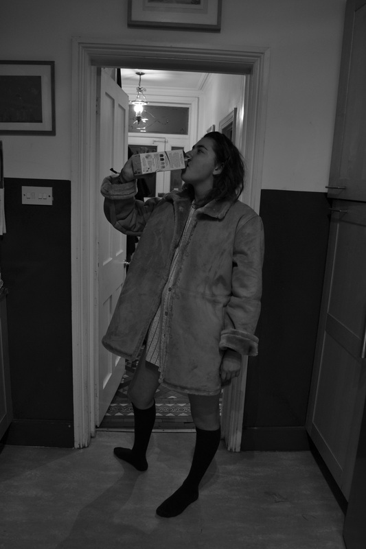
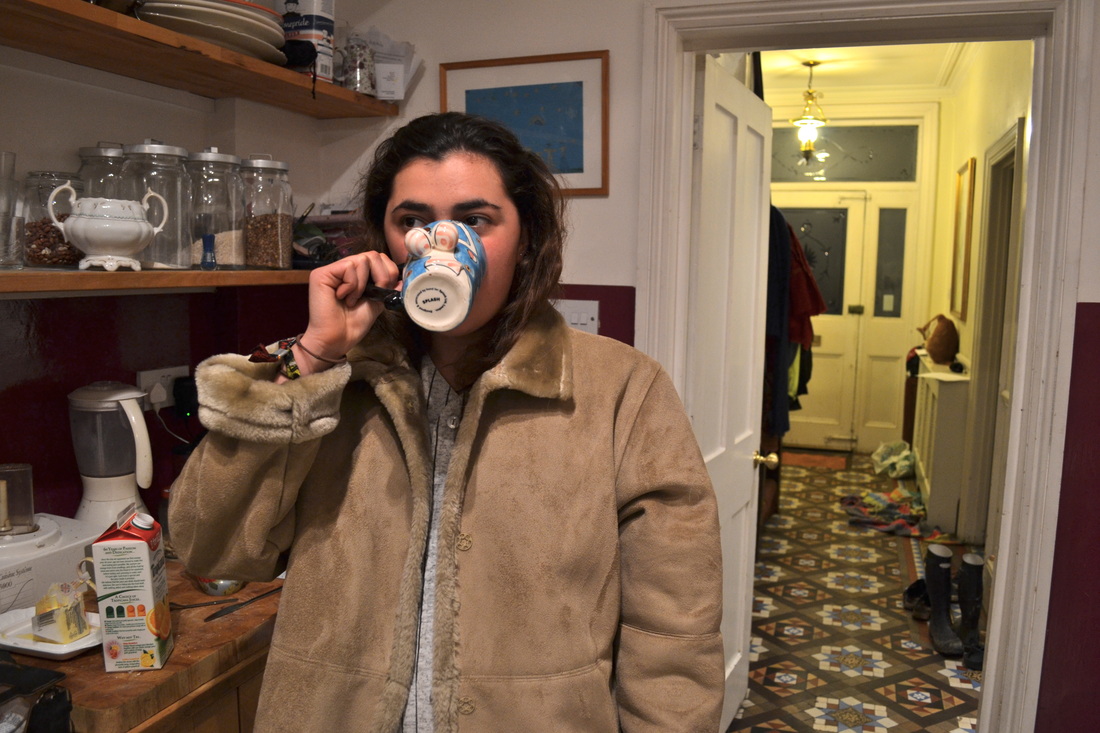
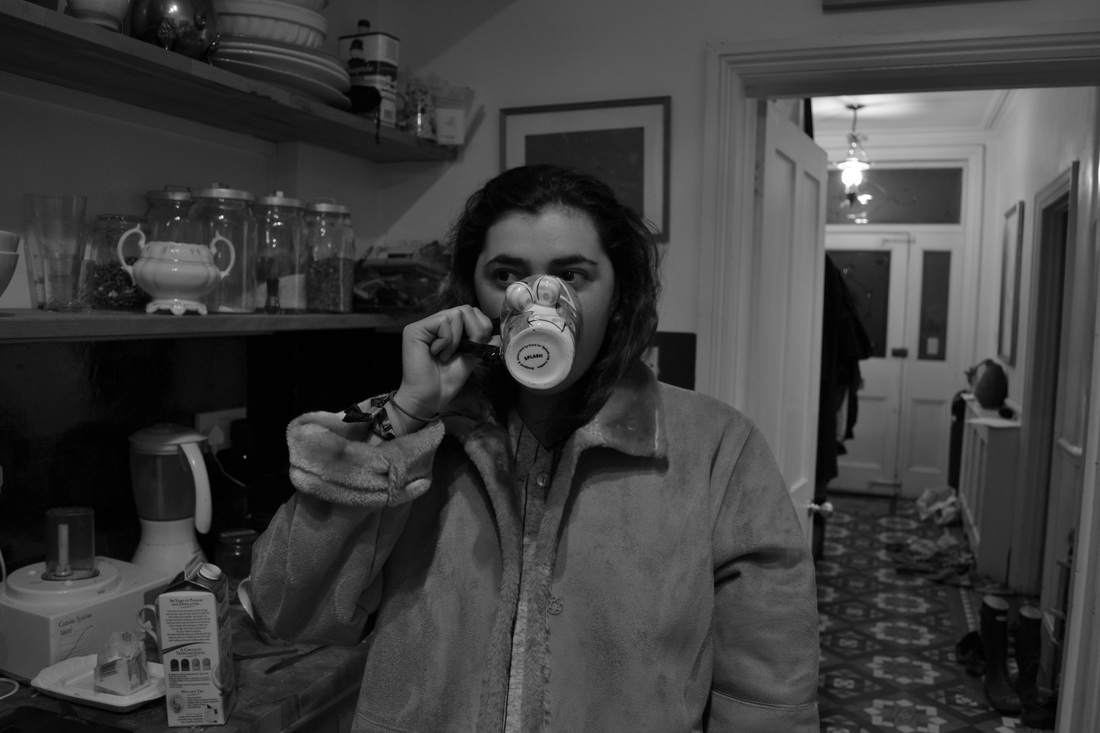
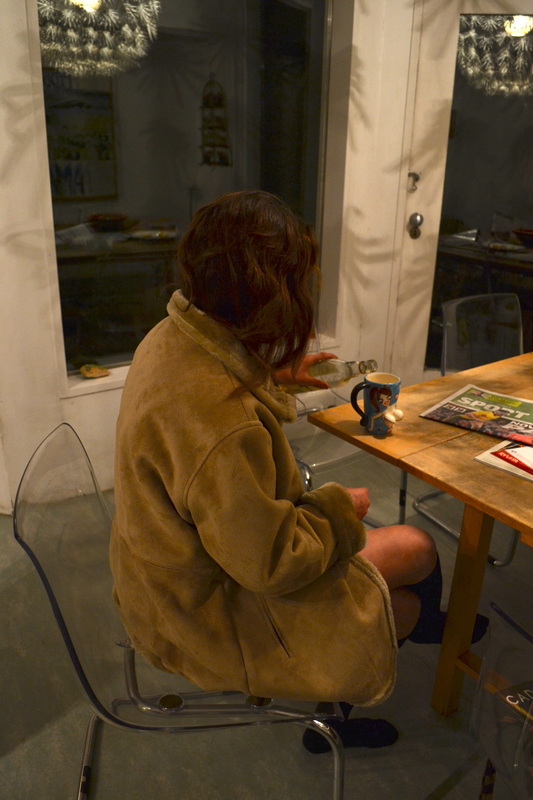
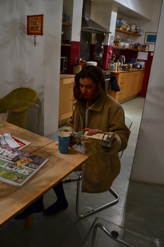
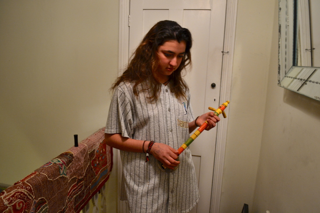
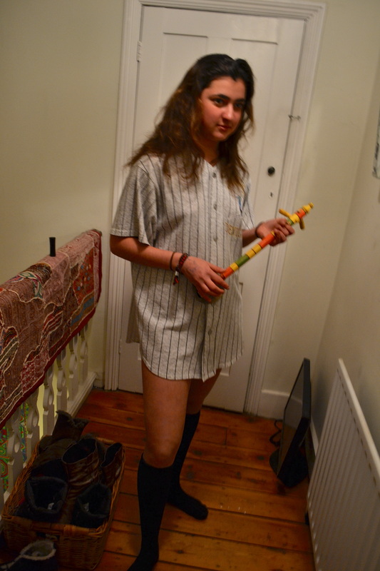
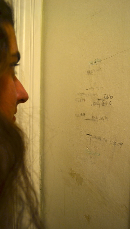
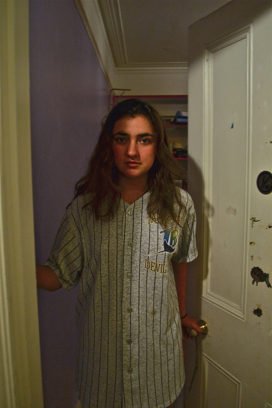
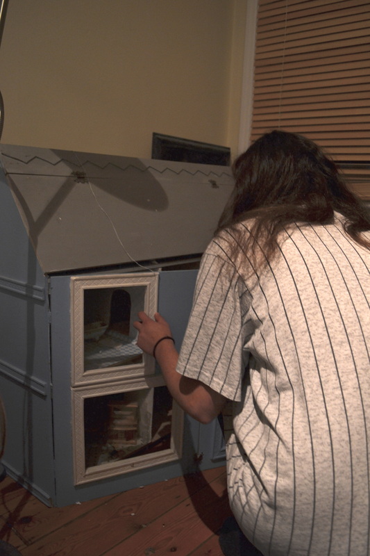
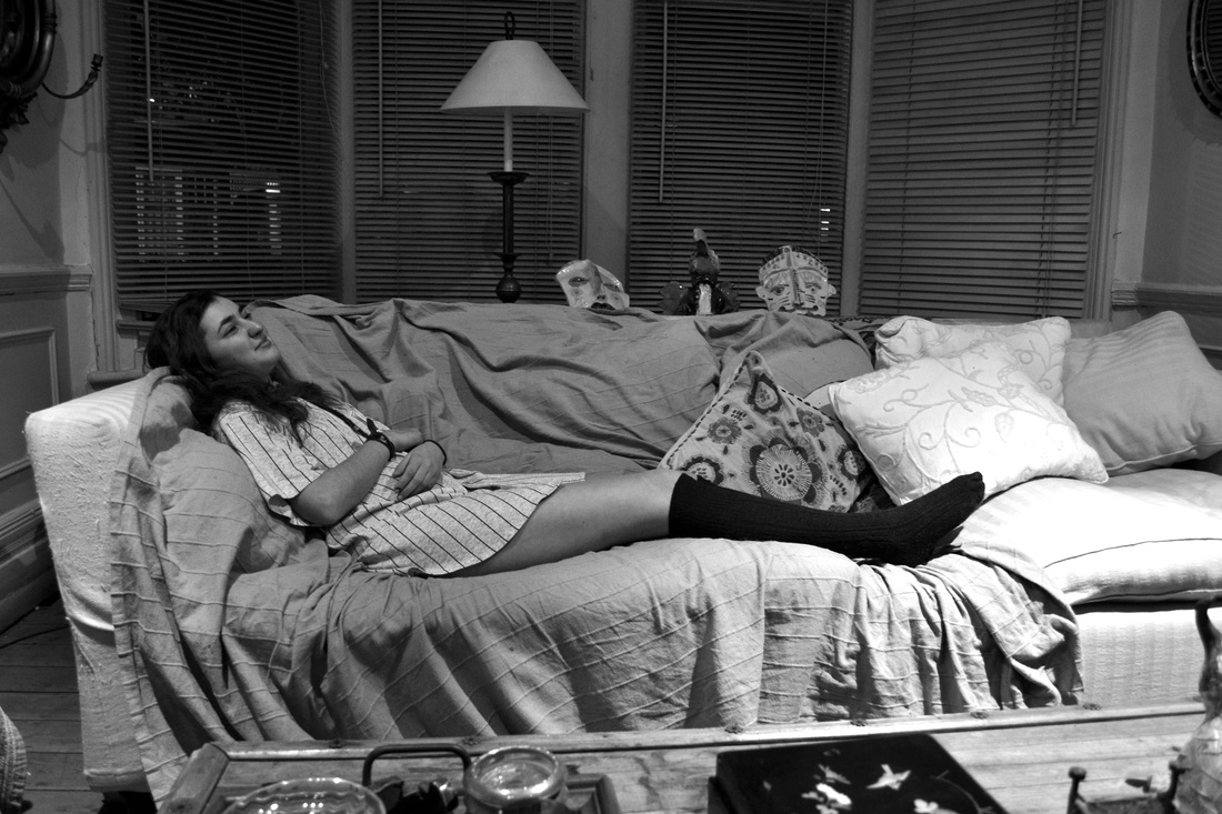
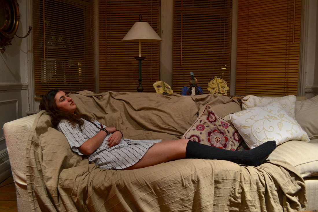
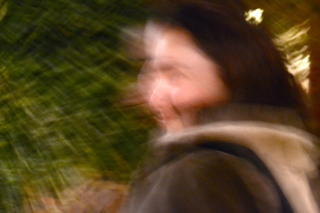
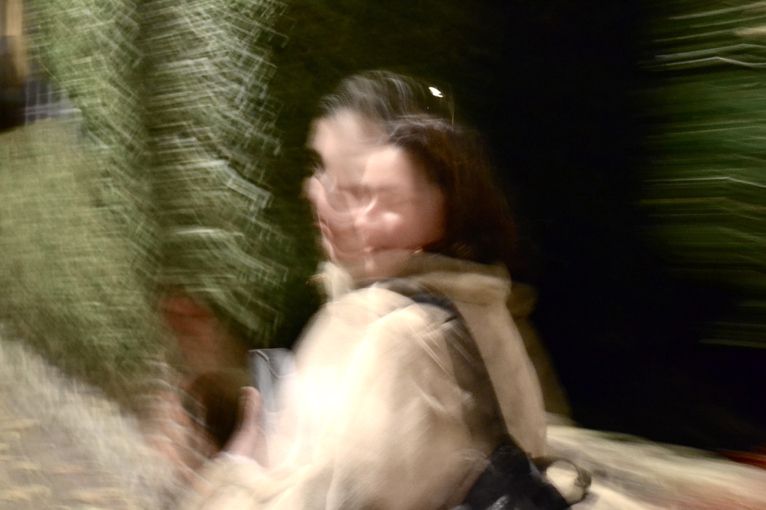
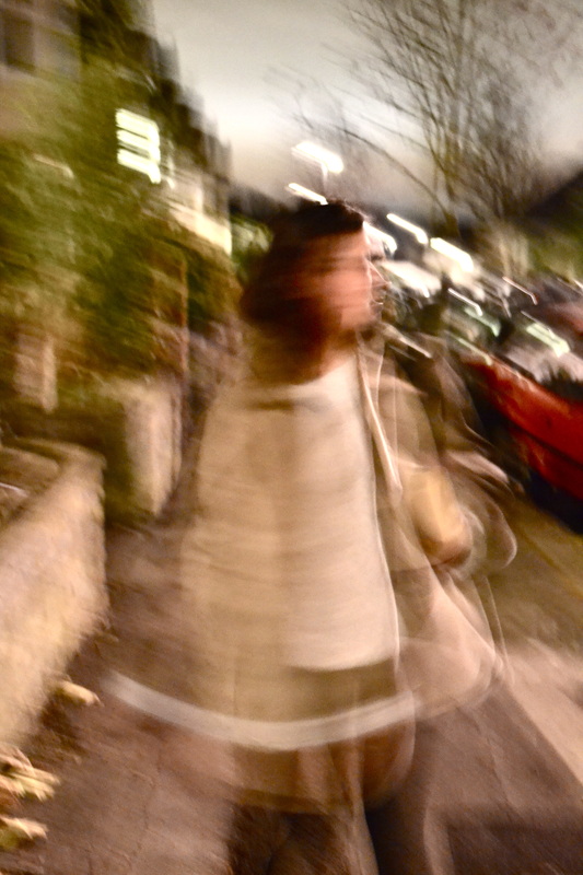
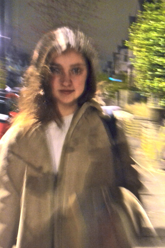
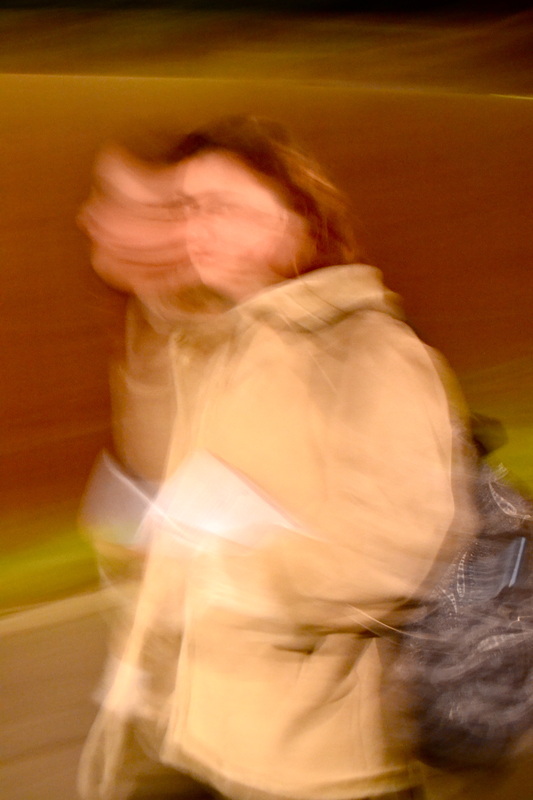
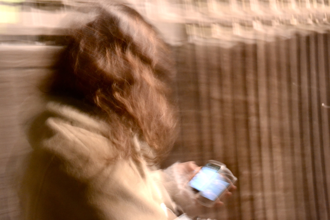
My first set of photos are inspired by Sophie Calle. Similarly, I decided to to photograph a 'day in the life' of my one of my friends.
In Suite Venitienne, Calle started of by following a man she met at a party in Paris to Venice, where she disguised herself and followed him around the city, photographing him in black and white. Next year, Calle organised a project named 'The Sleepers', a project in which she invited 24 people to occupy her bed continuously over eight days. Of these people, some were friends, friends of friends, and some were strangers to her. She served them food and photographed them every hour. Calle made another project named The Shadow, which consisted of Calle being followed for a day by a private detective (who'd been hired by her mother.) Sophie Calle described it as an attempt 'to provide photographic evidence of my own existence'. She led the detective around places in Paris that were meaningful to her, and kept a diary of her journeys throughout. Her projects question the role of the spectator, with views often feeling uneasy by violating others privacy. Furthermore, her documentary gives a sense of being artificial, questioning the nature of truths. In her project 'The Hotel', she was hired as a maid at a hotel in Venice where was free to gain an insight into the hotel guests. She qutoes "I spent one year to find the hotel, I spent three months going through the text and writing it, I spent three months going through the photographs, and I spent one day deciding it would be this size and this frame...it's the last thought in the process."
My first set of photos are inspired by Sophie Calle. Similarly, I decided to to photograph a 'day in the life' of my one of my friends.
my response to sophia calle:
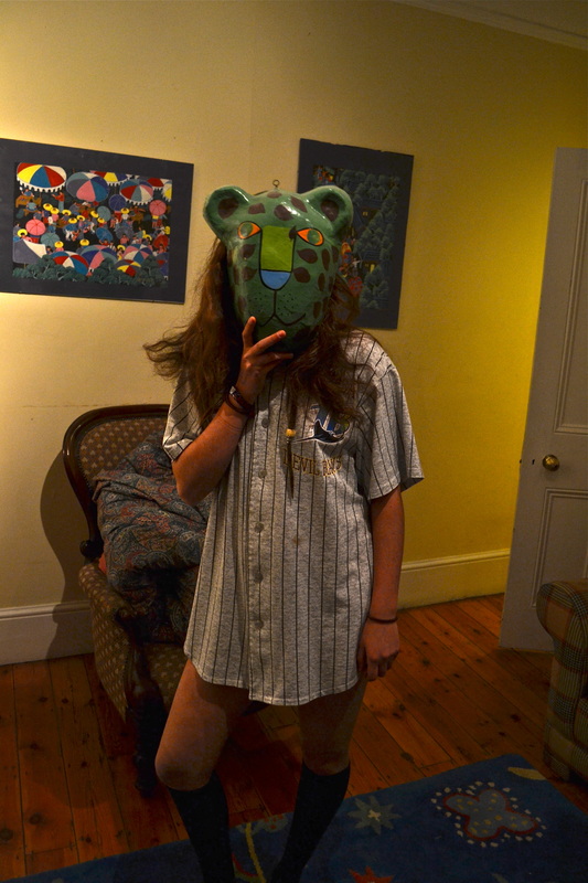
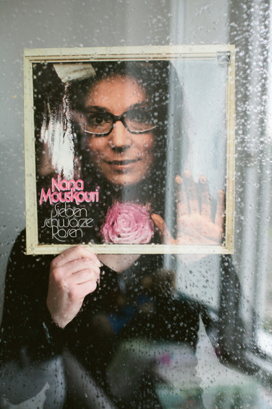
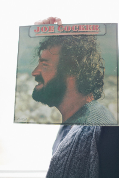
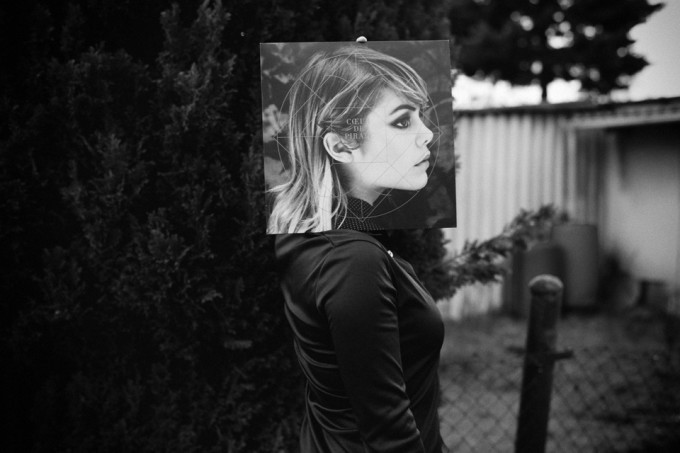
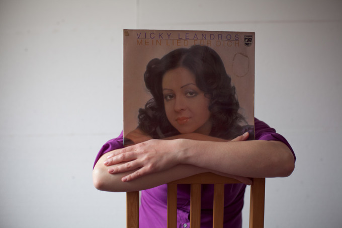
normen gadiel portrait series
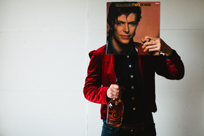
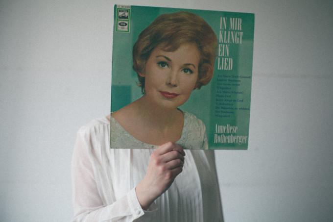
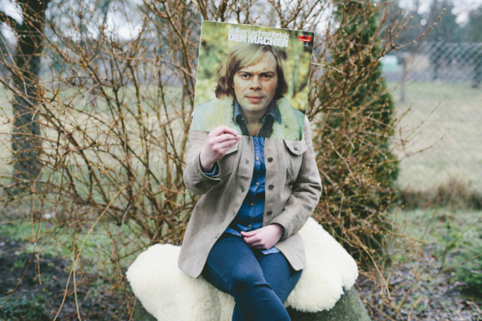
Normen Gadiel is a a 29 year old creative that specialises in portraits. He took a series of photos for a friend as a gift. “I did this together with a friend of mine. She wanted a special birthday present for her boyfriend. During talking about what we could make the idea of the vinyl covers was born because her boyfriend is a real fan of vinyls. There was no inspiration for it. We planned the (clothing, light, accessories and the right place.)” His photo's cause the viewer to question their perception of the images.
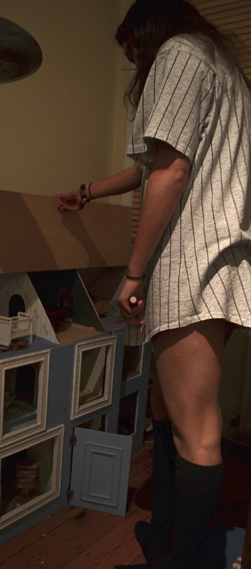
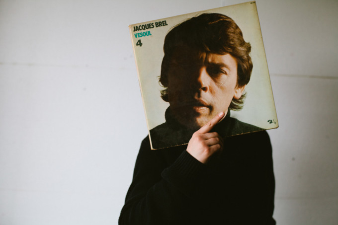
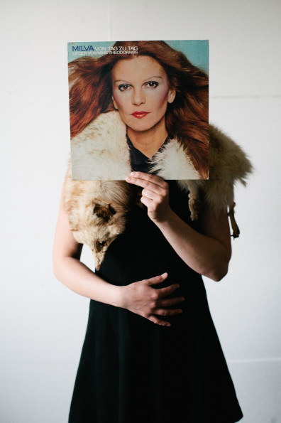
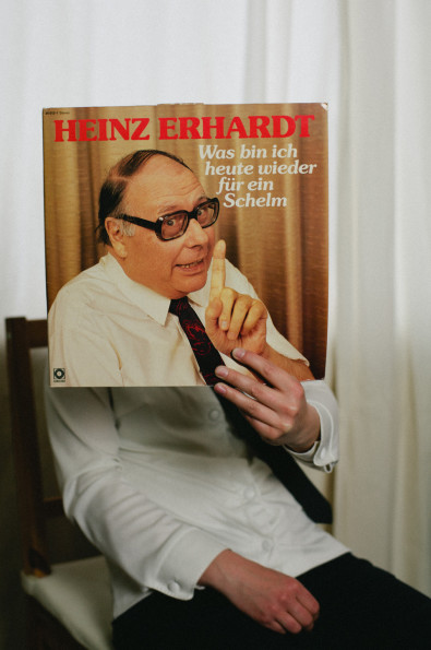
Whilst I was 'following' my friend, I came across some her old records. Inspired by Normen Gadiel, I decided to take photos of models holding vinyls across their face to make it appear as if the face on the vinyl belonged to the model. I found it difficult to identically match the model's I was photographing due to difference in size, skin tone, and clothes.
Whilst I was 'following' my friend, I came across some her old records. Inspired by Normen Gadiel, I decided to take photos of models holding vinyls across their face to make it appear as if the face on the vinyl belonged to the model. I found it difficult to identically match the model's I was photographing due to difference in size, skin tone, and clothes.

My RESPONSE to NORMEN GADIEL PORTRAIT SERIES
artist and me
|
|
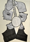
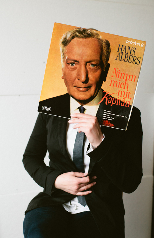
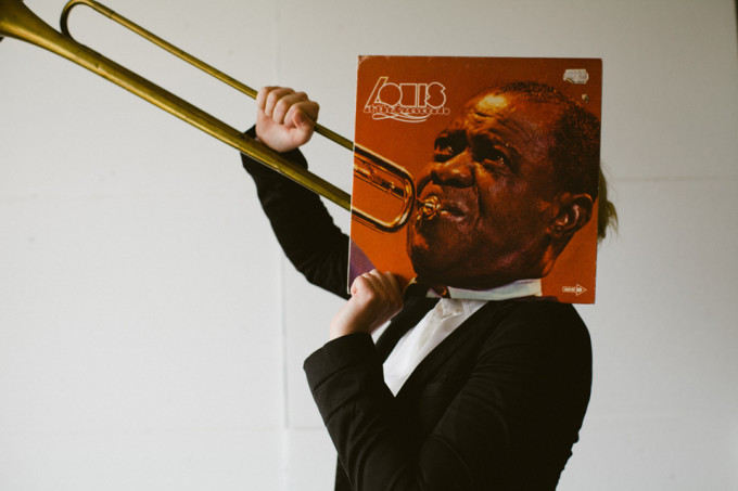
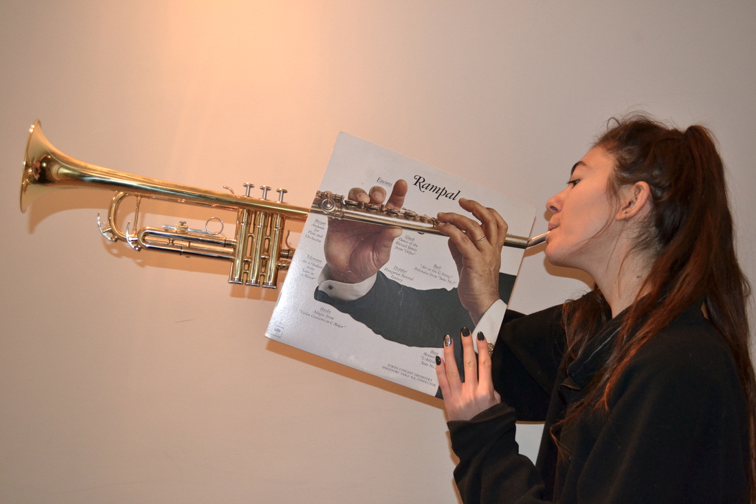
I responded to Normen Gadiel's photo using Louis Armstrong's album cover. The artist photographed a man holding a Louis Armstrong record in front of him blending it in to his body, making it appear to be one person. He's holding a trumpet, giving the illusion that it's coming out of the album. In my response, I photographed a model holding a record with two hands playing the trumpet. The model is wearing a black jumper, and is holding a trumpet to match the album cover. To improve I could of matched up the hans more successfully, by hiding the model's hand, as in my image there appears to be three hands.
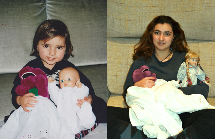
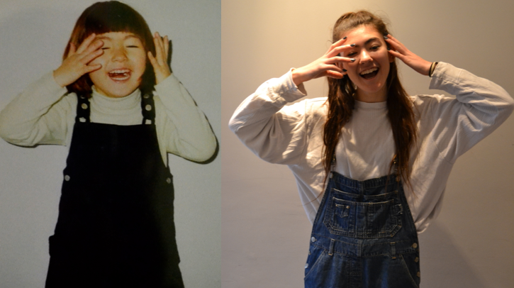
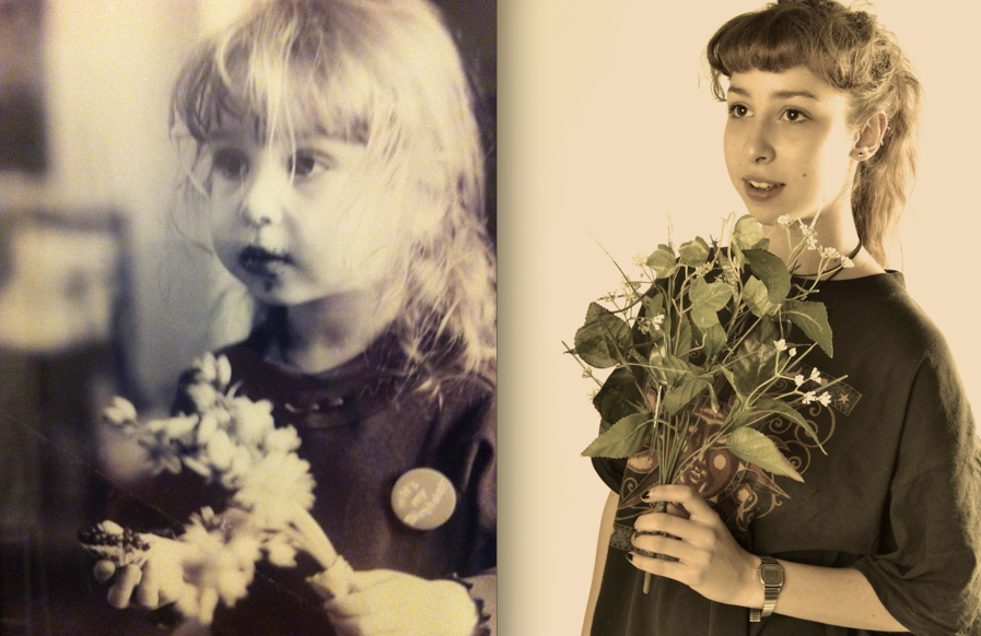
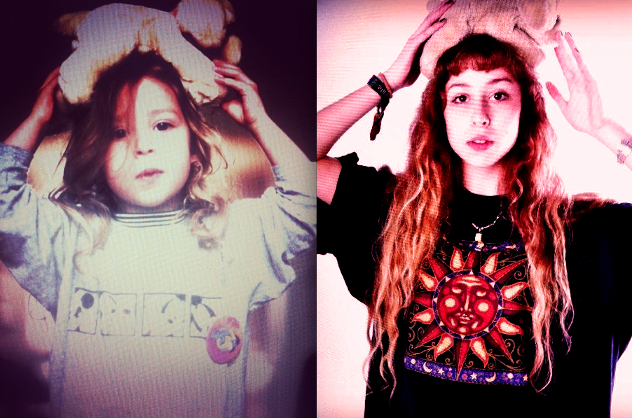
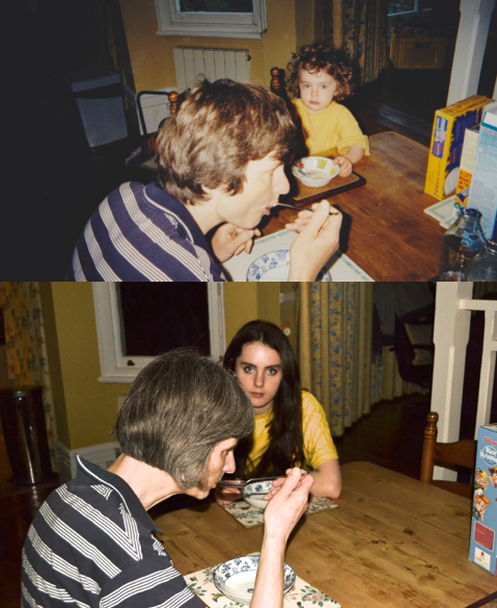
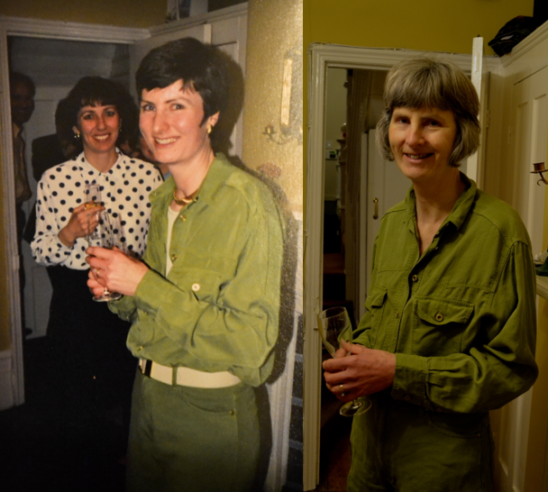
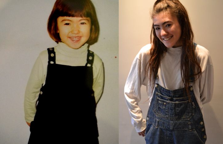
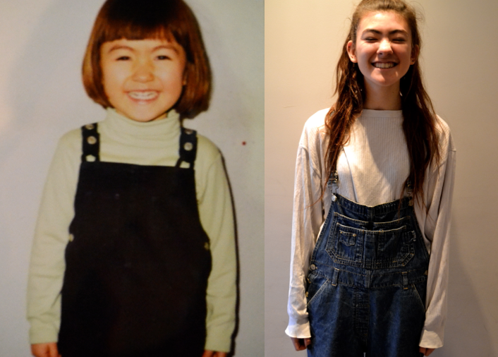
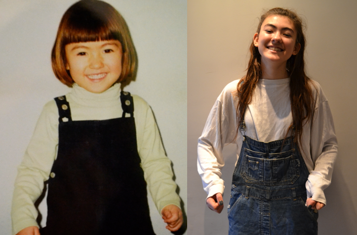
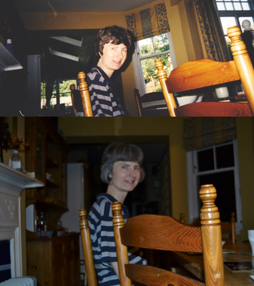
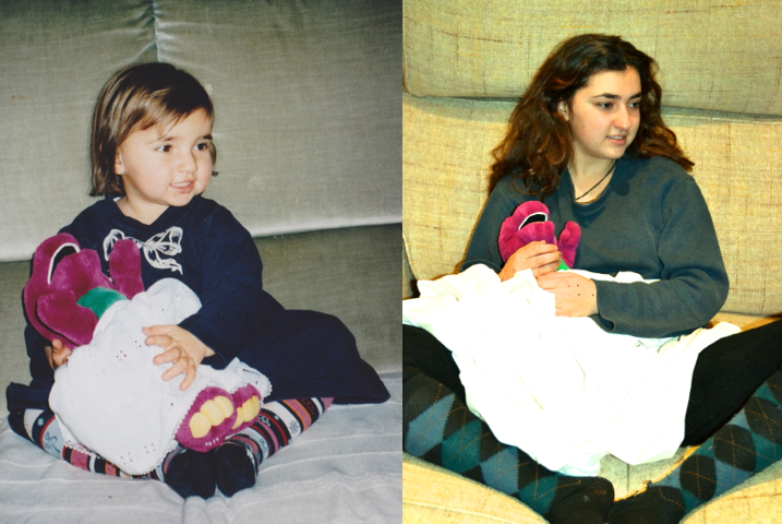
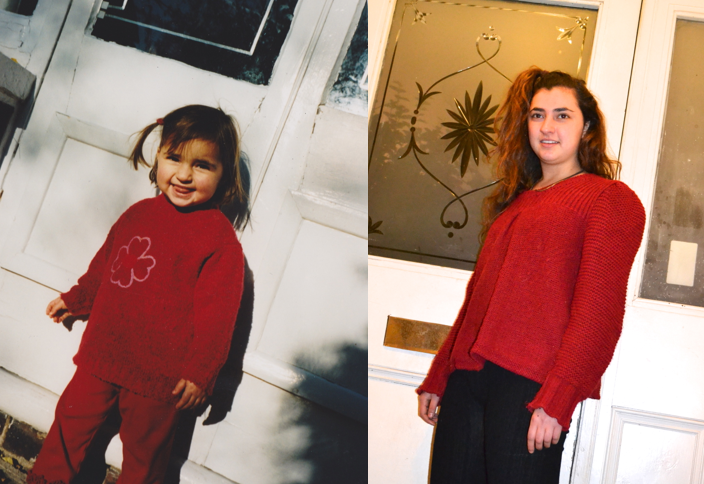
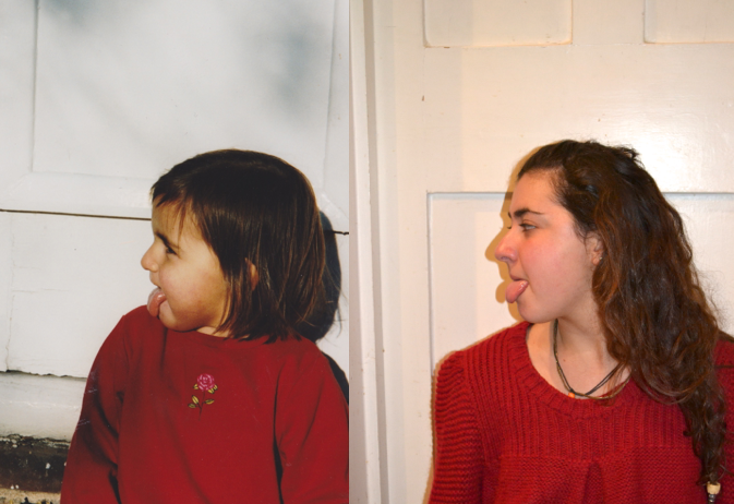
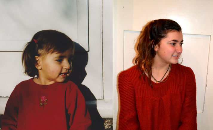
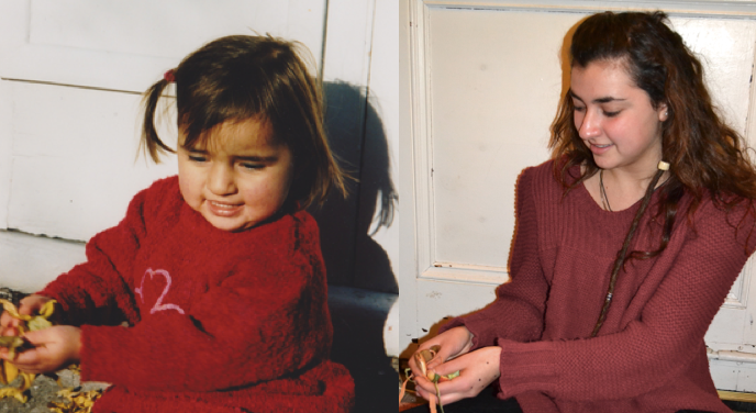
Irina Werning
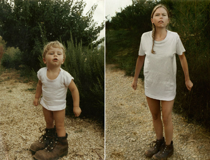
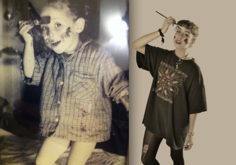
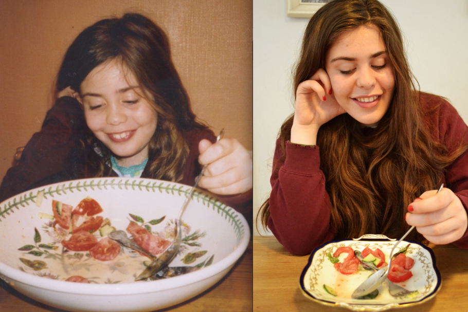
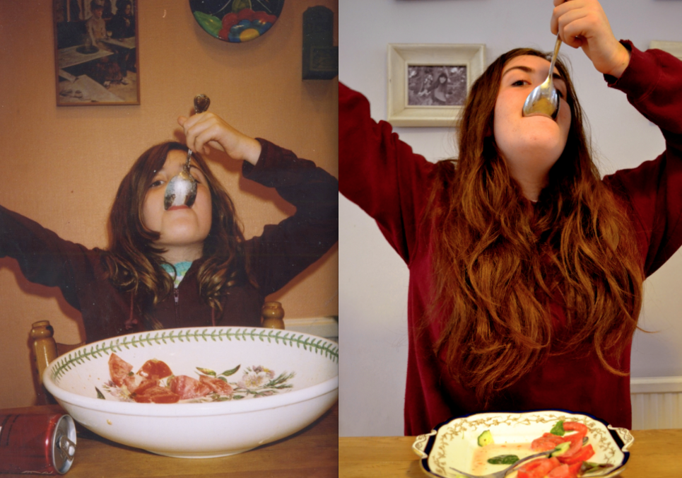
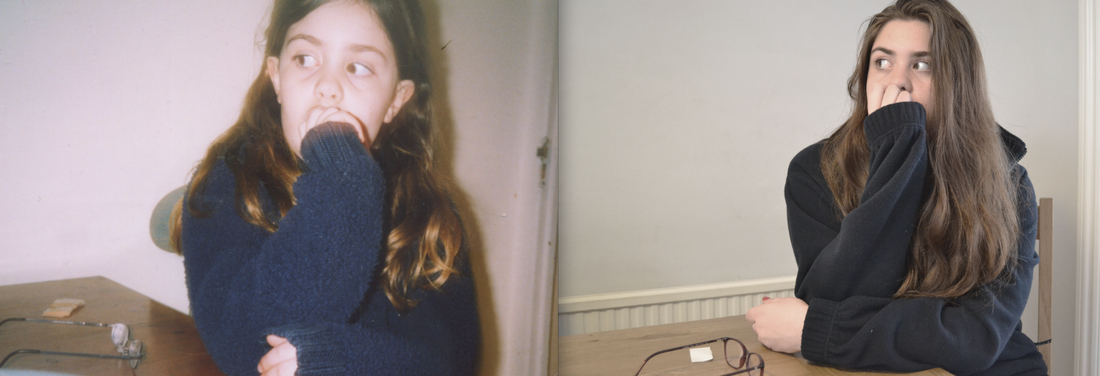
While I was 'following' my friend round her house, to take photo's in the style of Sophie Calle, I also came across some of her baby photo's. Inspired by Irina Werning's series called 'Back To The Future', I decided to recreate her old photos.
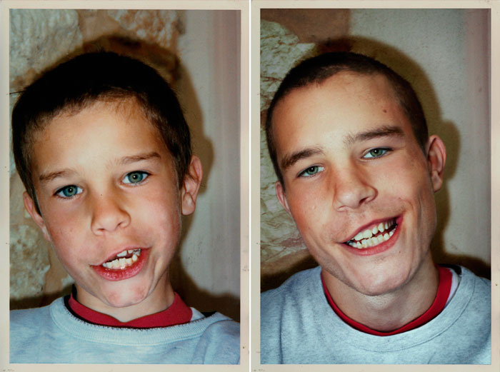
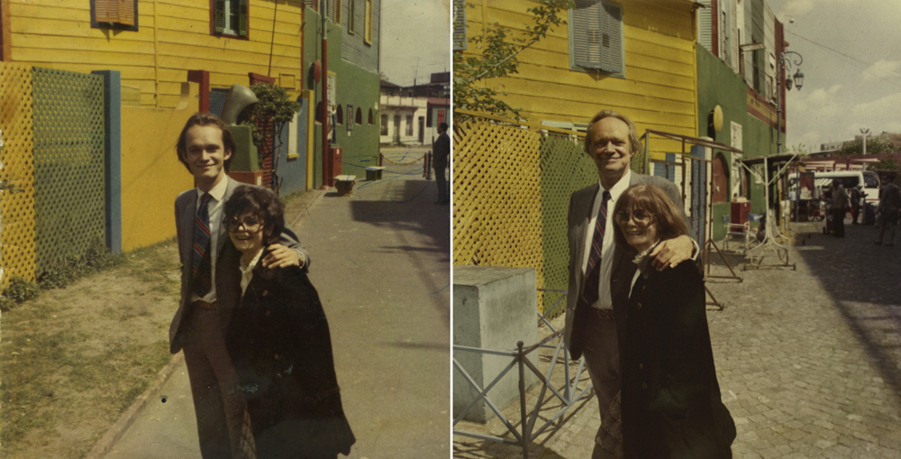
The photographer Irina Werning took a series of photos called 'Back To The Future', in which she recreated old photos. She quotes: 'I love old photos. I admit being a nosey photographer. As soon as I step into someone else’s house, I start sniffing for them. Most of us are fascinated by their retro look but to me, it’s imagining how people would feel and look like if they were to reenact them today… Two years ago, I decided to actually do this. So, with my camera, I started inviting people to go back to their future..' Here are some of Irina Werning's photographs.
The photographer Irina Werning took a series of photos called 'Back To The Future', in which she recreated old photos. She quotes: 'I love old photos. I admit being a nosey photographer. As soon as I step into someone else’s house, I start sniffing for them. Most of us are fascinated by their retro look but to me, it’s imagining how people would feel and look like if they were to reenact them today… Two years ago, I decided to actually do this. So, with my camera, I started inviting people to go back to their future..' Here are some of Irina Werning's photographs.
my response to 'back to the future'
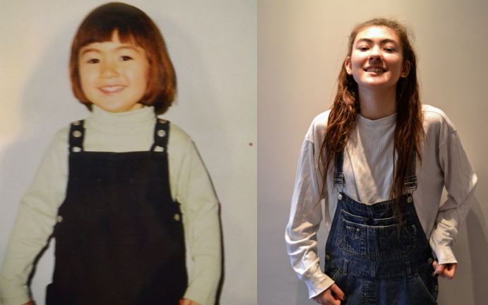
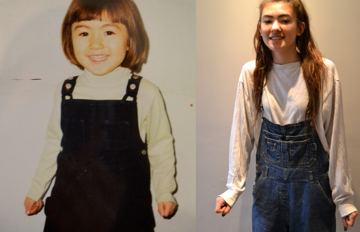
The following set of photos are inspired by Irina Werning. I recreated my friend's and family's old photos, and took them again making them as similar to the old copy as possible. It was interesting to see the how the person being photographed has changed over time.
my final six
I chose these photos for my final six, because I thought the re-creation was the most effective as I was able to photograph similar backgrounds and objects.